Official development blog
[ Latest Cogmind Release Notes: Feb 2026, "Unchained More" ]

Accommodating Color Blindness

Traditional roguelikes are both at an advantage and disadvantage when it comes to accommodating color blind players. On the one hand recoloring monochrome glyphs is a fairly straightforward process; on the other a game lacking any method of adjusting colors can be difficult for some to play, more so than say a game with unique multicolored sprites for each object.

A good number of roguelikes store data in external files,  so technically it’s possible for players to dig through the data and make changes to improve their experience. This is far from “accommodating,” nor is it very realistic to expect every player that needs it to be willing and able to do this. There must be better solutions.

But first, a closer look at the issue for those of us with normal vision.

Color Blindness

Color blindness mostly affects the male population, anywhere from 5-10% of it in fact, so it’s definitely an issue to take into consideration. Even before reaching out to a broader audience with Cogmind I’ve already been contacted by multiple players with color blindness who hope the game can accommodate them.

There are many forms of color blindness, some rarer than others. Here we’ll look at the most common one, deuteranomaly (approx. 6% of males) and its more extreme form deuteranopia (1%).

There are various programs and websites that enable people with normal vision to simulate various types of color impairment. The best I’ve found for desktop use is Color Oracle. It only simulates the most extreme versions of color-blindness, with the understanding that designing for extreme deficiency will naturally improve the experience even more for everyone with less extreme types.

The web-based solution I actually used because it provides more options is here. If you have a game/project of your own I highly recommend testing out some screenshots to get an idea what this portion of the population sees when viewing it.

Let’s take a look at the old Cogmind mockup because it contains many elements in a single image.
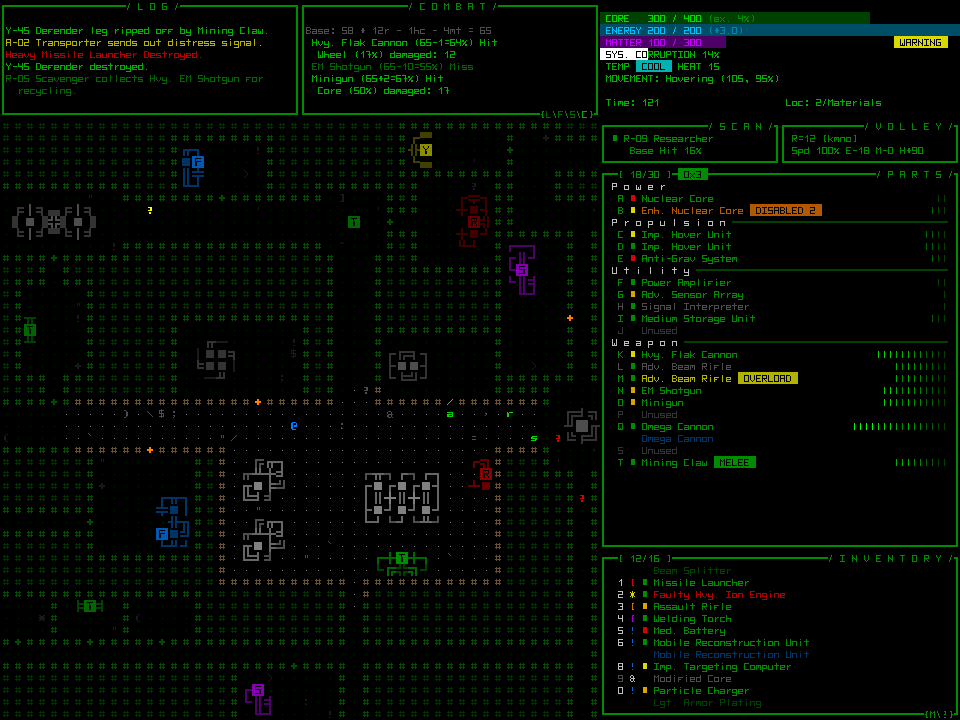
Cogmind Mockup

The original mockup. (click for full size)
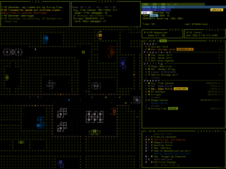
 

cogmind_mockup_v2_deuteranomaly

Mockup as viewed with deuteranomaly (green-weak). (click for full size)
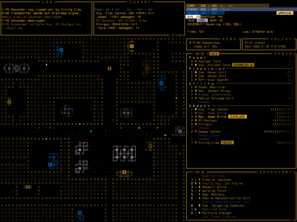
 

cogmind_mockup_v2_deuteranopia

Mockup as viewed with deuteranopia (green-blind). (click for full size)

While the second image appears much more muted than the original, especially given that terminal green is the Cogmind’s color theme, it’s still pretty playable. The biggest problem I can see there is that red no longer shouts “problem here!”

The third image, lacking any green whatsoever, would be much more problematic, though any solutions that work for one will work for the other.

Specifically which parts of Cogmind might need more attention in terms of adaptable color? Log messages would be an obvious one. Any important warning indicators would also need to be checked for how obvious they are…

The previous post about particle effects in Cogmind also discussed color themes used for particle effects. These are actually of little consequence and being able to identify them will have no impact on one’s ability to play the game. Consistency was the goal when assigning colors.

In game you won’t be frequently meeting lots of new types of enemies with different weapon effects distinguishable only by color--shape and style hold the most useful information, since all you need to concern yourself with is whether you’re being shot at by ballistic, thermal, or electromagnetic weapons, all of which have very different styles. With regard to color reflecting a weapon’s power, as you advance through the world enemy robots naturally use stronger weapon variants anyway.

A much bigger issue is the color of enemy robots themselves. Primary robot classes identify their variants from weak to powerful using a spectrum of color, therefore ensuring those colors are distinct is of utmost importance.
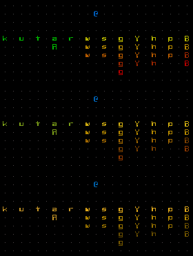
cogmind_sandbox_robots_greenimpaired

Robots from the Cogmind prototype, as seen by normal vision, green-weak deuteranomaly, and green-blind deuteranopia.

Fortunately the color scheme is fairly simple and therefore should be easy to modify when necessary using one or more solutions.

Solutions

While Cogmind can’t be accessible to absolutely everyone, it’s nice to be inclusive where possible. UI design principles emphasize that all information should presented in multiple ways, at least one of which that does not rely on color at all. It’s not always possible to both achieve this ideal and maintain a specific aesthetic, but I try.

In the case of Cogmind I am not allowing consideration of color blind players to affect or inform the overall design, but do intend to implement workarounds based on feedback from actual players when the time comes. Ideally the solution should be easy for both players and developer, and fortunately Cogmind is backed by a flexible data-driven system that simplifies the process. Here are some of the possibilities:

Message Logs

Message logs should always be colored to speed up visual parsing and make important messages draw more attention. Colors for individual messages are set in an external file located surprisingly in the “data/messages/” directory.
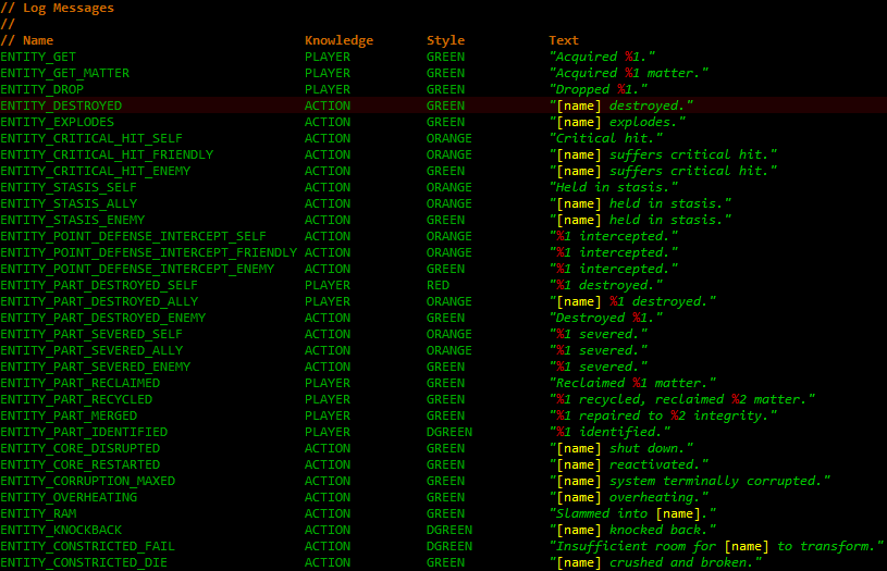
cogmind_log_xt

log.xt

That may give you highly specific control, but setting colors for more than a hundred messages while keeping them consistent isn’t exactly fun or easy. It’s less of a hassle to just change the underlying styles defined in a separate file:
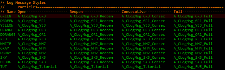
cogmind_log_styles_xt

log_styles.xt

“GREEN” is obviously for good things, “RED” for bad, etc., thus you could change the color for any of them by using an alternate abbreviation. The color abbreviation system used for internal particle names is pretty easy to follow--first two letters of the base hue followed by 0~5 for fully-saturated colors of varying brightness or 6~9 for desaturated bright colors. (Incidentally you can also use this file to change message drawing to use a completely different animation rather than just changing the color.)

Non-log-based temporary popup messages use the same system, defining only two styles “CONFIRM” and “WARNING,” colored green and red, respectively, that some players may prefer to switch to different colors.

Animation/Interface

Cogmind’s animation scripting engine includes support for global constant variables, which have already been implemented for much of the GUI. What this means is that by changing a single value or handful of values you can modify the appearance of large parts of the interface without messing with any scripting details. These values are all conveniently located in one place, enabling centralized control of this customization feature.
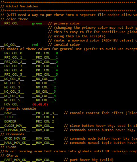
cogmind_script_global_variables

Global variables in scripts, a work in progress since it makes more sense to finish them off once the animations are finalized. This isn’t meant to be a user-friendly list at this point, just something for my own reference.

I’ll even prove it works! ;)
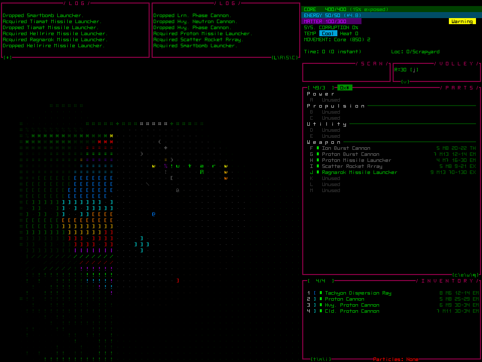
cogmind_ui_pink

Cogmind main UI, now with pink consoles. Because I can.

An Ultimate Solution?

We could take this even further and create a filter loaded by the engine that converts the entire color palette regardless of what the game gives it. Defining such a filter is far easier than it might sound, because while the interface may look colorful, the engine and game use a limited set of named colors.
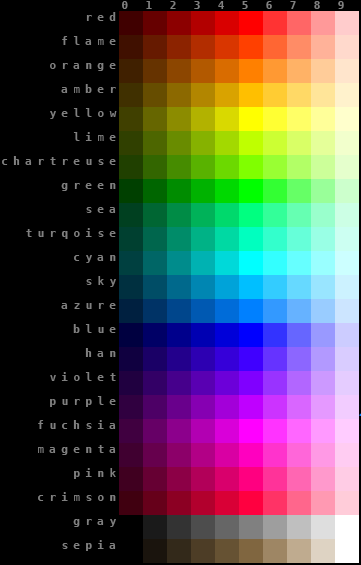
cogmind_palette_24x24

The Cogmind palette, a standard full-range hue chart with key colors.

All the engine uses is a short list of hue values, generating the rest automatically--even the multicolored ASCII animations are created on the fly by interpolation and alpha adjustments defined by scripted parameters.

I haven’t implemented the filter feature, but it would be easy to do. You could do something as simple as change a single value to turn the “red” line to some new blue, or go so far as to redefine every single color, which is still only 21 values. With a different red value, everywhere in the game that any “red” color is used would automatically use the preset blue replacement instead, with ZERO processing overhead (always a nice bonus).

It would be even more interesting if the palette could be swapped by using an external image file rather than text. As is, a mathematically generated palette means the simplest solution describes color hue by number.

For the GUI this is good news, but for the map I’d say that because Cogmind does a pretty good job of using the entire palette*, it won’t be easy to redefine object colors without creating informational overlap.

*By hue, not brightness--Cogmind actually only uses about 20 different colors on the map, and 50% of the colors you see in that generated palette aren’t used in the game at all! (It is a generated palette, after all.)


Additional solutions could be made available depending on player demand.

Overall the problem is complex enough that it won’t have an easy in-game solution--some file editing will be required, but it shouldn’t be too difficult. And I’d of course be happy to host pre-modified files for download, even better if they’re made by the community itself!


Update: Several years after this post, Cogmind added various Color Customization features as well as a colorblind mode accessible directly in the Options menu!
Posted in Design | Tagged , , , , | Leave a comment

Making Particles

I’ve already written about weapon particle effects, but previous posts have only focused on the results rather than the process behind their creation. Some readers would likely enjoy some elaboration on what went into that whole “week I buried myself in Cogmind scripts.” For everyone else, it’s also a thinly veiled excuse to show some more effects ;)

cogmind_particle_effects_03

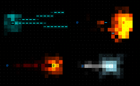
An Ion Burst Cannon, Scatter Rockets, Ragnarok Missile, and Proton Missile to whet your appetite.

Styles

The most annoying part of working with large data sets, but an absolutely essential one, is the need to ensure consistency in presentation. Weapons that are similar in some way should also share some qualities in their particle effects.

At the simplest and most obvious level, this is achieved by adhering to logical designs when choosing a style for each weapon’s particle effect. Before assigning any particle effects at all, a long list of major weapon types was subdivided by their respective styles.

cogmind_particle_styles_gun_ki

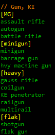
Ballistic guns, grouped by general particle styles.

The above list could be renamed “the duh category” because it’s comprised of mostly familiar weapons that players expect to look a certain way. (In fact, I made that part of the list after the fact just to have a record of it, since it was so obvious it wasn’t really necessary to write down before working on ballistic gun particles.)

cogmind_particle_styles_gun_th

Thermal guns, grouped by general particle styles.

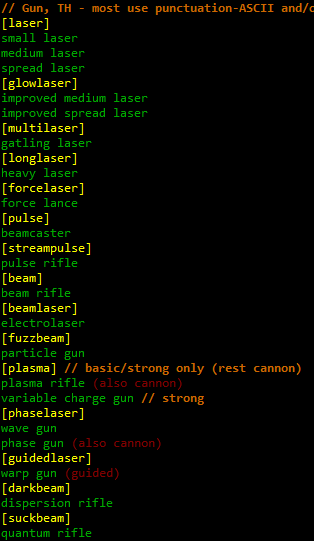
At the other end of the spectrum thermal guns can and tend to be more distinct since there’s more room for innovation, thus there’s almost a different style assigned to every type.

Having a list like this is useful as a centralized reference rather than having to search through the entire item data to make sure same-technology weapons are using the same style. Some guns also have “cannon” versions, i.e. same technology but bigger/cooler, and those should have similar styles as well. The cannon lists reuse many of the same styles, though with modifications to the particle effect to reflect their greater power.

Themes

Cross-style themes are used to convey other information about a weapon via color or other attributes (but mostly color). The color of an effect almost always reflects the weapon’s strength. Weaker ballistic weapons fire gray or light brown projectiles, while more powerful versions are orange/red.

cogmind_weaopn_particles_shotgun+hpw

Shotgun vs. High-powered Shotgun

Stronger ballistic weapons also tend to have more smoke/flash to their effect:

cogmind_weapon_particles_assaultrifle+HMG+gauss+massdriver

Improved Assault Rifle vs. Improved Heavy Machine Gun; Gauss Cannon vs. Mass Driver

Weaker versions of laser weapons are yellow, stronger ones are green.

cogmind_weapon_particles_pulserifles

Normal vs. Cooled Pulse Rifle

Non-laser thermal weapons, which also tend to be more powerful than normal lasers, range from orange to red.

cogmind_weapon_particles_hvyphasecannon

Heavy Phase Cannon

Plasma weapons all use similar colors, but grow larger and slower as they increase in power.

cogmind_weapon_particles_plasma

Plasma Rifle, Variable Charge Gun, and Plasma Cannon

Thermal weapons may also use randomized ASCII in their animation, but only punctuation marks--full ASCII is reserved for electromagnetic weapons. EMP weapons are especially dangerous to Cogmind, so it’s nice that they look (and sound!) very different. Almost all of them use ASCII glyphs; they’re also the only weapons to use blue.

cogmind_weapon_paritcles_lightninggun+teslarifle

Improved Lightning Gun and Tesla Rifle

Electromagnetic explosions follow the same pattern of full ASCII use.

cogmind_weapon_paritcles_tesla+gammabomb

Tesla Bomb Launcher and Gamma Bomb Array

As you would expect, normal explosions are generally yellow/orange/red.

cogmind_weapon_paritcles_grenade+rocket+missile

Entry-level grenade, rocket, and missile.

Some AOE weapons don’t fit into either of these categories and have unique effects.

cogmind_weapon_paritcles_neutronmissile_pointsingulairty

Neutron Missile and Point Singularity Launcher

Another general theme among more powerful weapons is a “charging” animation before firing. The longer the charge the more powerful the weapon. Duh. Some “charges” may only be reflected in the sound effects, like the cycling up of a minigun, but most are visible in some way.

cogmind_weapon_paritcles_HERF

HERF Cannon, for when your target needs a really good dose of EMP.

I haven’t shown any melee animations yet, mostly because they’re more functional than impressive. There’s only so much you can do within a mere handful of cells around a point-bank melee attack! Basic attacks simply flash a directional ‘/’ over the adjacent target. I’m sure you can imagine the animation without a gif… Better melee weapons are expected to look better, so there are a few styles that do what they can with the small space available.

cogmind_weapon_paritcles_melee

Melee rampage with a Shock Maul, Impact Mace, Gravity Flail, Plasma Sword, then Kinetic Spear.

The Sandbox

All my games have them. A hard-coded map that can be modified in any way necessary to suit a specific test (as opposed to game maps which would be loaded from external files and are not otherwise easily tweaked in code). Certainly not a replacement for in-game testing, but good for quick and dirty tests of specific features without all the other parts of the game getting in the way.

This is where all particle effects are designed, since combined with cheat mode it’s an easy matter to just pick up and fire any weapon in the game.

cogmind_sandbox

Cogmind’s playground, by default featuring one of every item in the game.

For testing other objects, the default sandbox also contains all possible kinds of different terrain, and one of every robot in the game.

cogmind_sandbox_robots

The original prototype menagerie, soon to grow exponentially with the advent of new robot classes.

More about robots in future posts, but before that I still have to finish off the last bit of weapon sound effects to go along with all these particles, so that will be the subject of the next few posts.

Update: On multiple occasions I’ve been contacted by colorblind players hoping Cogmind will have accessibility options for them. There will be solutions, and rather than tack on related comments here, I’ve decided to write a dedicated post on that subject. (See next post: Accommodating Color Blindness.)

Posted in Design | Tagged , , , , , | 2 Responses

MORE ASCII Particle Effects

After spending a couple weeks completing item art, next up was assigning particle effects to the 200 or so weapons. Last time I posted about ASCII particle effects (not long ago) was regarding the “first pass” at them a few months earlier, when the work was more about doing “what I felt like” and thought would be interesting (that and cleaning up and tweaking a library of existing scripts from my other games).

This time around was quite different--with the semi-final item list ready, it was time to assign all the particle effects to weapons, filling in any holes as I went along.

There were a lot of holes ;)

And of course a lot of other tedious work to do along the way, like ensuring there is a proper visual progression for effects used by early and late-game technologies, ensuring effects for similar weapon types are consistent with one another, etc. This would be much less of an issue if working with a small set of weapons, but there is quite a lot choose from in Cogmind, being a very dynamic component-based system.

Particle scripts currently contain the following number of different styles for each category (the number in parenthesis was the original count when starting this most recent phase):

  • 29 explosions (24)
  • 21 lasers (12)
  • 14 ballistic projectiles (7)
  • 12 EMP projectiles (0)
  • 12 melee attacks (0)
  • 11 special launchers (7)
  • 8 rockets (5)
  • 5 plasma blasts (4)
  • 3 special weapons (0)

Remember that these are unique styles, not recolorations, the latter being easy to do with a single line of script so they don’t count as “unique” (weapon sub-variants do generally use recolored effects for easy recognition, however).

I compiled a few new ones into a single image:

cogmind_particle_effects_02

An energy weapon, missile blast, and a couple EMP weapons.

The animations are tough to catch in a good screenshot (I believe I took some better ones last time), so here they are in gifs, along with a few more:

cogmind_weapon_particle_effects_04

Firing some cannons and energy weapons (twice each).

cogmind_weapon_particle_effects_05

Firing larger EMP weapons, and an explosive missile.

In total I spent 29 hours creating new particle effects and linking them to various weapons, splitting the time up over a week as it was rather draining. Honestly I think some of the effects are really cool, but more of them could be better. Having already spent a while on it, now’s a good point to move on since all weapons at least have their own effect. If there’s time or it seems absolutely necessary, tweaking the effects further after more playtesting will be easy.

Posted in Art | Tagged , , , , | 2 Responses

Cogmind ASCII Art, the Making of

Having recently finished adding 600 pieces of ASCII art to Cogmind, now’s the best time to write a bit about the process used to draw it all. (Read the previous post for a bit more background on ASCII art.)

First a disclaimer: I’ve only been drawing ASCII art off and on for about a year, so I’m not exactly an authoritative source on the subject, but in that time I have developed an interesting style that’s earned a good bit of positive feedback. Here’s how it’s done.

Form

Starting with the basic form is what you do in pretty much any drawing medium, but with ASCII it’s especially important because the “flow” of an image can be difficult to capture (though it is by far its most important aspect). After all, you’re drawing with a predefined set of glyphs!

cp437_12x12

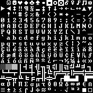
The code page 437 glyphs used to draw Cogmind art.

The limits force you to get creative when considering how to depict and connect various features. You have to think just as much about what isn’t there as what is, since the viewer’s imagination is instrumental in connecting the dots and filling in empty space. Ideally you’ll want to look at the same piece multiple times split up by periods of waiting to make sure you weren’t getting too used to looking at it a certain way--it may appear different (either worse or better) when viewed fresh.

While 255 characters is quite a lot, a smaller subset sees more use than the rest. An image can’t be a jumble of characters, since the eyes need a clear way to trace the picture by following lines or line-like characters (it’s good to remember here that a viewer will tend to imagine extensions of existing lines where convenient--always think about how “suggestive” a character is in a given position).

cogmind_weapon_concept_fail

Piece of crap from my earliest sketches. Serious WTF material…

Alphanumerics should be used sparingly or for emphasis/special purposes, as they are too recognizable as an individual unit and tend to feel somewhat detached from other glyphs.

cogmind_weapon_concept_gauss

A Gauss Cannon concept. I tend to use a lot of lines, which sometimes feels like cheating, but still retains that distinct ASCII look.


cogmind_weapon_concept_neutron_missile_launcher

Patterns and parallelism can also be useful, as seen in this Neutron Missile Launcher.

Another concept to consider at this stage is the “weight” of a given area, determined by the number of pixels that make up the glyphs used there. A concentration of dense glyphs will naturally lend more weight to that part, thus even where a glyph’s shape seems perfect for a certain use, if its thickness isn’t suitable then you may have to find another way to achieve that particular representation.

cogmind_weapon_concept_assault_cannon

The thicker lines and blocks around the barrel lend a lot more “oompf” to the Assault Cannon.

As shown above I work in grayscale for this entire step of the process, since we don’t want to be distracted by color. Color will be important, and naturally even affects the flow and weight of an existing design, but for me it’s better to readjust those later rather than working with too many variables to begin with.

At one point early on I was considering the feasibility of generating this style of ASCII art procedurally, but the flow and weight won’t look as consistent compared to manually placed glyphs.

Shading

The next step is to vary the brightness of individual glyphs as necessary to redistribute the “weight” discussed in the previous section. A piece full of lines/characters with uniform brightness can be hard to decipher. Key glyphs may be highlighted where appropriate, and both interior and exterior details are darkened so they still contribute to the overall image but don’t interfere with the “flow” of the main shape. This is also where background blocks can come into play, though for this particular style I use them only sparingly, and generally keep them dark.

cogmind_concept_power_ampifier

Pipes/wires going “behind” others are usually faded, as are those that trail off (the effect is more pronounced once color is added). This is a Power Amplifier utility, by the way.

Probably the most common shading trick I use is simple gradients, since those work well to give an image volume.

cogmind_propulsion_concept_hover

This Gravmag System looks a lot more round with the gradient around the base.

This entire step can still be done in grayscale, though may end up requiring tweaks depending on the colors used later (for example, violet gradients may need a greater step to achieve a purposefully noticeable gradient effect).

Color

As [my] ASCII art is mostly about shape, I don’t have to (or want to) use too many colors, at least not in a single piece. Small images generally use just one color, and only the largest might use three; a vast majority of the art uses two colors, one as the primary color and another often brighter or complementary color for highlighting.

cogmind_biometal_leg

An Enhanced Biometal Leg, because everyone knows biometal legs have two colors.

In keeping with the terminal interface theme, pretty much all colors are fully saturated and often also very bright. You don’t have to stare at them for long periods, and there’s only ever one showing at a time, otherwise I’d tone it down like the rest of the interface which generally hovers around 70% brightness.

cogmind_neutrino_core

A Neutrino Core. One won’t make your eyes bleed, but I stared at screens covered with hundreds of these for hours and hours while drawing them all =p

While there is not a lot of color mixing, quite a few colors are used throughout the entire collection. Colors are internally consistent where it makes sense, hence there are a several common sense themes like orange/red for anything associated with fire/plasma. That said, the art isn’t required for item identification so in a lot of cases I just use fun wild colors, sometimes in an attempt to keep better items looking “cooler.” No I will not show any cool items here. They shall remain secret until you find them in game. ;)

Time Lapse

Normally I do entire item types together as a group for each phase, meaning sketch all weapons, then color all weapons, etc., though below you can see all the processes as applied to a single item from back when I was working on initial concepts.

cogmind_hellfire_missile_launcher_timelapse

Time lapse of the process for creating the Hellfire Missile Launcher.

I wasn’t going to show any “really cool” items, but I already gave you the grayscale Neutron Missile Launcher sketch, which once colored is one of my favorites (though it’s only a mid-game weapon). So, here is a sped up time lapse of the process used to draw and paint that one:

cogmind_neutron_missile_launcher_timelapse_fast

Neutron Missile Launcher ASCII art time lapse.

cogmind_neutron_missile_launcher_timelapse_slow

Slowed so it’s easier to follow.

And the final product, colored and in game:

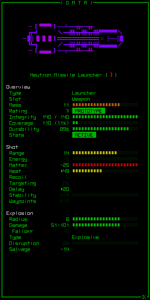
cogmind_neutron_missile_launcher_cinfo

Addendum

[Update in response to a forum question.] Anyone familiar with traditional ASCII art will know that much of it uses a lot of background colors/blocks, making it almost like low-res pixel art. On the contrary most of my art avoids background colors, which is a conscious decision on my part. I’ve found that it’s a lot easier to be more expressive in a smaller area using primarily line art and glyphs. Background colors result in far too many square corners that impact the flow of an image, and unless very dark they also tend to cause a strong weighting towards an area, limiting their use even further. A lot of my earlier concepts played with the idea of using more background colors, but I stopped adding them almost entirely later on. The majority of final art pieces that do contain them are larger and thus more easily “contain” a full square of color. Sometimes I’ve also used them to accent the second half of a half-block foreground glyph.

REXPaint

All of this was done using a tool I developed specifically for this purpose, one freely available for use in your own projects: Check it out. Of course the methods described above are for a very specific style I’ve developed, when there’s really a lot more you can do with REXPaint and ASCII art. Stop by the REXPaint gallery to see examples of styles by other artists. Also see this post for a guide covering REXPaint’s many potential uses in roguelike development (mockups, art, prefabs, etc.).

Posted in Art | Tagged , , , | 6 Responses

ASCII Art

Traditional roguelike aesthetics are all about abstraction. Object representations are distilled to a simple symbolic form, thus it’s no surprise that roguelikes sometimes come paired with ASCII art. Of course this is also often due to practical limitations--the engine/system itself may only be capable of displaying characters--but it’s also stylistically appropriate for art to use the same medium as the rest of the game in a similarly abstract way.

Here “art” refers to still works composed of multiple characters arranged to depict a larger subject. The overall aesthetic of a roguelike can definitely be said to have artistic value (heck, even Dwarf Fortress can make it into the Museum of Modern Art!), but ASCII art is a step in a slightly different direction.

Unlike letters, numbers, and punctuation that rely purely on player imagination to flesh out that goblin, dragon, or cannon-laden death robot, ASCII art gives the viewer’s imagination a starting point. ASCII isn’t generally used to draw fully “abstract” art; it’s more suggestive than that, while still lacking enough accurate details that there is plenty of room for a wild imagination to interpret and/or expand on the image. In terms of detail, ASCII art sits firmly at the bottom of a list topped by 3D/textures, 2D/pixel art, and more styles in between.

ASCII art itself can also range from more to less abstract, mostly dependent on the number of characters used.

nolithius_guild_portraits

An example of highly abstract art used for character portraits in Nolithius’ 2012 7DRL “The Adventurer’s Guild,” which you can play online here.


ondras_goldfish_inventory

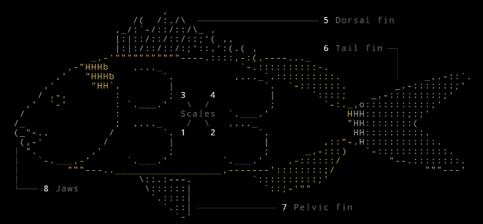
Not exactly detailed, but much less abstract due to its larger dimensions, an example from the inventory screen of Goldfish, a 2014 7DRL you can play online here.

For a collection of many more examples, check out this thread on TIGForums. There you’ll find plenty of roguelike mockups, many of which include ASCII art. Very inspiring stuff!

Art in Cogmind

While Cogmind’s animated GUI and particle effects can definitely be classified as (and are intended to be) art, procedural content aside I’ve decided to also add ASCII art to Cogmind. For now only items (components/parts) will be drawn, “only” being a very relative term here because there are 600 of them! Good news is I’ve already drawn them all and imported them into the game, so that’s another task out of the way…

The process began several months ago when I started drawing ASCII concepts for weapons to see whether it would be worth including them in the game. Initial concepts were well-received, so I expanded on them to make sure the necessary variety was possible within the restrictions of ASCII and the available dimensions in the item info window. Finally I sketched out other item types to make sure I could handle those as well.

At first I wasn’t sure if I could produce enough art within a reasonable time frame, but after months of occasional practice a consistent style appeared as I familiarized myself with the available glyphs and found uses for each. That and I got much faster at producing interesting designs.

Cogmind art sits between the two extremes described earlier: It’s a little abstract but there’s enough room to contain some more suggestive details.

cogmind_quantum_rifle

One of the earlier concepts that survived all the way to make it into the game: the Quantum Rifle.

Cogmind art uses a traditional code page 437 font, meaning 255 characters including your normal alphanumerics and punctuation along with extended ASCII. No glyphs have been altered (though the font is slightly wider than the IBM font to suit a square cell aspect ratio). Art is always more interesting when working with a set of stringent limitations!

The font is available at each resolution the game supports, thus art drawn with it can be scaled without any stretching/shrinking.

cogmind_ascii_art_scaling

A Neutron Cannon. The art is drawn using the default 12×12 glyphs (middle), but can be viewed in other dimensions as well and retains much of the same look.

Why

While not necessary, adding ASCII art provides Cogmind with another unique visual aspect and, more importantly, gives observers a little something concrete to latch onto. I love it just for what it is, neat-looking ASCII art, but from a more practical standpoint it’s a useful marketing tool for a game that honestly doesn’t have the most appealing screenshots. Cogmind is at its best when it’s in motion (the disparity is more apparent than with other games), and screenshots aren’t a very effective way to capture the feeling of playing the game. ASCII art is a quick and easy attention grabber that is likely to attract the same kind of audience that would be interested in this type of game. Or so I hope ;)

The next post will look at the process behind creating the ASCII art you see in Cogmind.

Posted in Art | Tagged , , , , | 4 Responses