Last time was all about exploring a high-level direction for Cogmind’s shift towards supporting an increased size for interface fonts and tiles by reducing the amount of space available to display information, beginning especially with the map view. Now it’s time to make concrete plans to determine what we can actually fit into a 45-row terminal. Concrete interface plans means… mockups! Lots and lots of mockups.
During my earlier Year 10 of the Cogmind post I shared a collage of the initial set of mockups put together in late November, so today we’ll be referencing a bunch of those individually to examine what needs to happen in order to construct this new UI layout.
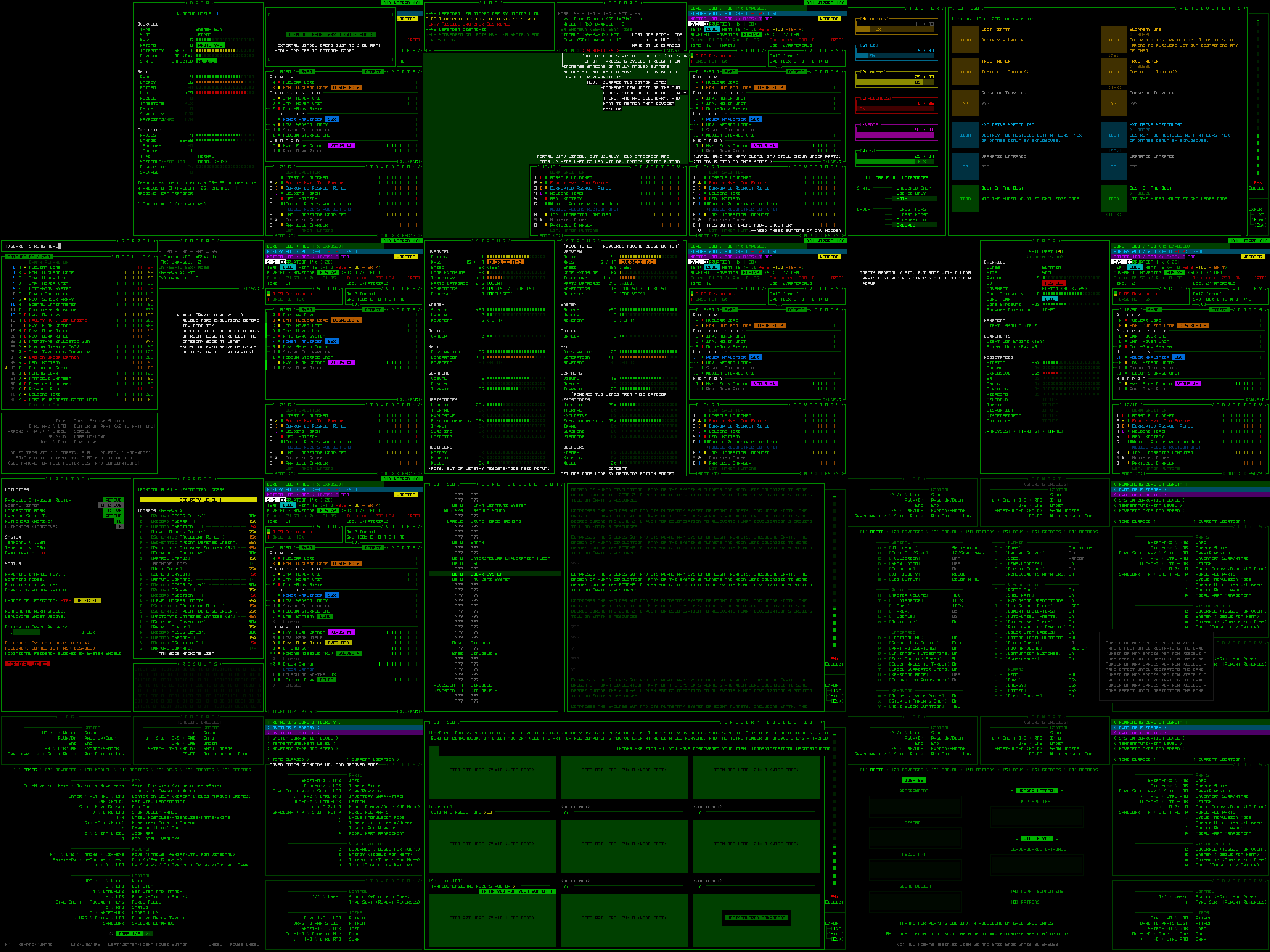
Mockups put together in REXPaint during a dev stream in preparation for Cogmind’s new UI layout (open for full size).
We’re now working under the assumption that almost everyone is using a widescreen aspect ratio display. Over a decade ago I didn’t go that far, instead supporting 4:3 by default and allowing for dynamic windows to fill any remaining width. The change doesn’t mean 4:3 players won’t be able to play, of course, there would simply be some letterboxing on the top and bottom (there aren’t yet any plans to make the full game height dynamic, although it wouldn’t be impossible to make it so at some point, just as width is dynamic now).
Before we continue, know that all mockups are designed in size 12, and all of them can be opened to their full size for closer inspection if desired. Also their content may sometimes include items and hint at mechanics that don’t actually exist--we’re just doing layouts, those details aren’t important ;)
It’s mockup time!
Main UI
Cogmind’s main UI is where the player spends the vast majority of their time, and the original goal of its design was to ensure that it provides immediate visual access to anything an experienced player needs without opening any other windows. Dropping from a 60-row to 45-row terminal is going to force us to bend that requirement, so it’s just a question of what to remove.
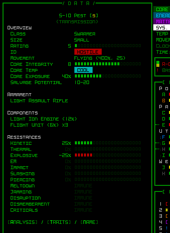
If you recall from Part 1 I showed a diagram highlighting the absolutely essential parts of the main UI, and the stored inventory is the only subsection of the right-side HUD that is not included in that highlighted area.
Modal Inventory
While a visible inventory can be quite helpful, it’s not what I’d consider absolutely necessary.
Now I wouldn’t have said that many years ago in early Cogmind development, but in the years since then we’ve gotten a lot of inventory-related QoL features that reduce reliance on the inventory window in the first place, for example the slot-specific type-wise swapping menu, or part auto-replacement which makes some common inventory management possible without even looking at the inventory at all, much less directly interact with it.
Slotwise part swapping, which doesn’t require any direct interaction with the inventory. (This old demo recording also includes some usage the inventory-first version of that feature, which isn’t relevant here, and I’m not even sure if anyone even uses it…) Keyboard input has the same access, though it’s harder to follow a recording of that so I’m sharing the mouse version.
Altogether this suggests that our number one target for info reduction is to turn the inventory into some sort of modal window as found in pretty much every other roguelike.
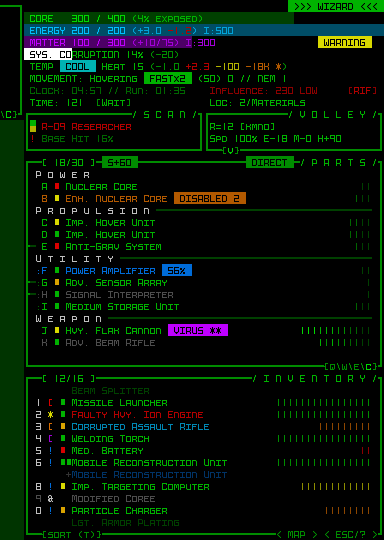
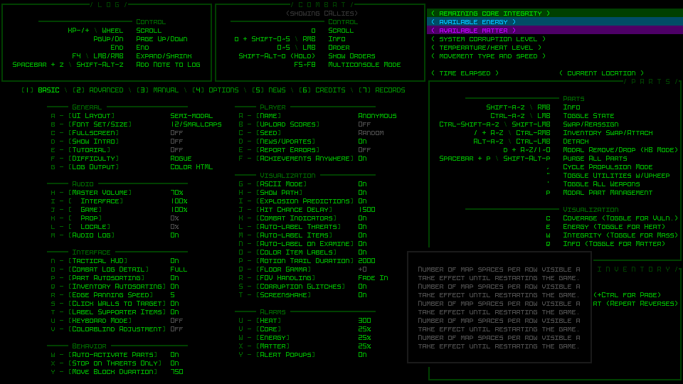
A basic 45-row main UI mockup without the inventory window.
It just so happens that the inventory alone saves us 14 lines of height, which is a mere 1 line below what we need :D
The other recovered line comes from removing a previously empty line from the top area, as marked by my notes on the mockup. With the data in that area becoming even denser, the order of the two bottom lines is swapped and the less important optional ones (if visible at all) are darkened to regain some of the desired visual separation.
The inventory is accessible via a button at the bottom of the parts list (and if it works out, simply moving the cursor over that button will also show the inventory and allow interaction that way, no click required).
The inventory window in its original form would simply pop up next to its original position, adjacent to the button. The button itself can hold the inventory capacity information normally displayed at the top of the inventory.
Pure keyboard players would be able to toggle the inventory window with the ‘i’ key, newly relieved of its functionality as described during the map zoom polishing stage. It will also likely automatically appear/disappear when using related “modal part commands” (the ‘p’ menu).
Aside: I’m currently writing about some of these new UI layout interactions in hypothetical terms, since these are plans rather than actually implemented at this stage, so there may be unforeseen roadblocks or alternatives necessary with respect to specific functionality depending on how everything works out in practice.
Another concept for supporting this new modal inventory is an indicator that pops up in the bottom-right corner of the map showing the name of the item and pointing to the inventory button any time an action adds an item to the inventory (such as picking one up) when it is hidden. These indicators could stack if there’s more than one in a short period, and disappear after a duration. Optional and adjustable, of course.
Dynamic Parts Window
Now it may be that experienced players well-versed in Cogmind’s inventory-related QoL features and familiar with parts, mechanics, and strategies won’t have much trouble managing a modal inventory if necessary. It does, however, interfere a bit with the natural flow of Cogmind’s highly accessible drag-drop interface, a fact which combined with hiding the inventory’s existence by default is not as great for new players.
Does the inventory have to always be hidden? The answer is a resounding NO! Also yay!
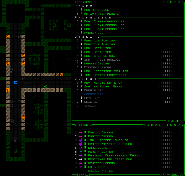
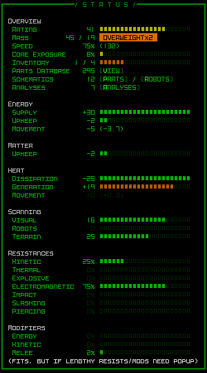
While Cogmind can eventually acquire up to 26 item slots to fill, that number starts at only 7, meaning we have 19 lines which start out unused. Recall that the inventory requires 14 lines, and you can see where this is going…
The normal inventory window displayed below a shorter parts list that doesn’t yet make use of its full height.
For however long the parts list is capable of appearing in a shorter format and still show everything it needs to (vital, after all), the inventory can just be visible as normal! On starting a new run, with the inventory visible there are still 5 lines of extra space for slots going forward, meaning the inventory does not need to enter a modal state until Cogmind’s third evolution, or entering -7/Factory.
Technically we could also have the parts list shrink again and unhide the inventory if your total slot count is once again reduced below the threshold, for example due to host switching in Polymind, or for, uh, other reasons some of you know ;)
While thinking about all the ways to save space, I also came up with an even more extreme version of this “dynamic parts list,” one that would be optional and definitely off by default. It also wouldn’t even be implemented right away as part of the first iteration, but since we’re talking about mockups we might as well look at it--mockups are practically free :P
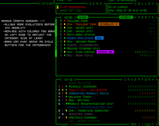
A header-free concept for the dynamic parts list.
Removing the headers and corresponding separators between slot types from the parts list gives us back another 4 lines, equivalent to 2 more evolutions, meaning under this layout style the inventory would not become modal until entering -5/Factory, or half way to the surface.
It’s harder to parse at a glance, but does save space and the essentials are still there, with categories instead reflected with light or dark bars along the side, and I guess they’d need to double as cycle buttons for mouse users who use those (as they normally appear along the separator line).
And with that our main UI is essentially taken care of! The changes I’ve described so far in support of a 45-row interface are enough to keep our main UI highly playable, which was what I was mostly worried about to begin with, being the main UI and all. I was pretty pleased with the [hypothetical] results this should produce, and it’s the main UI so that means we’re mostly done, yeah?! Well, no it turns out there are actually quite a few other things that need to be modified as well xD
Info Windows
There is a range of secondary info windows we’ll need to take a look at, some of which have always been especially crowded, so they could present some new challenges. This category includes item/robot/machine/status info and the machine hacking windows.
What really links all these as part of the same group is that they share the same dimensions and open in the same area: over the map. Based on the original assumption of a minimum 50×50 map view, they were all thus designed for a height of 50 rows. Now what happens when not only the map view is no longer large enough to contain them, but even assuming we no longer limit them to that area, the 45-row interface as a whole isn’t even big enough xD
The most worrisome of the group is item info. In many cases it’s fine with space to spare, but a portion of items have always pushed up against the height limit. Scrolling for stats is something I never want to require on principle, so we have to make do with what space we have.
Potentially helpful here is a feature I already conceived and implemented months prior to even considering a new UI layout: The possibility of a button to open additional mechanical details unique to an item. Item and effect descriptions normally hold this info, especially relevant to utilities, but there were always a handful of weapons (which mostly fill their window with stats) that also have abilities and there isn’t much room to explain those.
More!
This will be especially useful going forward as we get more and more unique items. But for our new layout it’s not enough! Nor is it even suitable since this is only for exception parts rather than the norm. Regardless of this functionality, what used to require up to 50 lines now only has 45. In the end the answer is pretty obvious:
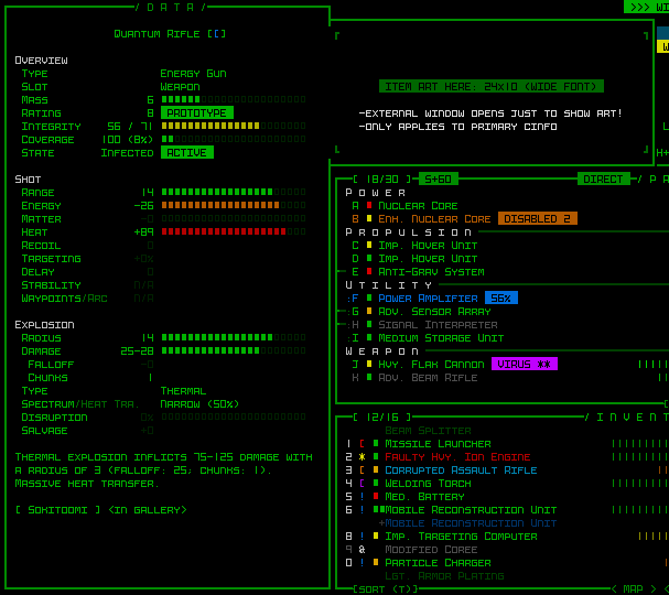
Item info mockup, with art displayed off to the side.
Item art occupies a height of 10 in the item info window, so let’s just move that aside and there’s plenty of space.
Examining the other mockups in this category…
Robot info generally fits, although there are probably one or two cases of robots that have a ridiculously long list of parts and resistances that could cause it to extend outside the window bounds. I’ll just wait and see where this is an issue.
Status info can sometimes exceed 45 lines, but I’ll be alleviating some of the pressure by removing two lines of low importance, and we may need a pop up to display the full list of damage resistances or modifiers? This is another case where I’m just waiting to see it in action and will decide what to do then.
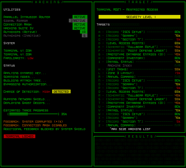
The hacking interface is essentially okay as is. With a completely full direct target list (not all that common) it still fits, even if the resulting output area to the bottom ends up on the small size. At most this window might have to cut short the list of relevant hacking utilities shown (if someone has an absolutely insane number of them in possession), which are there mainly as fluff anyway.
Escape Menu
The multipage Escape menu, or game menu, is a bit problematic.
It was designed around a 50-row map view, allowing us to display individual page info over the map while also displaying all the commands directly in their relevant main UI windows. I wouldn’t want to redesign it all to change this behavior, and not only because that would be a lot of work, but it was done this way because I very much like the immersive feel provided by that level of integration with the main UI. So we’ll have to find alternative solutions for whatever problems arise… and they’ll definitely arise considering the available space was reduced from 50 rows to 35, a 30% loss xD
The game menu and basic commands page (1) is fine, since that’s kept simple to avoid overwhelming new players with more than they need to know right away.
On the other hand, there’s no way the advanced commands (2) would ever fit. They fully-utilize the map view space, and I had to keep some of the more esoteric ones off the list in the first place, relegating them to the full in-manual list since there simply wasn’t enough room, meaning what is shown with 50 lines is already a somewhat slimmed down version. I tried to see if a two-column approach would be possible in order to fit the minimum required set, but the width is insufficient.
The answer is, finally, subpages. Advanced commands in the map area will just have to be given another page accessed by Left/Right or buttons at the bottom.
The first page of advanced commands when divided into multiple pages.
Seen above, with our dynamic parts list height the loss of rows also affects the space available to show its commands, but a number of those were either not really used or already covered in the basic commands, so I slimmed that one down just enough to fit.
In-game manual access (3) is pretty dynamic already since it’s just a list of topics and blocks of text, so no issues there.
The options menu (4) is already divided into to columns, both of which mercifully fit into even a 35-row area (well, 33 because we need the menu bar as well). We can attribute this favorable result to the fact that unlike the command list it’s an interactive window, and keyboard players need access, too, so we have lowercase options on the left and uppercase on the right (26 each, plus some lines for headers and category spacing).
What doesn’t fit due to the resize is the option descriptions, which normally display in an area below the options list when hovering the cursor over one. That can be simply be moved to another temporary popup window and we’re done with this page.
The options menu in a new layout, with dummy text showing to the side.
The news page (5) is quite simple. No worries there.
Credits (6) doesn’t have a ton of info on it, but definitely gets more squeezed than I prefer, removing a lot of the extra spacing that was available before. In the interest of finishing Cogmind some time this century, I’ll accept it ;)
The Records (7) page itself is just a menu to access more windows so no problem there, but the windows it opens are problematic. Lore Collection, Gallery Collection, and Achievements were all built to the same specification, 55 rows, so we’re going to need to hack away at least 10 of those from each…
For comparison here is the original Achievements mockup used to build the one currently in Cogmind, designed for a 160×60 terminal:
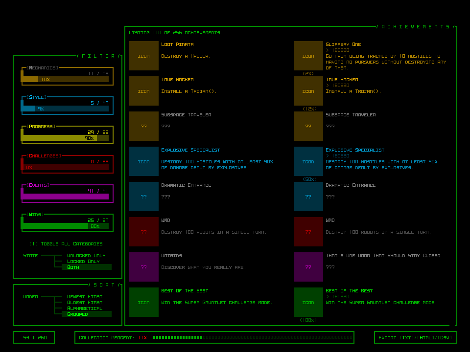
Cogmind’s current achievements UI (mockup). You can read all about how it was put together here.
To squeeze everything into 45 rows we need to reduce the number of achievements shown at once, merge and align the menus on the left, and, most importantly, find another way to display the secondary windows below the main one. This latter part is especially important, because all three of our interactive records interfaces use that same format, so whatever happens here needs to work for all of them.
It turns out there’s just enough width to move those things off to the right side, and then the new height comes out to be almost exactly what we need.
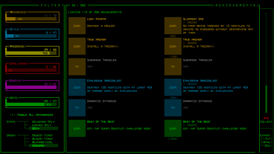
The new Achievements UI compatible with a 45-row layout (the page-wise object counter originally in the bottom left now appears along the top-left border of the main window, which is probably a better place for it anyway, even if it draws less attention there).
I prefer the original layout--spacier, better delineation of areas, but it’s gotta fit within our new restrictions, and thankfully it does without any more hacking.
Lore Collection is the easiest of the three, since like the manual it’s composed of just a topic list and corresponding text blocks. This means we can reduce the height without any real consequences in terms of functionality, and it’s fairly easy to do.
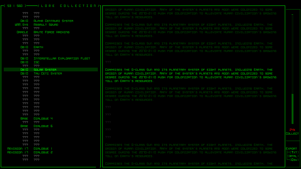
The Lore Collection UI shown instead with the new sidebar elements.
The Gallery Collection gets a bit cramped, removing almost all the extra spacing that was available in its original iteration, and also losing the extra lines devoted to providing extra information for those alpha supporters and others who have their name associated with a particular item (the original purpose of the gallery). I’ll have to figure out a new way to provide that info.
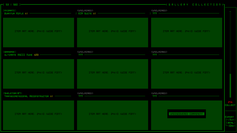
A much more cramped Gallery Collection UI (green blocks used to delineate element area for formatting purposes, not representative of what it’s supposed to look like).
It’s cramped, but it still works. Unlike with Achievements I didn’t want to further reduce the number of object visible at once, since it’s already just nine…
World Map
The world map UI was also built to fit within the map view area, requiring a minimum of 50 rows. We can easily give it the full vertical space, so 45 lines, but that still isn’t enough for its current layout.
It just so happens I wanted to redesign it anyway, since as linked there the original focus was on animating the complete route, which may have not been too bad many years ago, but Cogmind’s world has expanded greatly and routes can get quite long now (which means it takes a while to fully trace). Furthermore, the architecture is such that it actually has to animate the whole thing in order to draw it at all, and it can only be sped up so much, so yeah, something needs to be done here.
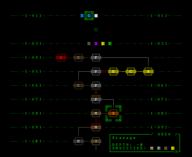
A new 41-row mockup for the world map.
It turns out that the original style still works fine, and I rather like it because it provides a very condensed format for reflecting all types of movements, transitions, and maps. Simply by removing the one extra line of padding between each depth we end up with a 41-row interface, which will fit! Like some of the other changes before, it’s a bit cramped but works fine.
I will still have to rebuild it to enable snappy opening, but at least the design is familiar and effective.
A Huge Problem
It was only after drawing all the mockups and taking a ton of notes that I was going through to make sure I hadn’t missed anything when I realized there is a huge problem: the intro/ending animations. Especially the latter. There are a lot of them, they’re pretty involved, and all were designed specifically for a terminal of 60 rows. Wider is fine, but they can’t be adjusted for something shorter. Oh no.
For that I came up with a crazy solution that I’ll be covering next time, in yet another engine-related detour…
This is the second in a multi-part series about building Cogmind’s fully upscaled semi-modal interface layout:
 RSS (posts)
 Mastodon
 Patreon
 Discord
 /r/Cogmind
 Indie DB
2 Comments
Each modal window brings Cogmind closer to NetHack… and I’m all for it! Even the (i)nventory key is similar to NetHack, soon I could play both games exactly the same way >:)
Noooo that’s not the aim!!! :P
I did always want to avoid modal windows, and it should still be optional, but I am really glad that this only really has an impact past a certain point in the game, and that the ‘i’ key could be recovered because it’s the best ;)
(also sorry for the late reply--my freaking WP install hasn’t been emailing me notifications :/)