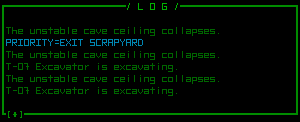
Arguably the most vital part of a traditional roguelike’s interface, a message log gives the player all those details that might otherwise be depicted by (or lost in the confusion of) greater graphical detail. It’s also a nice after-the-fact record of why you find yourself flirting with the brink of death when things suddenly start to go south.
Message logs also present another dilemma unique to games attempting to “modernize” the roguelike tradition (for the first dilemma discussed earlier, see here).
Any game interface needs a primary area where the player is intended to focus the majority of their attention--all other areas are supplementary, otherwise it’s tiring and difficult for the average player to constantly divide equal attention among multiple UI elements. This is especially important in games that are (or can be) played quickly, including both real-time games and roguelikes, lest the player miss important information (a leading cause of sudden death among RL players! ;).
While in most map-based games the map area is the focus of attention and any HUD information is secondary, one could argue that in traditional roguelikes maps are solely a way to tell the player what is where, something you need only glance at as a reference to understand the more important information contained in the message log: details of all the events that have transpired since the last turn. (Parts of the game where you’re just moving around and nothing special is happening are irrelevant here since they’re just filler, anyway.)
Compared to traditional roguelikes, Cogmind is slightly less reliant on the message log to convey important information, as combat animations are a big step towards transferring more attention to the map in event-heavy areas. Maintaining the right “balance of attention” is difficult, though, and there may not be enough reinforcement of certain combat results as is. More visual effects will be added to the map as necessary when development heads in that direction.
The Log
For now the message log is mostly for combat messages of the highest importance (like part/robot destruction), notices about changes in Cogmind’s status (many of these are now accompanied by visual effects so the log or HUD data are not the only places to learn about them), and updates about what nearby neutral/unarmed units are doing.
The ultimate goal is to make the log a secondary source of information while the player focuses attention on the map. This is part of the reason why the log is so tiny, showing only six lines at a time!

Calling this “short” is only comparing it to your everyday multi-line log, because honestly games that reserve a single line for their message logs are ridiculously annoying.
More Log
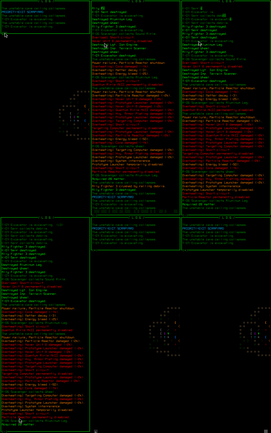
If there are a lot of interesting events going on, or you think six lines is too few, or you just really like message logs, there is a new feature called the “extended log” available as a new mode for the multi-functional console first discussed along with the ally orders interface (so now this particular part of the interface has three options for what it shows). When the extended log is visible it shows the next six lines “older than” (above) those currently shown in the log:
The normal and extended logs scroll in tandem, so you essentially double the amount of information (12 lines) visible at any given time.
To see even more log messages, the normal log itself is now also expandable to the full height of the window, giving you at least 56 lines of log-viewing pleasure. Animated, of course:
A full-screen log would be more jarring to switch to (not to mention unnecessary since lines are generally short, anyway), so the log simply expands vertically in place. While expanded it’s even easier to scroll back (via page up) to very old messages for references.
*Disclaimer: The messages seen in these screenshots are not representative of an actual game, just me fooling around in the debug playground to fill the log for demonstration.


12 Comments
How about further color coding the log or finding another way to emphasis certain words along with the existing color coding? The thing is, sometimes the player doesn’t want to spend time reading the log for too long if he wants to pay close attention to the non-obvious actions going on. They tend to look for keywords so they don’t have to read the whole thing which means that highlighting important keywords (npcs, objects, verbs) with color would make things a lot easier.
*How about color coding individual words-
As part of the simplified log scheme, messages are all *very* short, like 4-5 words, so I think highlighting individual words wouldn’t necessarily improve their usefulness like it can in games that have longer messages (most). Messages are also a lot less frequent than in other games
The sample log I’ve shown is a poor example because it’s displaying a lot of red messages, making it appear a bit more uniform than what you’d see in actual play. (To fill the log I was repeatedly firing a ridiculously hot missile launcher in a mostly empty room ;)) The only big blocks like that you may see would be less important messages shown in darker colors, with a minority being brighter important messages.
The final color scheme is not yet complete since new messages are still being added, so I haven’t bothered tweaking any colors. The color used for each type of message is controlled from an external text file, so modified schemes are possible as well.
I think such short messages split up into multiple colors wouldn’t fit the game’s generally uniform aesthetic, either. In any case, the way messages are currently handled internally makes coloring individual words impossible. That would require a better log system. It’s certainly possible, but not something I think we’ll need. This is the kind of feature that, later, if a bunch of players start to request it once the game is more complete I’d be happy to go back and add it in.
I agree that messages need to be quick to parse, but that can also be achieved by the way they’re written--always putting the most important word (usually the subject) first, for one.
What about adding the ascii character that the npc in the message uses beside its actual name so it’s easier to distinguish which is happening to which?
That could be a good idea, though notice that under the current naming scheme all robots are already prefixed by their serial number, which indicates their class, which is the same letter used to show them on the map. The only difference is that letters in the serial number are always shown in upper case. (Ex. from first image: “T-07 Excavator” is a Tunneler class robot, represented on the map by a ‘t’. Later you see “R-06 Scavenger”, which is a Recycler class robot shown as an ‘r’.)
The only information you’re missing is the color, which again can’t be added without changing the way the message log stores and draws data. I could add something later as an option if there’s enough requests, maybe a vertical bar parallel to the lines that shows the exact map symbol (properly colored) of the robot mentioned in each line. I think time (and some actual gameplay) will help tell what needs to be done. In the prototype I found I rarely spent much time looking at the log at all, and was able to play quite quickly. Check out the only Cogmind video I ever made, back when the prototype came out.
Wow, that message chime that happens for each and every letter of the log gets annoying after the first 30 seconds. I only notice it now because I was a bit slow when playing the prototype.
Just a small suggestion that’s probably less important than the other ones I made regarding the same topic. Dwarf Fortress allows you to select the messages in the log to bring you to the location of the event. Maybe you could make it so that clicking the event message would cause the location of occurrence to sort of “ping” with a highlight.
You’re right, and it’s been mentioned before so you’re not the only one. So far the first step I’ve taken towards a solution is to replace it with slightly softer and less annoying blips (all the sounds have been redone, actually, and many more added so far). I’ll test it out once the game is more playable and if that’s not enough there will be other options, like muting it (right now you can already mute all UI feedback sounds, though that would be a bit excessive since they’re helpful).
I like the suggestion, and it’s also fairly easy to implement. The only question I have is would you expect it to always know the *current* location of the associated object? Or is it instead a more “historical” record that indicates where the actual event occurred on the map?
There are 2 ways you can go about doing this: bring the camera (or just make a little blip on screen) of the location of where it happened regardless of where the cause of the event is currently or bring it to the entity’s location regardless if it’s moved from the location of the event. If you’re doing the second and the entity is somehow gone, force the first or bring the camera to the location where it was last seen. I have no idea which should be used.
Ah, I was just curious what your preference/expectations might be since you made the suggestion ;p
Just added this feature to the to-do list. It will ping the current location of the actor/object referenced in the message, or show an alternate interface message if the target no longer exists and/or is not in view.
Request: please, please make the (highlighting) colours customizable. I am red-green colourblind, and the red-on-black is a very difficult contrast to read for me that I suspect would physically tire me quite quickly if I were playing the game.
Perhaps some simple brightness/contrast/gamma settings, if you want to keep the colour scheme consistent.
A couple times throughout development I’ve been thinking about colorblind players, since I know there’s a lot out there. All log colors are modifiable through a simple text file where you just type the color name you want for each kind of message. I’m sure even more than just colorblind players will appreciate features like that.
Pretty much the entire interface is colored via text files, though any parts other than message colors would be a little more difficult for the average player to tweak. We’ll see how the game looks for you later, and see what we can do about it.
The general color scheme as it exists now is already about as high-contrast as it gets since most colors are already fully saturated, so I’m not sure what other general full screen options would be helpful. Maybe a brightness setting if that will be useful (though it would wash a lot of the colors out, if it looks *better* for some people then great).
By “highlighting” colors what are you referring to specifically? The map “ping” color Someone64 and I were discussing? Or the map dynamics discussed in the more recent post? I’ll gladly make sure anything important is not too difficult to customize.