Normally when I publish a new article, the focus is on explaining the results of some new feature/mechanic/design. Today’s post is a little different because it’s about an important feature that has not yet been implemented, nor have I come to a decision on how best to handle it.
I’m using this post as a way to lay out all the facts and considerations before making a decision, while at the same time giving anyone else who’d like to provide input an opportunity to do so.
So what precipitated this post?
For some players the Cogmind UI is too dense given the size of their screen. I prefer playing in a small 720p window myself, but when making a game for wider consumption it should be as accessible as possible for as many different types of players as possible, and some players find that their setup results in objects/words that are too small to parse/read clearly--they “just want bigger fonts.”
Unfortunately it’s not as simple as that.
Cogmind already comes with many fonts, including very large ones, but there is an upper limit to what can be used in combination with a given screen simply because the current UI requires a minimum of 60 rows to display all its information.
Note that I used the term “screen” here, and not “resolution.” The latter is not an issue, since Cogmind’s font system will allow it to scale up to any resolution with pixel-perfect crispness (right now I’ve only included full-size font support up to 2160p/4K, but more can easily be added on request).
Thus the question we’re addressing here is one of physical screen size--regardless of resolution or pixel density, displaying 60 rows of information means dividing that physical screen height by 60. The only approach, aside from recommending play on a desktop or large-screened laptop, is to offer a different UI layout that reduces the amount of information available at any given time, and apply this across the entirety of the interface. Oh my.
History behind Cogmind’s UI
How did we get here in the first place? The current UI’s history goes back surprisingly far, to even before Cogmind’s conception…
In 2011, I began working on X@COM, a tactical squad game based on the original UFO Defense. Naturally one of the first things that needs to be decided with a game represented via an emulated terminal is the dimensions of the grid. I had spent many years developing games in real terminals before that point, so it felt natural to go with the standard terminal width of 80 characters. As for height, the largest UFO Defense maps play out in a 60×60 grid, so it looked pretty perfect to fit that into the standard width and leave a 20×60 area for the UI sidebar.
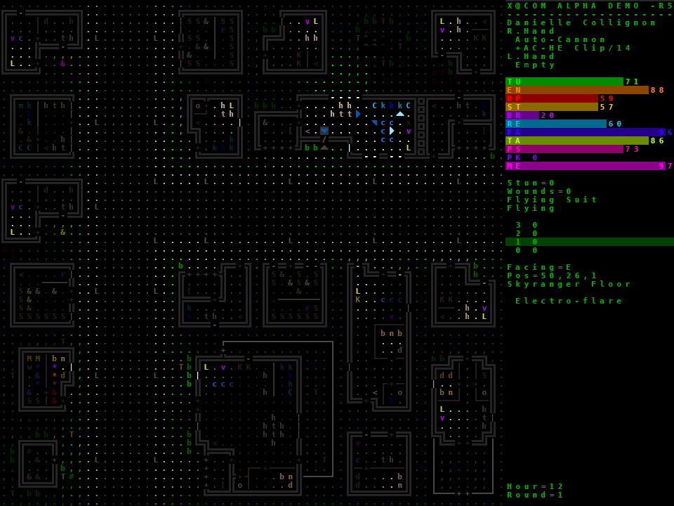
A shot of the early X@COM UI (it was later changed, and there are other windows). (Click for full size.)
The following year I decided to participate in 7DRLC2012, and I certainly wasn’t going to start from scratch, so I basically gutted the X@COM source to use as a foundation in creating Cogmind 7DRL. The latter ended up being designed around an 80×60 terminal, purely because that’s what X@COM was using at the time.
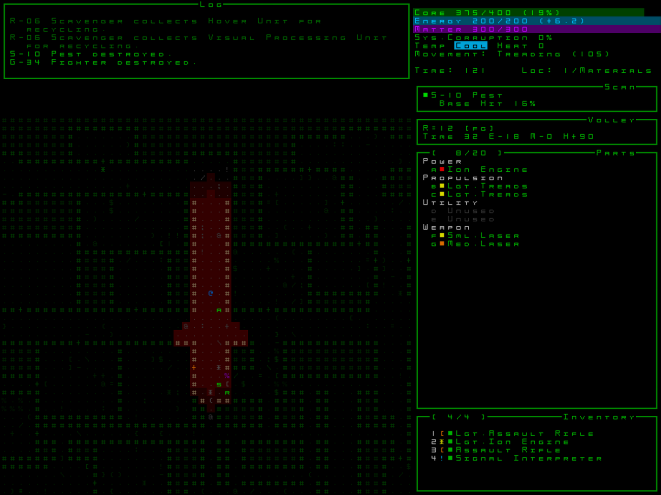
Cogmind 7DRL from 2012, which has multiple font options as well. Coming from X@COM I did reduce the map view to 50×50, since maps are much larger than that, anyway, and we needed the space for a log plus more info in the sidebar. (Click for full size.)
So if you weren’t already aware, now you know that Cogmind originated as a game jam game that itself splintered off a UFO Defense fan game. The early decisions definitely had an influence on how the game developed, because at no point in all this did I start over from scratch.
When I decided to pick up Cogmind again in 2013 to turn it into a full game, I made a short-lived attempt to start over before deciding it was a waste to throw away all that prior work (this was discussed on the blog a couple years ago).
In terms of UI layout, for Cogmind the 60-row minimum was just enough to fit all the information I wanted to include in the 7DRL, and font size was also less of an issue then because all characters were square, and therefore could use twice as much horizontal space as in the new version, making them easier to read even when small.
I was really excited to transition from the 7DRL to the modern version capable of narrow fonts, effectively giving me a 160×60 terminal where non-map text is concerned, because it meant I could fit in all the extra information I needed to make the UI as useful as possible with little window switching. (I hate square fonts, anyway, so I was happy to see them go.)
And there you have it, the origin of Cogmind’s default 4:3 aspect ratio, which is somewhat out of place in today’s world of HD resolutions. Of course I’ve made the UI dynamically expandable, allowing the logs to fill as much space as possible, though this can often result in a lot of black space up top since log messages were meant to be short and the contents of those windows were designed to fit well within their narrower default width. (See the end of this post for diagrams/explanation regarding UI expansion.)
Thus we finally come to the current version:
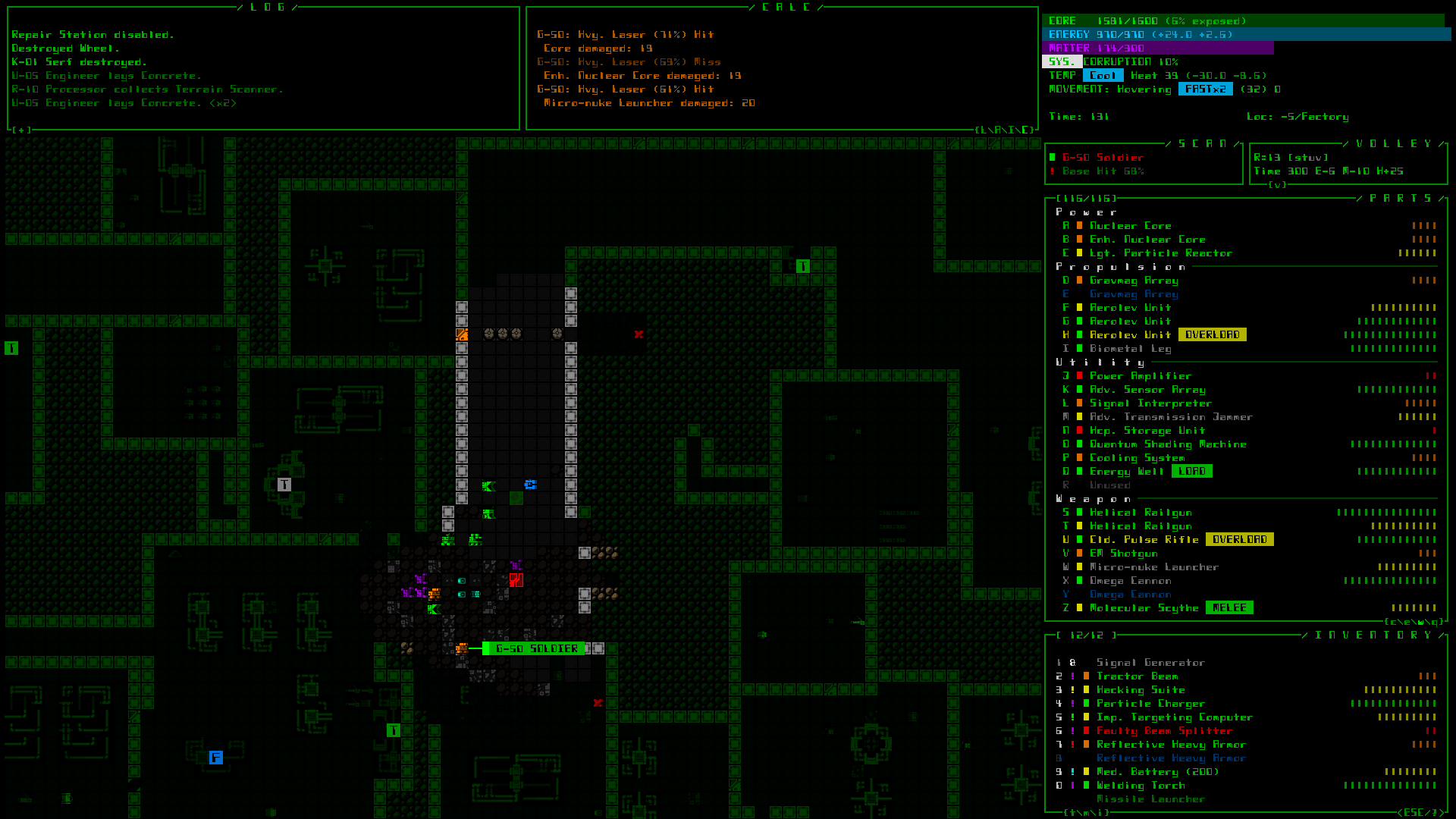
Cogmind’s current primary UI, as it appears in the most commonly used resolution, 1920×1080 (click for full size). Currently the second most commonly used resolution is 1366×768.
I’ve also put together a new reference page where you can preview what Cogmind looks like at different resolutions using different fonts, especially useful for those prospective players who aren’t sure whether Cogmind’s UI will be too dense for their particular screen of choice.
Why an Alternative?
Now that we have our background and recognize the current state of affairs, the first important question to look at is why it’s even necessary to explore an alternative. There are two main parts to this…
The first is a question of marketability.
These days, Let’s Plays on YouTube and Twitch make up one of the most vital marketing channels for indie games. (It’s a fairly obvious trend; see this report for one summary with data to back it up.) If a game isn’t easy to stream/record, or doesn’t look so good in that environment, it’s less likely to be picked up by as many channels. A UI crammed with fine details doesn’t hold up against compression very well, and won’t always look great unless viewers are willing and able to watch in a large window at high quality. When I stream, I somewhat cheat on this by using my 1200p screen to stream at 1080p, letting the lower 120 pixels be cut off since that area’s not too important for viewers, anyway (and therefore I can stream using a larger font).
So a very dense UI is non-ideal for recording or streaming, and while Cogmind has already received fairly good video coverage since launch (from smaller channels!), reception and exposure would no doubt increase with an option to enlarge the UI elements.
Interestingly, I did recently encounter an unexpected marketing-related benefit from Cogmind’s UI density when it appeared in a 2015 GotY list alongside other games like Undertale, Helldivers, and Everybody’s Gone to the Rapture, where the editors couldn’t do the game justice with a smaller image like they could with the other games, so they just gave Cogmind a much bigger image :P.
The second, more important question is one of individual accessibility.
As mentioned before there are plenty of players on laptops rather than desktops (the second most frequently used resolution is 1366×768, a common netbook resolution) as well as older players and others with poor eyesight that need to be considered.
And again, it’s not so much a question of resolution, but the fact that physical screen sizes are shrinking compared to years past (even compared to when Cogmind was first developed).
I’ve been contacted about this literally dozens of times since Alpha 1 released. The number is only a small portion of players overall, though there is a common rule that for every person who makes a statement, unless it’s something completely off the wall then you can expect there are X more thinking the same thing who just didn’t speak up about it. That and alpha players are more forgiving. Add these X’s up and it’s no longer such a tiny portion of players.
My first response was to release alternative fonts, which was enough to satisfy some of these players. However, that only works for those for whom the default text was perhaps just a tad too small or, more accurately, was not as readable due to the stylization in combination with its small size on some screens.
We need to examine the feasibility of a more heavy-handed approach.
Roadblocks & Solutions
If only the solution were easy! But no, there are some major roadblocks in the way here.
Anyone who’s followed the blog for a while, or played Cogmind before, will know that a lot of attention has been given to the UI design, and it’s unfortunate that the ideal solution here--reduce the amount of information available at any given time, would undermine years of careful thought and effort.
Showing less information at once breaks one of the fundamental rules in the design, that as much vital information and interactive elements as possible be accessible at once, without additional windows or scrolling. The UI has been quite successful* at this, though it ends up requiring a large grid to achieve it, leading to the topic of this post. (*One notable exception is the meta strategy some alpha players are using with large inventories, which require excessive scrolling and will likely prompt me to add a new inventory management mode to alleviate that down the road and fall in line with the usability of the rest of the UI.)
So at the root of the problem, having started out with 80×60 terminal means that each UI element’s size, relative location, contents, interactions, everything even including game mechanics have been influenced by that decision. It’s a delicate house of cards in which any piece that’s moved or resized will trigger a ripple effect that essentially lowers the quality of the entire game (unless it’s redesigned from the botto--NOPE :P). If I’d taken this issue into consideration from the start, Cogmind would be a different experience!
However, here I must admit that as part of my vision for the game, I was intentionally cramming the interface with as much data as possible. It does a very good job of fulfilling the goal of creating a sometimes overwhelmingly detailed environment that really gives you the feeling that “You are the Cogmind” :D. In that way it’s been a success, just not a success that transfers well to all devices…
Let’s begin investigating specifics!
(Images for discussion below will use Cogmind’s “native” 720p mode, all of which can be opened to see them in their crisper full-size form.)
First of all, note that because Cogmind was designed to a 4:3 aspect ratio, our limiting factor is height--width is never an issue, what we need to do is reduce the number of rows of data in the interface. How many rows we can afford to lose, and what impact does that have on the rest of the UI?
Starting with the main interface, let’s assume we’re redesigning it 1) for a 16:9 layout and 2) to allow for an increase in relative font size across all resolutions. My first thought was to move the inventory from where it’s hanging out at the bottom, since that is the biggest potentially movable chunk…
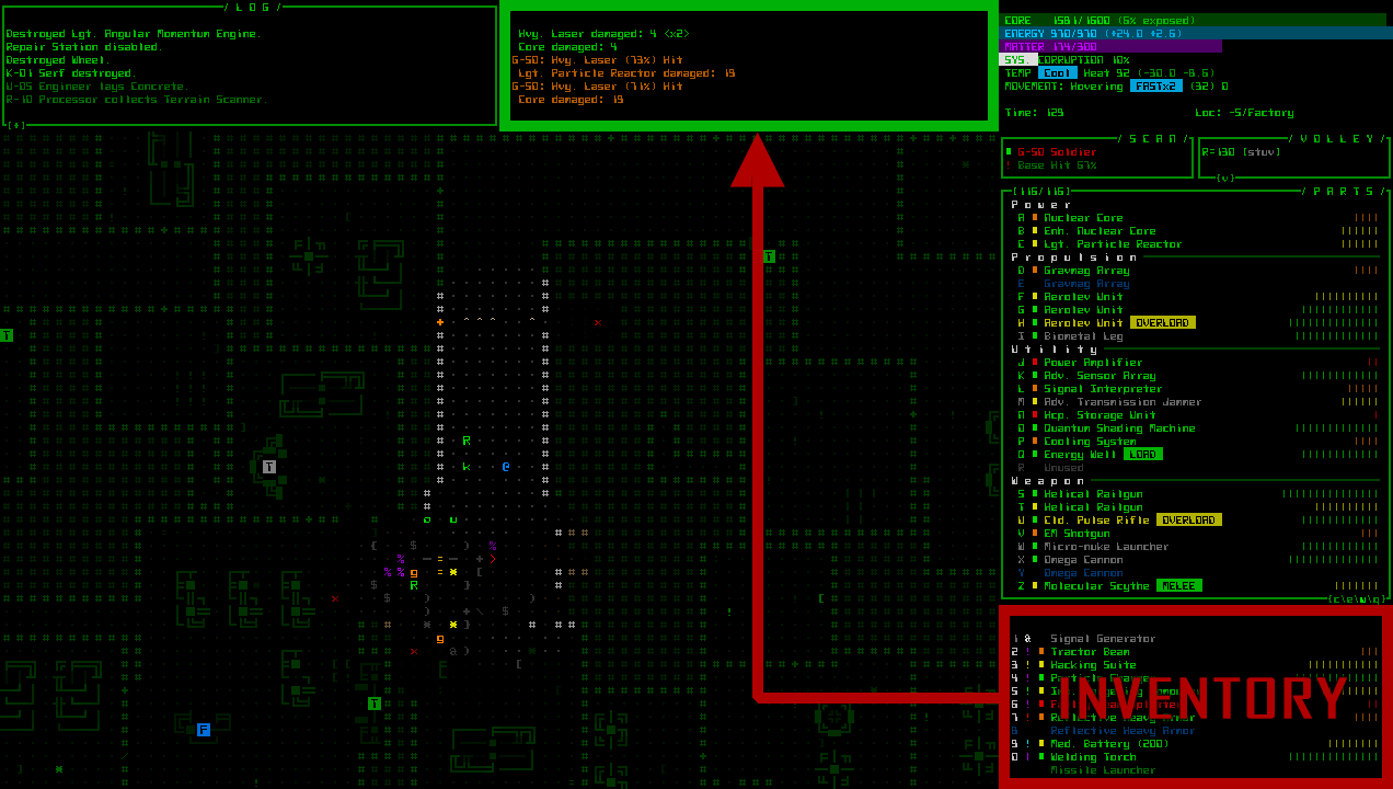
Doing so would give us back 14 rows! Sure enough, such a change would allow the current 1366×768 players to upgrade from a size 12 font to size 16, and 1920x1080p players to move from size 18 to size 22. However, such a radical change leads to multiple problems on the main UI alone…
- It would reduce the amount of visible inventory from 10 items to 6 in order to fit the top area.
- It drops the viewable map height from 50 to 36, meaning that with the player at the center only 18 spaces are visible to the north/south, while it’s technically possible to see out to 24 spaces according to the mechanics (not to mention all the other mechanics that work beyond 18 cells and are normally within view).
- The current inventory position relative to the parts list above it is actually quite important. Conceptually it’s a smaller area below (= less important than) the list of attached parts, and to use something you move it upwards (= raise its importance). (Yes, this was part of the original UI concept, and these are the kinds of things I think about when working with a GUI--many of my ideas come from prior training in linguistics and conceptual metaphors.) Moving the inventory away also loses its parallelism with the parts, both of which share the same info visualization modes to allow for more direct comparison of values like integrity or other qualities.
- A lot of the game is spent moving items between the parts and inventory windows, and further separating them would slow that process, especially for mouse players.
- If the inventory were to become a part of the top-center multi-console, as it’s the most commonly used window the player wouldn’t be as free to choose one of the other optional windows as desired (the area was intended for situational secondary windows).
So, um, yeah, that’s not gonna work.
Before we continue experimenting with the main UI, let’s look at the effect of changing the console height on other windows. We do have the status window, item info, hacking interface, and the help and many game menu pages to think about. These, too, were naturally all designed with the 60-row limit in mind, along with the desire to have as much information available as possible without scrolling or forcing separate windows.
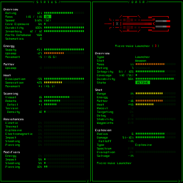
Without removing any existing data, these two windows have about 3-4 lines to spare. Ideally we’d also want to leave an empty row at the bottom because it looks better. Given these examples I can see ways to condense the amount of data to free up a total of 5-6 lines without any serious sacrifices in content or quality. Technically there are a few items that manage to fill their entire data window, so those would need to be dealt with as well, but they’re in the minority. (No scrolling allowed here!)
The hacking interface has plenty of room and flexibility, so no need to examine that.
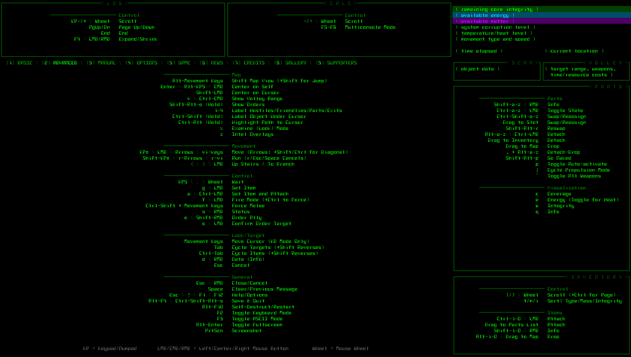
As for game menu pages, most of them are dynamic and don’t required their full height--basic commands, manual, game, news. The options and credits pages each have about 8-10 rows to spare at the bottom. The art gallery would need a slight redesign to be able to free up at least 8-10 rows, but that one’s not too difficult. The only one that would need a bit more work is the advanced commands page, which is already packed in its current form :/
Looking at the numbers overall, the scale of the 14-row inventory move described earlier would also be an impossibility where many other windows are concerned. Something lesser might be feasible, though.
Before we continue, here it’s worth bringing up a common misconception among players just starting out: It feels like there’s plenty of empty space in the HUD, so why not just allow the contents to be larger? Or, for example, why not shorten the parts list by the necessary amount since that area’s not being used?
Anyone who’s played longer knows that, as you can see in the sample complete UI image shown earlier, that list eventually gets filled up with parts--26 of them from A to Z. There’s actually not a single row to spare, and seeing that list in its entirety is extremely important, i.e. not something that can be sacrificed to scrollability. That number of parts was another mechanic that was decided early on but could’ve easily gone another way had I decided it was necessary to have a lower part limit for the purpose of shrinking the UI. Now the entire game is balanced around it!
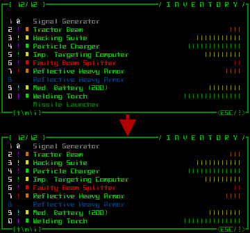
So let’s take another look at the main UI for different candidates from which we can realistically remove/relocate some rows. Within the inventory, there are the two item-name scroll buttons at the top/bottom, empty if there is no previous/next item. We could theoretically get rid of those and enable scrolling via another means.
That doesn’t really work, though, since it would ruin the consistency of the aesthetics across most of the other scrolling windows, most of which are laid out and interacted with in the same manner (plus it looks bad). More to the point, only removing two rows isn’t going to make a meaningful enough difference to allow for font size increases.
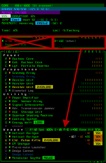
A better candidate for adjustment is the HUD area above the Parts window, specifically the Scan and Volley windows, which don’t have to be at that particular location. In fact, both could be redesigned and provided as info over the map or other windows.
The Scan window’s info is actually almost entirely available through other means as is (it’s a legacy 7DRL feature left as redundant info even after adding the dynamic map info system we have now). The Volley info is only really used in firing mode, and could be represented on the map, or together with weapons when preparing to fire--it only needs to be shown in that mode.
Unfortunately the 4 rows this saves aren’t quite enough--it turns out we need to reclaim at least 6 rows in order to give our most common resolutions the next font size up (1366×768 would increase from 12 to 14, and 1920×1080 from 18 to 20). So we’ll still need two rows from elsewhere…
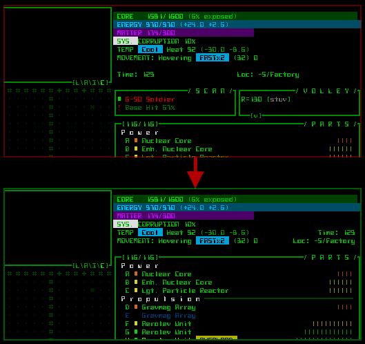
The top HUD area has two empty lines, though that’s a bit of intentional black space to keep things from getting overly cramped. Even more important, the HUD is shaped as it is because the corner intersection of the top-side windows and sidebar forms a makeshift rectangular area that doesn’t need a border of its own. Shifting the sidebar upward looks bad.
Well, now that I draw it out, it doesn’t look quite so bad. Yay for mockups. I prefer the bi-directional diagonally mirrored look, though the zig-zag intersection is somewhat interesting. The corner layout’s density is a bit over-the-top, and it looks kind crushed and less important considering it’s actually your most vital info…
But we did free up 6 rows :P.
There would be quite a few other consequences of this and changes mentioned previously, in terms of little UI feedback details and interactivity, but I’ve been focusing on the big picture here. To point out some of the other problems on the main UI alone, the cascade of changes would also require: moving the volley visualization toggle, a new home for the hidden Scan buttons, some new way of providing the names of machines, another method of showing the item data summary… All of these elements fit and work nicely where they are now (while also making sense!); I think the overall quality of the UI suffers by shuffling these things around, since they’ve already been optimized, after all.
Feasibility
In terms of difficulty, providing an alternative UI doesn’t seem quite as bad as I expected, but at the same time the benefits are not as great--it only enables one step up in font size.
Converting the base terminal area from 80×60 to 80×54 does bring it almost half-way from the 4:3 (1.25:1) aspect ratio we started with to a native 16:9 (1.77:1) better compatible with today’s screens.
That said, under the new system non-16:9 screens (the most common one being 1280×1024, approximately 5.7% of Steam users) would still not benefit from the changes, remaining at the same font size. On the technical side, the advantage of a 1.25:1 ratio is that you know you can always expand it horizontally to fit whatever screen space is available, while it’s not so straightforward with a terminal with an odd 1.48:1 ratio =p.
On the plus side, even a one-step font increase will slightly narrow the top-side windows back towards their intended/designed width, which has always been stretched too far for these 16:9 screens.
Mapwise, shaving 3 cells (6/2) off the sight range to the north and south is okay, though it would mean we’d probably need to remove the best tier of sight range-enhancing items, simply so they’re not annoying by frequently spotting hostiles outside your map view.
(Note: As is the case now, players can always opt to use a smaller font to see more of the map at once.)
Timewise, implementation could require devoting the majority of an entire major version release to this one feature. That’s about 3-4 weeks.
Financially I believe the effort could probably still pay for itself down the road by expanding the number of potential players and somewhat mitigating the number of complaints. (I’d be far more certain of this if we could increase the font step by two instead of one, but that appears out of the question.) That said, money has always been the lesser of my concerns, with the priority instead on making an awesome game. Cogmind was, after all, designed from the ground up with these particular UI dimensions, layout, and content in mind, which has in turn heavily impacted the mechanics.
Technically, one of the options here, and how I originally approached the issue, would be to make the alternative UI an optional “special mode,” i.e. not the default appearance. But maintaining two such distinct modes is complicated, and would continue to be a drag on future development. Fortunately the 6-row proposal reached above is not a significant divergence from the original UI, thus there’s a chance it could become the UI layout.
In summary, it’s doable, but do we want to do it?
Conclusion?
If the necessary UI adjustments were any larger I was originally just going to chalk it up to lack of foresight and say it’ll have to wait for Cogmind 2 where the design could account for it, but based on the analysis above (carried out as I drafted this post :P) it seems worthy of serious consideration.
The question, now more specific, becomes whether it’s worth investing the necessary time/money while also making slight sacrifices in the original UI.
One aspect that keeps me from enthusiastically jumping on this opportunity is that the second most common resolution, 1366×768, would be upgraded from Cogmind’s “native” (and best-looking) size 12 font to size 14, which is the absolute worst in terms of style (it’s an intermediate font size that’s difficult to balance properly given the style).
There’s also the loss of the half-width HUD windows that nicely divided up the sidebar to keep it from looking too monotonous, not to mention providing effortless access to more information… :(
I’ve prepared some mockups showing what Cogmind’s UI would look like under the new system in the two most common resolutions.
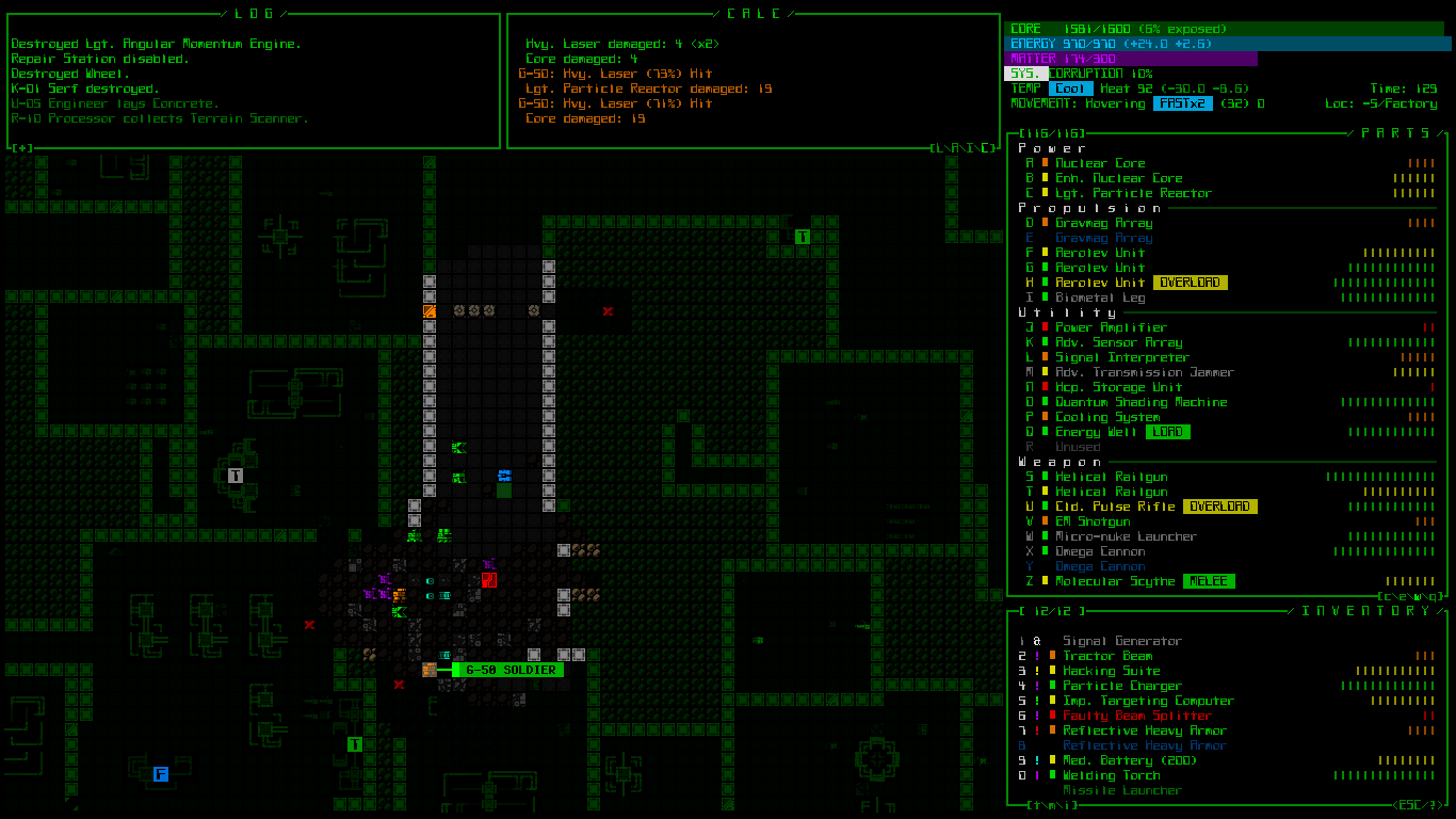
Concept: Condensed 1366×768 UI. (Click for full size.) Also in ASCII form, and using one of the alternative fonts (Terminus). Compare to what 1366×768 looks like now.
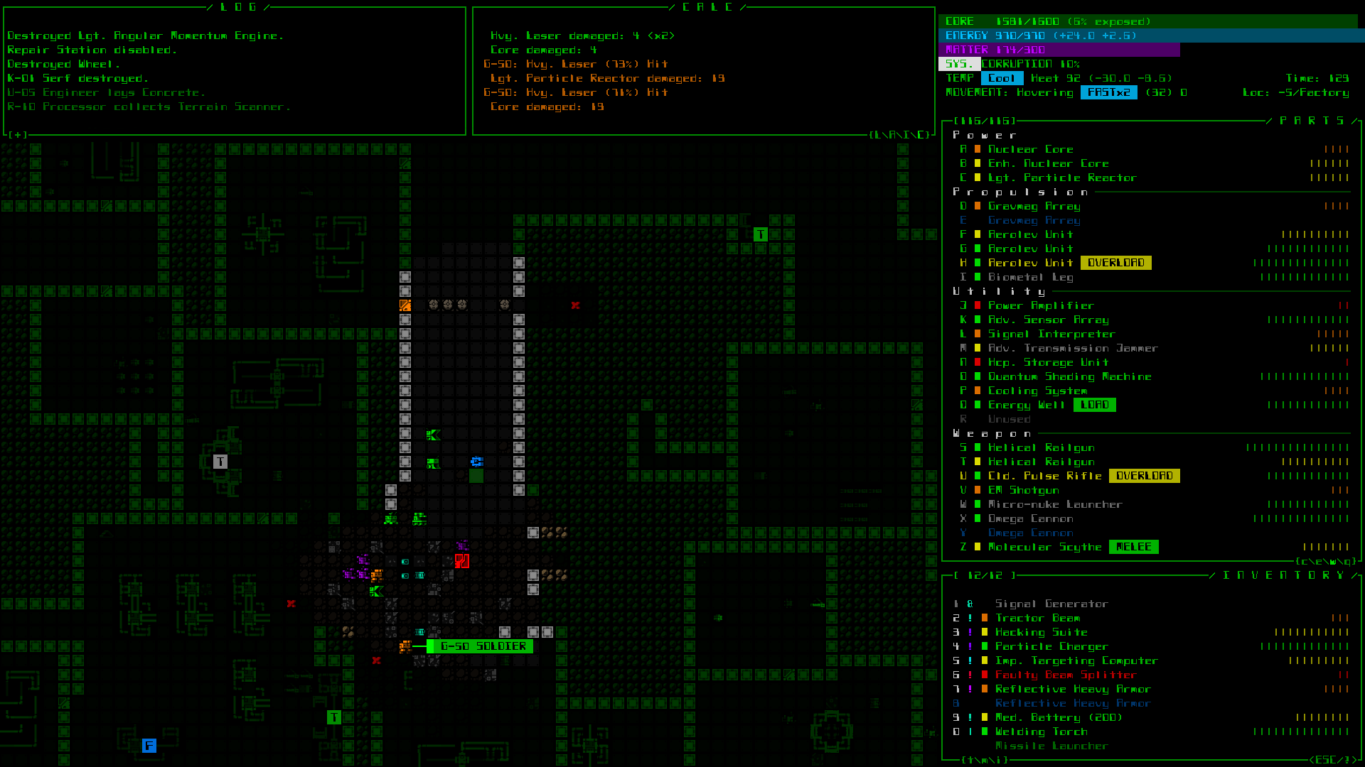
Concept: Condensed 1920×1080 UI. (Click for full size.) Also in ASCII form, and using one of the alternative fonts (Terminus). Compare to what 1920×1080 looks like now.
What do you think? Is it better? (Worse?) Is it worth it? Is it enough?
Update 180329: In the time since this was first posted, specifically for those players who don’t have a large enough monitor but would like to play a Cogmind-ish game I’ve released POYLBOT-7, a free remake/demake put together for the 2018 7DRL Challenge. It was designed from the ground up for a much larger font size on all displays.
Also, to perhaps help understand more about terminal grid sizes and how it impacts design, consider checking out the POLYBOT-7 development postmortem. It goes into great detail about how the UI and content of Cogmind were almost completely redesigned to suit the new layout.
Update 211112: As this topic comes up at least once or twice per year, it’s certainly gotten a lot of discussion. I was hoping to one day write a much lengthier explanation of the design constraints and impact on art direction, UX, gameplay and content, as well as overall experience, but still haven’t gotten around to doing that (my list of potential blog posts is quite long and I’ll never get to everything xD), but in the meantime I did add some more info on this topic during a discussion over on r/Roguelikes where you can learn a little more.


16 Comments
I’m not sure it is worth it, but it would push me towards a buy. Cogmind’s tiny presentation has always been something I’ve struggled with when looking at screenshots, and even the original 7drl.
After writing this post, I came up with what would essentially be a 16:9 remake that would up the font size even further, +33% instead of +10% as in this post. It converts the window into an 80×46 console. The main thing stopping me from even proposing that one is the viewable map area would simply be too small, reduced to ~50×36, which really isn’t enough in the north-south directions to allow for efficient play, not to mention it would be quite at odds with Cogmind’s large map size…
Cogmind was really meant to be a desktop game where players can take advantage of larger screens, but there are so many playing on laptops that some option needed to at least be considered :/
Thanks for the input! I’m hoping to get a lot of feedback from different quarters on this before making a final decision, so not something I’m working on in the near term. Interesting that you have the same issue with the 7DRL version, since the text is twice as wide there (but yes, no taller).
I’ve already bought a copy, but I really like the new 1366×768 layout… and that’s relevant to me, because that’s my laptop’s resolution, and I’m old. So if you develop this layout, I personally would really appreciate it; I’d definitely play the game a lot more. (It truly is excellent, but it’s not very easy on my eyes.)
Thanks for the feedback, noted!
I don’t know the functionality of the UI as I haven’t played yet, but it seems to me a better route to saving space would be to remove the colored meters on the right hand side, replace them with a couple digits, and try to fit two columns of items/parts which should save 40% or so. Possibly have a set of shorter names to use when in two column mode to get them to fit. This seems like it would work across all the screen types you showed.
Another option which you didn’t mention which I think might work okay, would be to slide in a wider but shorter UI which partially covers the play field when a large key is held down- like space- and recedes when the key is released.
I would also have this layout switch happen automatically if you chose a font which doesn’t fit with the original and revert if a smaller font is chosen. Then have a “Force condensed UI” option hidden somewhere in the settings for those who actually prefer it.
In terms of reducing the UI size, I actually came up with a more extreme solution after writing this post, one that would work at least on the main UI to effectively turn the entire thing into a 16:9 ratio and allow all font sizes to jump multiple increments from what they are currently. (In said layout the map itself is 50×36. For reference here‘s the unreleased mockup I put together.)
So it’s not really a problem of having no way to do that--the bigger unfortunate issues are two-fold (as described more fully in the post):
1) Non-main UI windows can no longer contain as much content and would require scrolling. I didn’t show these other problematic windows in the post because I already made the decision that it’s impossible to reduce them by more than about 5 lines. This alone means true 16:9 is out of the question.
2) The map can only be reduced in size so much before play for everyone (not just those affected by smaller fonts) becomes extremely annoying, and multiple modes cannot feasibly be supported. That’s what I wanted to do, before looking into what this would entail. Going that far would be very prone to bugs and eat a massive chunk of dev time, not to mention lead to huge usability issues that would require mechanics to change. Might as well be two separate games!
(By the way the so-called “colored meters” are actually a flexible mode that provides useful information depending on players settings, either stat summary, integrity, coverage distribution, energy generation/use, heat generation/dissipation. I talked about some of them before here.)
I feel that the removing the two blank lines in the top HUD removes from the style and the fluidity of the UI
Thanks for the feedback! I strongly agree on that point.
With something like this UI which has so many pieces and functions, one built on top of another, and at each step along the way many factors were considered, you end up with a situation in which any single change can throw off others in a chain reaction, not to mention what happens when there are as many changes as we’re seeing here (for relatively minor benefit…).
Surprisingly, however, overall the reception of this proposal so far has been pretty lukewarm, presumably because it doesn’t go quite far enough for those who really need/want something like this, anyway.
It’s now quite likely that nothing will come of this, but at least I did what I could--spent a couple days investigating the situation in depth and drafting this proposal for others to comment on :D
As designed, Cogmind is essentially a desktop game, or at worst for big laptops or those who can handle the small cell size on even smaller machines.
I don’t think it’s worth it, but one thing you can do right now is make Terminus the default font. I love the current default, it’s got tons of personality, but it is impossible to smoothly read, regardless of resolution or display. Lots of people are going to squint at that and be turned off right away.
Yeah, I’ve decided this week based on the feedback that it’s not worth it (more on that in the previous comment).
As for the default font, several times I’ve been on the fence about changing it. There are several reasons I still haven’t made that move:
1. Surprisingly, based on the player data I have the majority choose to use the Cogmind font even though other options are available (and they know about them). However, the percentage of players using alternatives is on the rise (and Terminus is the most popular), so it’s something to keep an eye on.
2. The other fonts have no “Cogmind personality,” and as I’ve discussed in previous articles, unfortunately style and readability will always be at odds with one another when it comes to fonts. I prefer to err on the side of maintaining style in this regard.
3. It’s nice for those people who care enough to look into it and/or ask to suddenly discover that there are quite a few options. Unlike some devs who are into maximizing profits and exposure, I care a lot more about attracting quality informed players.
I also try to make it really obvious that Cogmind has multiple fonts, with reminders and notifications in various forms.
But still, thanks for bringing it up since you’ve put it back on my radar and only now have I seen that the number of players using the default font is falling. So maybe I’ll try a completely new font when I get the chance.
If only you could somehow get metrics on how much people are squinting at or otherwise struggling with the interface, so you could pop up a “here’s what other fonts look like” window.
Speaking of which… how about some kind of preview dialog which lets you quickly see your current game view in various fonts and sizes, without going in and out of the options menu.
Also, I thought of “cogmind’s version of clippy” and what came to mind very hard was the salvager bot from this thing: https://i.imgur.com/4yQHUrS.png
At least for now I think most people find that there are other fonts available, especially those who are having any issue with it, since it’s right at the top of the options menu, and also on the forums where people look to ask.
You can actually change your font/size in place, at any time, without going to the options menu: Ctrl-PgUp/PgDn do that.
Haha, scavenger clippy :P
That’s pretty cool, is it documented anywhere?
Also there’s an oddity where you have to release and repress Ctrl after every change.
Sure it’s documented, on the in-game list of commands like everything else :). You do have to separately release Ctrl each time, though--that’s not something I can fix, it’s a requirement of the library I’m using.
It looks like logs don’t occupy all the space they are given and can be shrinked. Didn’t you tried to move that “core, energy, matter” block to the left and move parts and inventory up?
The logs still manage occupy the horizontal space a lot of the time, I just happen to have used an example with extra short lines in this case. Line wrapping is not uncommon even with the current setup.
In the end narrowing one or more of them doesn’t really save much space anyway, especially given that the UI was designed for a 4:3 aspect ratio in which many more lines are wrapped. The extra space comes from the fact that most people tend to play on a 16:9 view, so shorter messages won’t fill the available length. With a 4:3 layout there isn’t any extra horizontal space for pretty much any line, so each top-side console needs to be half as wide as the map view, whatever that happens to be. Space might’ve been optimized somewhat differently if Cogmind made 16:9 at requirement to play, though it would probably have ended up even more cramped as a result :P
That said, even if you narrow those somewhat it doesn’t really help in any meaningful way given the lack of an effective way to arrange the info required by other windows.
Really the best “solution” for an alternative approach would be to design a game from scratch to have smaller maps and/or smaller scale encounters, ranges, and intel needs. The original idea was instead striking a balance between maximum scope and what can be reasonably displayed on the target hardware (or, more specifically, the hardware and grid was first chosen to maximize space, and then that space was filled to the best possible extent, making it later impossible to reduce the available number of cells without ruining everything xD).