The design philosophy behind Cogmind emphasizes maximum immersion wherever possible. For this reason I’d like to avoid game-y interface elements--those which are not part of the game world itself but instead remove your mind from that world and remind you that it’s a game. (A fact you’re obviously unlikely to forget, but anything that breaks the illusion is still bad.)
As discussed earlier, we tucked the options and game menus away with the help and manual interface using the same animated style as the rest of the game to make the transition to “non-game-world space” a little less jarring. An options menu accessible from anywhere, plus mandatory permadeath (and no save menu--games aren’t so long you might play multiple runs in parallel), mean we could almost do away with the title screen entirely.
I like how the the 7DRL has no title screen--immediately on opening the game you are dumped right into the action regardless of whether starting a new game or continuing an old one. So for a long while I’ve been operating under the assumption that the game may not even have a title screen, doing away with an unnecessary “gateway” into the game itself.
More recently I’ve reconsidered that direction, since even without any interactive functionality (we’ve now removed or relocated everything that would apply), a title screen does have other advantages. One of the most important is name recognition in various places the game may appear, e.g. screenshots, and more importantly YouTube LPs.
Plus it’s an opportunity to have a cool-looking title logo.
And that’s actually where the change in direction originated from. It started with a Twitter follower pointing out that the official Cogmind logo as seen on the new website doesn’t reflect the art style of the game. It “needs the ASCII treatment.”
Thus I began sketching an alternative design in REXPaint for whatever purpose:
")
First concept sketch evolution for an ASCII-fied Cogmind title logo. (Click for full size, as with all other images in this post.)
As it started to look promising, I imagined how fun it would be to animate it and put it in the game. So of course I had to try :)
Flow-wise we already had an intro that plays when starting a new game, so the title was inserted before that and leads directly into it--the two work pretty well together since they share the same animated ASCII style. Both the title and intro are skipped completely if continuing a previous game.
Title Art Composition
When the title is shown, the goal is to minimize its “intrusive nature” and make it look like it belongs in the game world. This isn’t too hard since everything uses the same ASCII animation engine, and in terms of composition you’ll notice the title also uses the same style of line art used for items. (I still have yet to do a dedicated post showing off the different types of art in their final form, but some examples were previously shown here.)
I already liked the concepts, though the last iteration seemed a bit overdone, so I aimed to use something like the second to last one. First I redid some of the ASCII “circuitry” to rebalance the overall shape and flow of the title.
")
Rebalanced “ASCII circuitry” and some slight color adjustments.
The animation plan was to actively draw the background circuitry, then have the word appear on top of that. This means we’ll also want to draw parts that are under the word itself, as they’ll be showing before the word appears. So I split the art into two layers, one for the word itself, and another for everything behind it:
")
Title art separated into layers.
Minimalist is good, but I didn’t think this would be enough substance for a fully animated title which could really use at least a tiny bit of buildup. What better than even more circuitry! So I drew a third layer under both of those:
")
Stacking three art layers. (The bottom layer is drawn in a single flat gray--no shading--because the shading will be applied during animation as necessary.)
This bottom layer should look good both by itself and when combined with either or both of the layers above it. This meant a lot of layer toggling during the editing process. The bottom layer is only used fleetingly, though, (and is not a part of the final appearance) so the attention to this kind of detail is mostly overkill.
The animation part was pretty easy, only requiring a handful of scripts. For the curious:
")
Title screen animation scripts.
The second half of the above scripts are used to animate the title itself; the first half actually animates the “Grid Sage Games presents” text which appears before it. (Yes, might as well put that in there since we have a title now.)
The bottom-most layer, and first to animate, is seeded with 20 randomly located emitters from which the ASCII lines are traced in gray along cardinal paths (i.e. no diagonal drawing). Half a second later 20 more emitters are created on the middle layer, which is traced in green (this one allows diagonal paths as well, to ensure quicker complete coverage). Another second layer the title flashes in with a special glitch effect, while at the same time the bottom layer flashes in its entirety for a moment before quickly fading out. See it below:
")
Cogmind title animation. (Click!)
That’s it, three layers of ASCII art imported from a REXPaint .xp file. Notice one key difference between the result of the animation and the art itself: The “COGMIND” lines are brighter and have a background color to them. Turns out that when I borrowed an existing script to draw that part of the title, its design happens to leave the background color behind. I liked the fact that it stands out more and also melds the letters with the background circuitry via the few half-cell blocks scattered around the edges. So I kept it that way.
")
A static shot of the final title appearance, in game.
There you have it, Cogmind’s new “title screen.” Conceptually it’s still an out-of-game element, but at least it doesn’t require interaction--the game automatically starts about two seconds after the animation is complete.
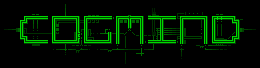
Update 4/21/2015: Surprisingly, because most everyone by this point was very familiar with the name of the game, no one mentioned that to first-time viewers the title logo looks a bit too much like “COGMINO.” It was only mentioned once, but months later as part of the trailer production the topic came up again and I thought to survey more people, finding that most were reading it that way! So, back in April 2015 shortly before launch we went back through all media and changed the logo design to the following in which the ‘C’ and ‘D’ are both curved and symmetrical:
Updated logo to better differentiate the ‘D’ from the ‘O’.
6 Comments
If you need more practice doing ascii logos, Incursion could use one for it’s title screen ;-)
That would be totally outside my comfort zone (hi-tech) ;)
BUT I may just take you up on that, or at least try to. What format? PNG or something else? (Not sure if you’d just use it as a splash screen image, or want the individual layers/chars for manipulating/drawing specific elements.) You want it to fit in that current title area of Incursion’s main screen? For flexibility I guess it makes more sense to handle it as ASCII, but the problem is Incursion has the option to use either narrow or square fonts, which would really change the appearance depending on user settings…
Well only if you get the urge :-) I’d likely do one eventually.
Ascii. Up to 80×30 would be a maximum screen area. But if I do one, it’d be in the 15 high, however wide it works out to be. Square would be fine. I’m going to make 800×600 the default resolution, with 8×8 font size.
Okay, I’ll keep that in mind if I get the urge one day :)
I do like 8×8 myself. Such a nice compact size that’s still readable despite being square.
That is not only a great logo, it’s an awesome animation AND a really cool dev story. So badass! All done with your existing tools.
I’m so psyched for this game!
Thanks! I was originally skeptical myself, having no idea how it would turn out and thinking “an animated logo? How much time will that take…” Ended up being pretty simple, and now I can’t stop looking at it myself ;)
It was a nice little condensed dev story, so I thought I’d write it up for everyone--glad you liked it :D