Finding the perfect font can be difficult, even more so if you’re also hoping that font will offer a unique appearance associated with your game. You’ll often come across fonts that possess several of the right qualities but have other drawbacks, especially when taking into consideration the many factors covered in the previous post about roguelike fonts in particular. This is when you want to take those qualities as inspiration and break out the pixel brush. Roguelikes have so few visual assets that it’s worth investing some time developing your own font. I’ve been making and working with bitmap fonts for about ten years, so I’ll share some of my observations and workflow tips here.
Formats
There are two main options for dealing with fonts: 1) use a font engine to render a TrueType font (.ttf), or 2) use a bitmap.
TrueType has the advantage of being scalable to almost any size, making it the solution with ultimate flexibility. However, this flexibility comes at the cost of precise pixel control, thus TTFs won’t always look good at all sizes. In a game where text is secondary this drawback may not be a huge deal, but with terminal roguelikes (emulated or not), the text is the graphics, so it’s nice if we can control every pixel. Think of roguelike fonts as pixel art in that regard. Also note that creating a proper TFFs requires a good bit of technical knowledge, and specific tools.
Most roguelikes, and many 2D games, use bitmap fonts instead. The bitmap approach is great for that pixel-perfect WYSIWYG appearance. I’m guessing that most readers already know what a “bitmap font” is, but just in case:
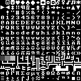
A bitmap font image (REXPaint code page 437 in 10×10).
As in the above image, all the characters are pre-drawn in a grid, and at runtime the game copies individual characters from this image and puts them on the screen to form words.
The main drawbacks to bitmap fonts are the need for different bitmaps for every font size (if more than one), a lack of automatic kerning (which you get with TTFs), and narrow characters (like ‘i’) taking up much more horizontal space than they should. Bitmap fonts don’t have to be limited to monospaced output, but with a grid-based terminal display we don’t have the luxury of specifying character spacing.
Aside from that, bitmaps are more powerful than they appear. At runtime the engine can recolor them to any color necessary:
And “pixel-perfect” doesn’t have to mean sharp edges--bitmap fonts are even capable of alpha shading and anti-aliasing:
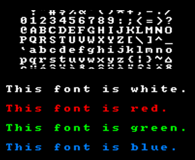
To demonstrate, the 10×10 font bitmap was upscaled in Photoshop using a smoothing algorithm, producing anti-aliased characters that can be copied as well. (Naturally in actual use we’ll want to manually draw in the antialiasing--full pixel control FTW!)
As seen above, alpha-enabled fonts can be recolored all the same and preserve their alpha transparency.
Layout
With bitmap fonts the other consideration is what layout to use. Your game, or other programs, need to know where each letter is located, just as if this were any other sprite map. Since you can specify the coordinates, it’s really up to you.
One of the more common choices is US code page 437, the standard extended ASCII layout used by games like Dwarf Fortress--the same such layout you see in the first bitmap shown above. Some programs may orient it differently (column-wise rather than row-wise), but in general there is a benefit to making the bitmap directly correlate to ASCII values. There are lots of bitmap files already out there in the wild, and if you can read a more standard format like CP437 then you can potentially import any of them without trouble.
For Cogmind I’m not interested in reusing other bitmaps, nor am I using the entire code page 437 set, so seeing as we only have to map the character positions once in the source, might as well make editing the font easier by creating our own layout:

Bitmap layout for the Cogmind 7DRL/prototype default font. The layout will remain more or less the same, but the font will be retired (it’s a Deja Vu font--I didn’t make it).
This layout ignores the many ASCII characters we don’t need, and lines up lower and upper case letters immediately next to each other. Much cleaner to edit.
Tools & Basics
There are a ton of drawing programs out there, many free, though I always use Photoshop, even for pixel work (for which I don’t think it’s particularly suitable, but I’ve been using it regularly for about 15 years so it’s what I’m used to…). Examples will be shown in PS but translate to just about any decent program.
Layers
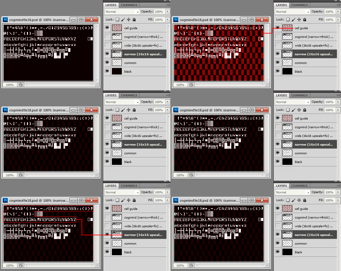
Below is the 9×18 text font design file.
All font files have a “guide” layer which shows the boundaries of each cell, useful when zoomed in drawing individual characters and for eyeballing pixel padding. I always use an overlay for guides in PS because using lines would occupy space and then you have to remember which cell the line belongs to and maybe even draw over it. (Area-based guides are also useful because you can ctrl-click the layer to select the entire guide area, though that doesn’t matter in this case and is a technique for other PS work.)
The 9×18 font currently includes three variants: “cogmind” (a highly-stylized sci-fi font), “wide” (8×10), and “narrow ” (7×10). Remember that when making a bitmap font for roguelikes in which a character will occupy an entire cell, we must embed horizontal character spacing and vertical line spacing in the actual font, so characters will rarely take up an entire cell in the bitmap itself. We can describe the variant by its letter size (I use the dimensions of ‘A’).
Common glyphs like lines are held in a separate layer since they don’t differ between variants.
Variants
When creating a font in multiple sizes and variant styles, to save time we’ll obviously be doing a lot of copying.
The 9×18 font actually began its life as a direct copy of the 16×16 square font, shifting lines/columns as necessary followed by tweaking features to bring it more in line with the other narrow text fonts and improve readability (in words). The 16×16 square font itself began as an upscaled 12×12:
The 16×16 font immediately after upscaling from 12×12--definitely needs lots of adjustments, but having most of the pixels there already will save plenty of time.
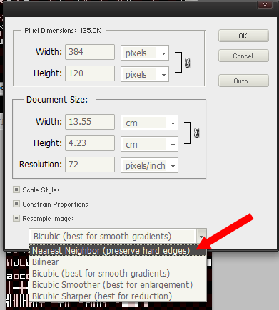
Note that when upscaling for this purpose, to avoid anti-aliasing/smoothing we have to change the resampling method to “Nearest Neighbor”:
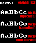
Because larger fonts take much longer to draw, even if the intent isn’t to use a smaller font you can begin by drawing the general style at a size like 8×8 then upscale it. From there you can tweak the strokes, or even add anti-aliasing:
Typeface Anatomy
When you do have to draw from scratch, the first thing to do is decide on some basic parameters that will more or less remain consistent throughout the font. The relative positions of these three lines are especially important:
Most characters sit on the baseline, the cap line defines the upper edge of capital letters, and the mean line is where we find the crossbars for capital letters and often the tops of lower case letters.
Remember that for roguelikes we must also embed both character and line spacing in the bitmap itself, and these can have a significant impact on the final result.

The difference between leaving two (left, 7×10) or one (right, 8×10) pixel of horizontal space in the 9×18 font.
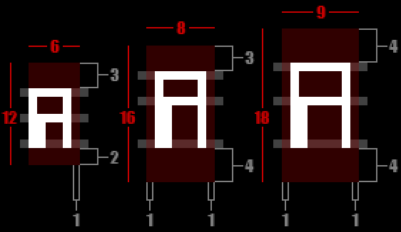
When scaling variants to multiple sizes, I’ll first sketch a quick reference diagram to ensure the ratio of space and glyph size remains fairly consistent to keep the style intact across each version.
Design
This post is geared towards the technical aspects of making bitmap fonts, but I can offer some simple guidelines and techniques for design.
Theme
It’s pretty obvious that fonts each have their own theme, essentially a set of defining characteristics that show the glyphs belong to the same group (font). Creating a consistent cohesive font is simply a matter of making a list of rules that define those characteristics, then sticking to it. Rules regarding how different letters treat the reference lines (base/mean/cap), uniform behavior of decenders (hanging lower case strokes), relative prominence of punctuation…
Again that last one is very important for roguelikes, since periods especially are so commonly used on maps. An extra pixel or two can make a huge difference in the overall appearance of a map. This and other thickness-related concerns are inseparable from the use of color, since they work together to determine how bright the interface will be overall (assuming the use of a traditional black background). Fine periods are compatible with bright colors, but thick periods would threaten to overwhelm the map unless presented only in dark colors.
As you can see, even with a darker color the map is harder to read with a thicker period--looks like the 2×2 version would need to be even darker to work at that size. That’s a 12×12 map font, for which Cogmind is currently using the 1×1 centered dot (left).
In the end, a theme’s rules may need to be bent or broken for a few stubborn letters that aren’t too compatible with the chosen style, but do so sparingly.
Text vs. Map
In the previous post we outlined several properties that differentiate the ideal text font and map font, and we can actually treat them somewhat differently in our bitmap images. Herein lies another advantage of separating the two: For map fonts we can ignore character and line spacing for the purpose of text readability and instead put glyphs in the center of their own cell.
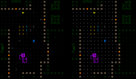
This is another step away from the classic text-as-map roguelike appearance, but preserves the even distribution of space between objects as found in normal game maps. The advantage is most apparent with the period, which usually sits on the baseline but in this case can mark the center of an empty map position. Few if any roguelikes use this feature, but Cogmind certainly will:
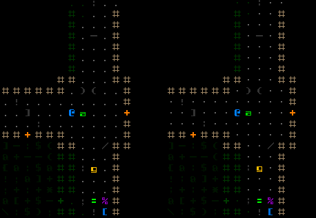
An in-game comparison of non-centered vs. centered map fonts (16×16). Centering the glyphs results in better alignment between different map components.
While it’s true that in raising the baseline for lower case characters you might reduce the visual effect of “tall vs. short” when horizontally adjacent to their upper case counterparts, truly large creatures are best presented as multi-cell objects anyway (as they are in Cogmind), and upper case letters do still occupy more pixel space.
Perspective
When creating a bitmap font, it’s important to realize that while an individual character may look cool, its difficult to give a well-rounded appraisal while pixeling it because 1) you are usually zoomed in close, and 2) there is no question of how recognizable the character really is (you already know what you’re drawing!).
We must examine the font at its native resolution during the process. Most painting software comes with some kind of “preview” feature with which you can observe changes to the image itself while editing as if it were zoomed out. In Photoshop, selecting the “Window > Arrange > New Window for…” option creates a duplicate window for the current image, and both are updated simultaneously, so one can be set to the original image size to see changes as they are made while zoomed in at the pixel level.
But even keeping an eye on the font bitmap at its native resolution is not a complete solution. Remember that the readability of text fonts is partially defined by how characters interact with other neighboring characters. Seeing the font in action will suggest additional necessary tweaks, so intermittently dropping it into the game helps refine the design. For that purpose I keep a separate copy of REXPaint where I can quickly drop in fonts and see how well they work. (It helps that Cogmind’s GUI mockups are all stored in REXPaint .xp files.)
This is the second in a four-part series on roguelike fonts:
- Part 1: Fonts in Roguelikes
- Part 2: Font Creation
- Part 3: Cogmind Fonts
- Part 4: Readable Text Fonts for Roguelikes




2 Comments
Fantastic series of articles :)
Love the game.
Thanks, and I’m glad you enjoyed the articles! I wish I had more time for new series--there are plenty of topics to cover in more detail, but I’m quite busy now that the game is out there…
For now I do much of my dev blogging as host of the ongoing /r/roguelikedev FAQ Friday series, where you might find some other interesting topics :D