Official development blog
[ Latest Cogmind Release Notes: Feb 2026, "Unchained More" ]

Adventures in Map Zooming, Part 5: QoL

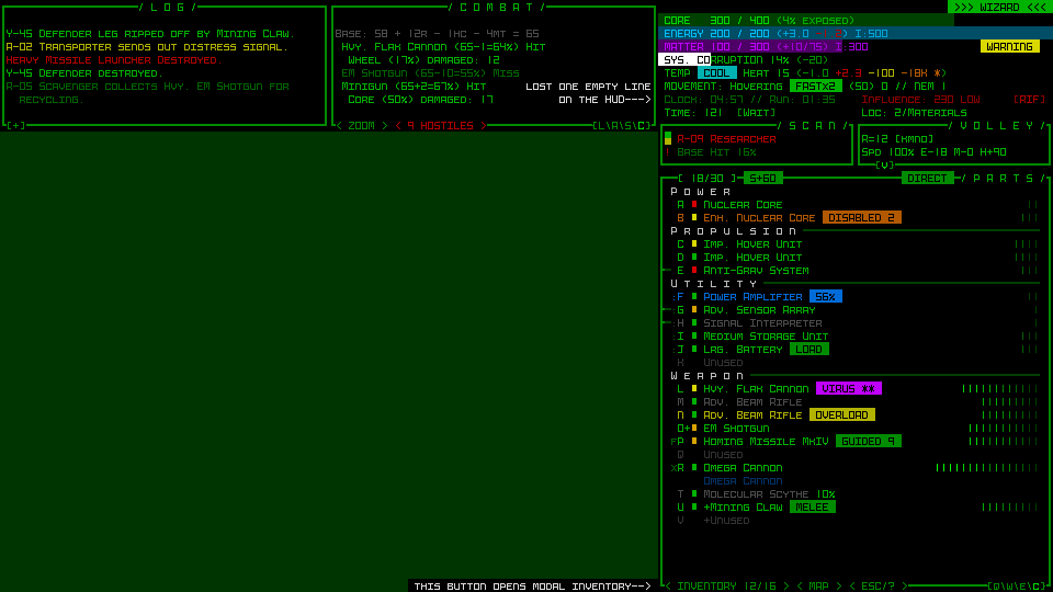
Map zooming again! Although I finished off the final bits of the core map zooming feature, that series went quiet when I turned my attention to planning and preparation for the upscaled UI, essentially due to my belief that once the latter is implemented, map zooming wouldn’t be as necessary in the first place.

But it would still no doubt be used by some, and more urgently I also realized that it wouldn’t make sense to put out map zoom test builds without including the additional QoL required to make a zoomed view actually playable in a normal sense. Although I rightly assumed few current players are very interested in zooming, some of them might at least test it out, and for proper feedback the QoL needs to be in place, otherwise any feedback will essentially amount to “needs QoL” :P

Good QoL is a make or break part of map zooming, where the real magic happens, and I love me some QoL design, so let’s see what we can do to facilitate zoomed play!

First of all, not exactly surprising or amazing, but one piece of the puzzle did suddenly fall into place here: scroll wheel zoom toggling. Back in the polishing stage I covered the reasoning for using methods other than the scroll wheel to zoom, but when putting together the QoL features I realized that zooming in and out might often be done in conjunction with map panning, which among several other methods can be accomplished by holding Shift and moving the mouse. Well if you’re panning with the Shift key held, using the mouse wheel wouldn’t do anything since that’s not a command yet (Shift-Wheel), so we can conveniently assign it to zooming!

cogmind_mouse_map_zoom_and_pan

It feels very natural to add mouse wheel zoom functionality to the existing Shift panning method, making it easy to quickly zoom in and out between multiple distant locations.

That’s low-hanging fruit, though. We’re going to need much more powerful QoL…

Relative Centering

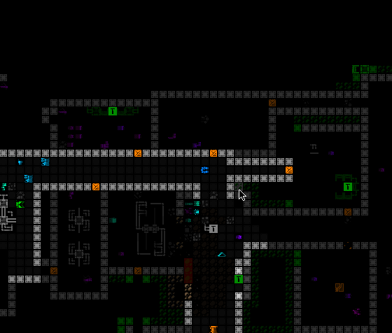
A common theme throughout map zooming QoL development is enabling the player to get information about, and react to, things that are outside the current map view. As explained in my article on the history and theory behind Cogmind’s interface and plans for other layouts, in a roguelike it’s crucial to have easy access to knowledge that affects near-term decision-making, and by shrinking the map view to increase the size of its content we’re giving up a lot of that easy access!

We need to find ways to retain it where possible, or at least create alternatives.

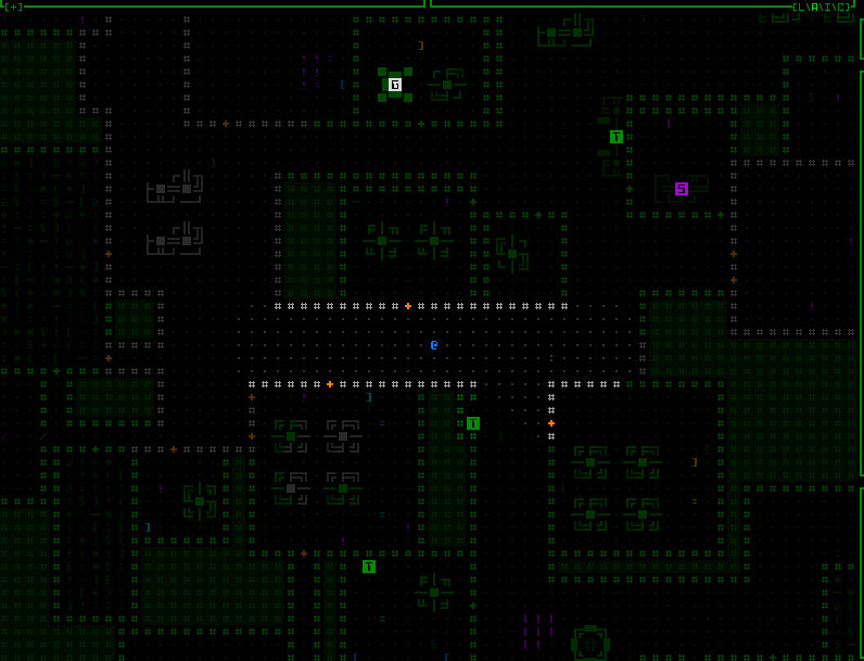
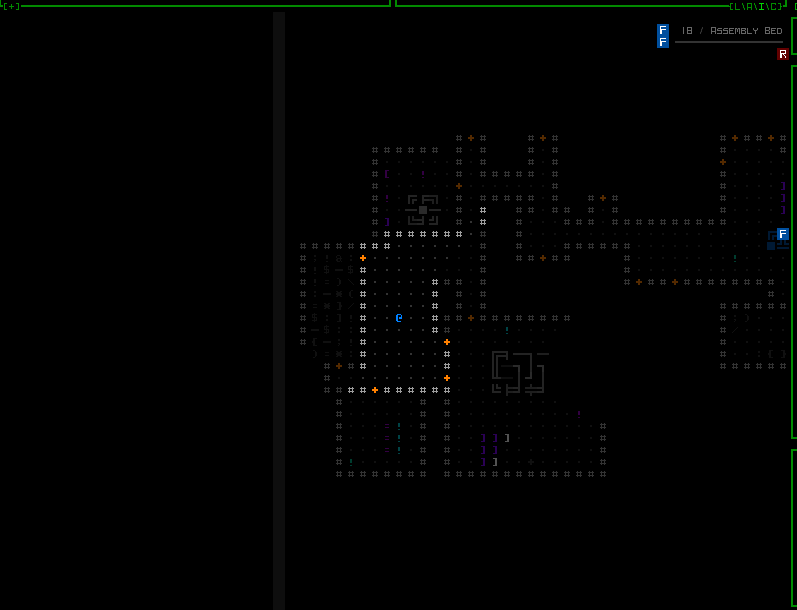
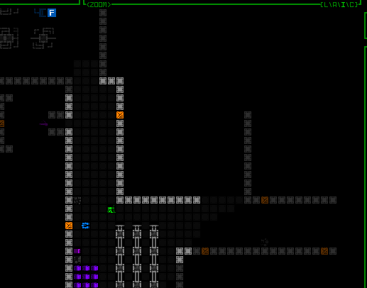
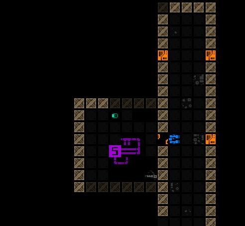
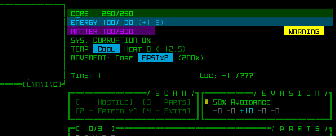
One of the most direct ways to accomplish this is to offset the player’s position from the center of the map. Normally Cogmind is shown at the center of the view, allowing the player to see equally in all directions, but technically we can assume that what’s most important while exploring the world is what’s in front of the player in whatever general direction they’d like to focus on. Thus one new optional feature is the ability to manually set a new relative centerpoint.

cogmind_view_centerpoint_manual_mouse

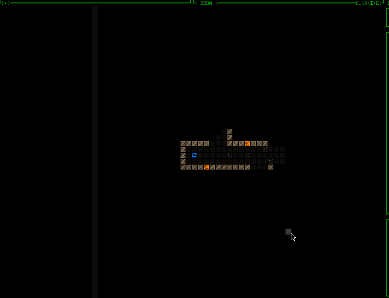
In this zoomed map view, notice how one can choose to look further in a particular direction, and the view continues to shift along with your movement, as usual. For as long as such a point is set, it is used in most instances which otherwise want center on Cogmind, and the point is never allowed to be so far away it results in Cogmind being out of view entirely. Zooming the map in/out adjusts the relative centerpoint by the same factor, and it’s ignored or even automatically reset in some special instances, like… say… outright teleportation ;)

The above recording shows how setting such a point is accompanied by a fading cardinal crosshair animation akin to the drone centering/following animation, but here is grey instead of green. This keeps our visual theming consistent for the idea of interface-controlled “centering.” While a manual centerpoint is set, you can also see the intermittent flash of the current centerpoint, which is optional and can be adjusted or disabled. Restoring the default centering is as simple as setting your current position as the centerpoint.

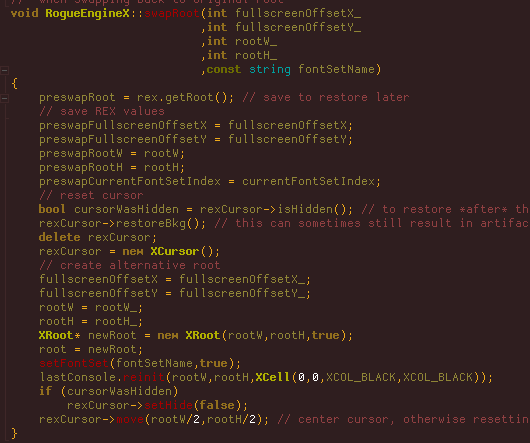
How do you set that point, anyway? Oh no, it’s time to go… back to the engine! (are you counting? this is the fifth time :P)

I decided for this feature we are finally, after ten years, going to have RMB detection based on releasing the button. Cogmind has always responded to mouse down events for input, which I prefer since it’s that much more responsive, but the difference isn’t huge, and by forgoing that approach we gain access to a new realm of mouse input: holding the button for a different effect!

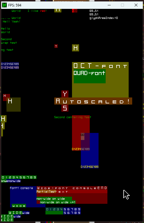
Now this alone doesn’t require any extra engine work, it’s just a different event we could always detect, but if you’re going to have input based on holding a key you probably need to know how long it’s been held, and for that we’re going to need more engine functionality. Paging the REX testing environment!

rex_mousedown_timers_demo

Testing LMB/RMB holding timers, a new feature for the engine.

RMB has always been one of the other methods for panning the map in Cogmind, by just right-clicking on some location outside FOV, but now if you hold down the button for a bit longer (the default is 350ms, but it’s adjustable) it will not only pan the map over there but also set it as the new relative centerpoint, as seen in the demo.

As far as implementation goes, although a little more difficult to implement, it made more sense to cause the centering effect to occur immediately after a set time had passed, rather than simply waiting for the player to depress the mouse button after a minimum amount of time, because otherwise the player has to guess whether they’ve held down the mouse long enough to count for one input over another.

Dynamic Centering

Pure keyboard users need access to this recentering concept as well, though unlike with a mouse where it’s fairly quick to select a new forward point to center around, this isn’t so convenient to do via keyboard… We need an automated alternative!

By default whenever zoomed in keyboard mode, simple regular movement will automatically attempt to adjust the map view so that a more useful or pertinent area is visible at all times. Exactly how to achieve this is a big question, however :)

I’m sure no single algorithm will be perfect for everyone, but I experimented with five different possibilities before settling on a default. Most of these are included with the game as optional alternatives, and can also be completely disabled or further adjusted by specifying a maximum distance out to which they’re allowed to offset the view. Many of them feel quite strange at first, but with some actual play experience I got more and more used to the default as a helpful feature.

cogmind_keyboard_automated_view_centerpoint_style_WIP_3_instant

INSTANT: “Smart leading” behavior #1, simply instantly “face” the direction of the most recent move. Just try not get whiplash :P (seriously though, controlling these, and also gaining some experience with them, is a lot different from watching them; also adjusting this one to have a shorter offset range would make it less jarring :P)


cogmind_keyboard_automated_view_centerpoint_style_WIP_2_midpoint

MIDPOINT: Behavior #2 is the same as INSTANT, but makes diagonal turning less violent by checking whether a new movement direction is only 45 degrees off the previous one, in which case the new centerpoint instead uses the midpoint between the old and what would otherwise be the new instant direction’s centerpoint.


cogmind_keyboard_automated_view_centerpoint_style_WIP_1_gradual

GRADUAL: This more tame approach slowly shifts the view to reflect ongoing movements, both in terms of direction and distance, so that moving forward gradually extends the view outward.


cogmind_keyboard_automated_view_centerpoint_style_WIP_4_pure_fov_weight

WEIGHTED: GRADUAL doesn’t perform as well with sudden changes in direction like going around corners, so I wanted to experiment with using a more complex algorithm that instead tries to orient the view based on the weighted center of all FOV cells. The theory seems nice, but in practice is kinda chaotic and not very effective. primarily because it entirely forgoes predictability in the face of a pure focus on information, when we probably want a balance between the two. (This particular gif happens to have a persistent red dot where it’s centering the view, so I could better keep track of it during the experiments, since the weighted behavior was harder to get right.)

The behavior I actually chose for the default was a combination of the last two, gradually shifting the centerpoint with each move, and using a second pass to try to ensure that FOV edges are visible where it’s possible to shift the view without obscuring already-visible FOV cells. This is a pretty effective way to solve the corner problem, or whenever a large batch of new cells becomes visible, for example on passing through a door, or terrain destruction. It can also even keep the FOV shifted backwards if the current direction of movement doesn’t yet really contain much to see.

cogmind_keyboard_automated_view_centerpoint_style_WIP_5_gradual_with_FOV_shifting

The default behavior, a gradual two-pass approach striking a balance between seeing further in the direction of exploration and maintaining visual confirmation of existing FOV areas.

As with the mouse, keyboard users can also manually designate a relative centerpoint. This is done with the ‘s’ key in examine mode with the cursor over your desired target cell. Assigning a manual centerpoint deactivates the automation feature until designating Cogmind’s own position to reset it, at which point the automated system will again take over. This feature is also useful for quickly recentering the map to reset the automated system, by simply pressing ‘x’ to enter examine mode followed by an immediate ‘s’.

cogmind_view_centerpoint_manual_keyboard

Manually setting centerpoints while playing in keyboard mode. It’s actually fairly fast if you’re familiar with jumping the examine cursor!

While playtesting keyboard mode, zoomed in for almost the entirety of play, I started to rather like the combination of default autocentering sprinkled with occasional setting of a manual offset for certain situations!

Notice that while in keyboard mode, the centerpoint highlight is not shown--that’s a mouse-only thing because it is automatic, and also at times quite near Cogmind’s own position.

Internally, the automated centering feature is implemented by simply adjusting the same offset variable used for manual centering, just doing it on the fly. So they’re the same mechanism. Automating this behavior during mouse-based play doesn’t really work because you have to be able to click on locations, including most importantly your next move destination, but that’s hard to pull off when everything is shifting around in a semi-unpredictable manner.

And even for keyboard mode, the automation behavior is only applied while the map is zoomed in, but it’s always being calculated and updated while not zoomed, so that zooming in again can continue to take the latest navigation information into account.

Of course I added new contextual tutorial content for these features, including Cogmind’s first tutorial messages that will eventually repeat themselves if you haven’t actually tried a given feature yet, because these are quite important :)

Offscreen Object Info

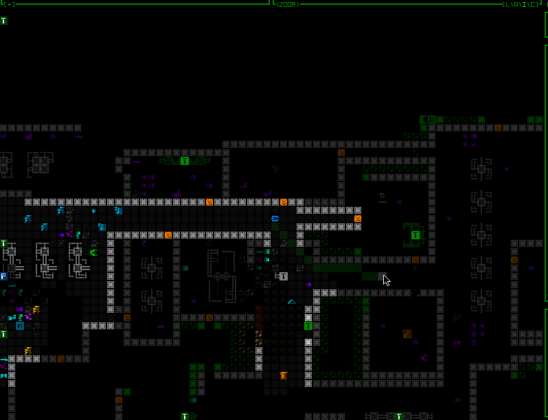
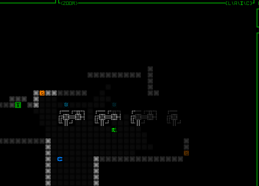
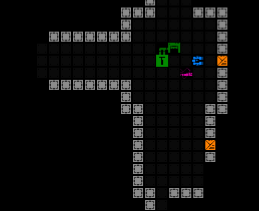
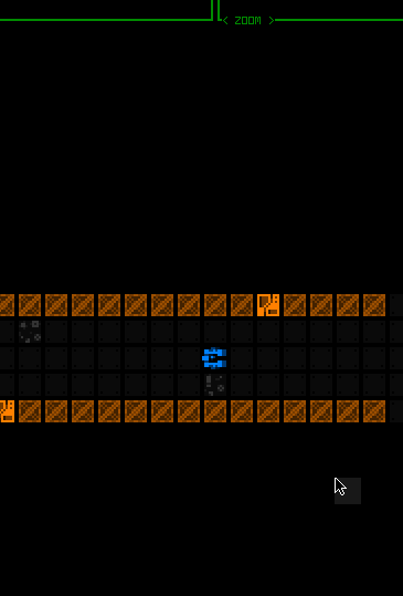
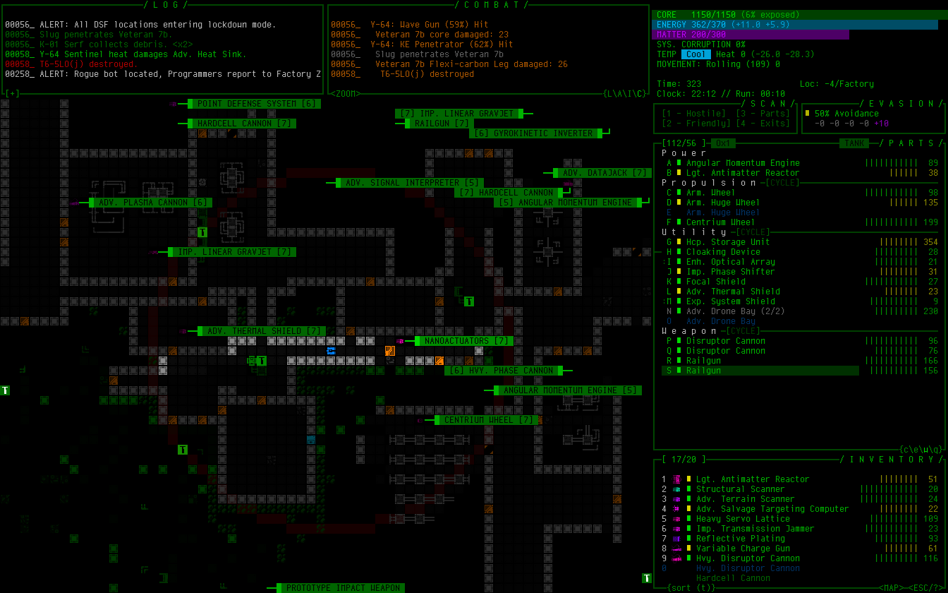
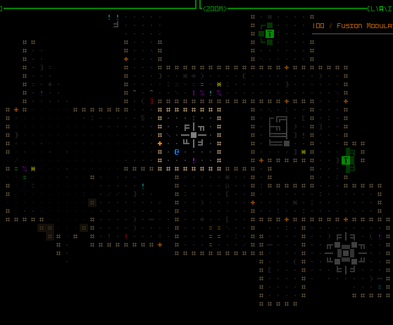
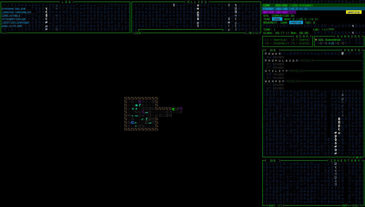
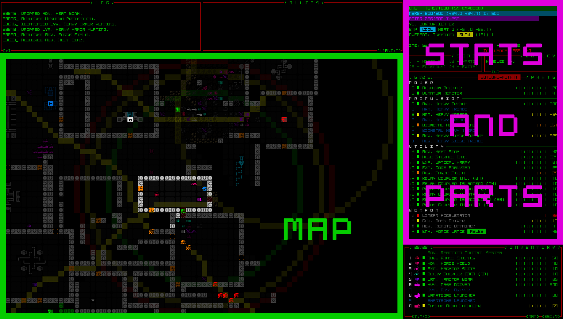
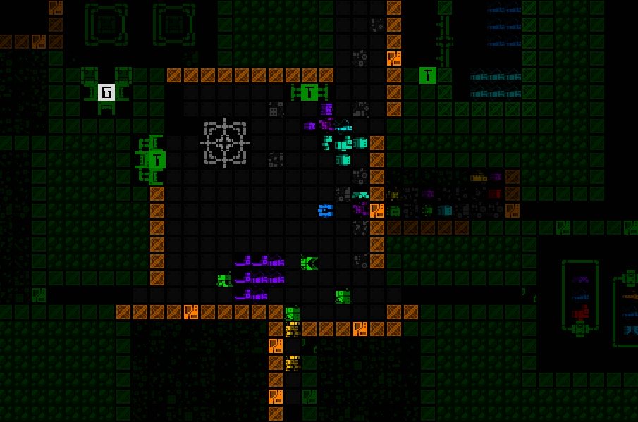
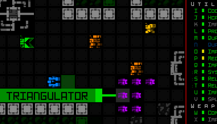
So far we have ways to try to keep important objects in view, but once you’re zoomed in on only a quarter of the normal map area it’s literally impossible to always see everything you might need to see in every situation. We need new indicators for important objects outside the current map view, especially those which are still within FOV (and probably even attack range!).

While manually panning the map or designating a centerpoint to keep an eye on a particular direction is useful, and temporarily zooming out to get a general idea of the surroundings is another option, to save time there are a variety of new markers that can appear at the edges of the map view to denote objects in that direction. You’ll see markers for offscreen hostiles, non-hostiles (both neutral and friendly), new items, and sensor data. Each marker category uses its own unique background color, and in the case of sensor data is also darker and blinks in and out to reflect the fact that it is not a directly visible object like the others. Items are only marked until automatically labeled for the first time after entering view.

cogmind_map_zoom_qol_edge_labels_robots

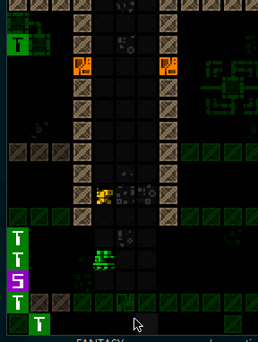
A demo of flashing offscreen zoom markers for visible robots (I have some drones out here to help demonstrate). Threats appear on a dark red background, while non-hostile robots use dark-green. As usual, the colors used are different if colorblind mode is active. (Also curse multitile robots and their special requirements, but yeah I got them working with this system too…)


cogmind_map_zoom_qol_edge_labels_items

Flashing offscreen zoom markers for new items, which use a dark gray background.


cogmind_map_zoom_qol_edge_labels_sensors

Dark offscreen sensor data markers with a low-frequency blink out effect. The range for this and other FOV data (which actually includes drone FOV that may be further away!) actually uses the non-zoom window dimensions to determine the extent within which to draw objects from, meaning this feature essentially serves the specific purpose of giving you more info about many things you’d normally be able to see if not zoomed in.

We’ve seen such map edge markers before, for map intel (for example known interactive machine locations) and also Cogmind or drones currently out of view. The latter appear a couple rows away from the map edge, so there aren’t any issues with overlap, though intel would technically be able to overlap these markers, also being up against the view edge. I’ve updated those to not only reposition to avoid any offscreen object markers, but they also avoid covering visible robots currently at the edge.

cogmind_intel_markers_avoiding_visible_edge_robots

Intel markers avoiding visible robots at the map view edge.

Similarly, the new offscreen object markers will also avoid covering visible robots.

cogmind_offscreen_object_markers_avoiding_visible_edge_robots

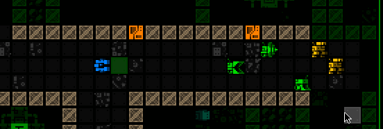
Offscreen robots markers shifting aside when necessary to reveal visible robots at a position they would otherwise occupy.

Offscreen Object Responses

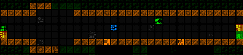
Indicators are great, but not quite enough. After all, what do you generally want to do when a new threat comes into view? A quick visual check! What exactly are they, what’s their status, do they have company, what’s the surrounding environment like… These can be important questions to answer before making your next decision, and by default Cogmind already pauses for a moment in these situations in order to let the player have a moment to take it in (and avoid accidentally wasting valuable turns), so why not also use that opportunity to automatically shift the view over to spot the threat?

cogmind_map_zoom_qol_view_shift_for_new_threat

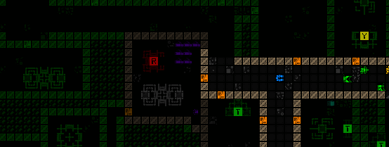
Automatically shifting the view a bit more to the left as soon as a Sentry is spotted down at the end of a corridor.

This feature is optional, but active by default.

cogmind_map_zoom_qol_view_shift_for_new_threat_multiple

Another autoshifting example, in this case simultaneously spotting enemies down two different corridors and shifting to put them all in view.

Notice that the shift leaves one space of padding to the edge rather than putting the hostile right at the edge, which is harder to see and there may also be other markers present, plus it’s nice to know a little of what’s around the target.

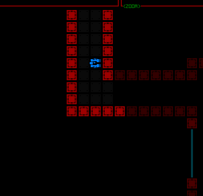
There are also a couple other important threats that don’t involve direct sighting of enemies, but that most players would probably find worth automatically shifting to see for better situational awareness.

cogmind_map_zoom_qol_view_shift_for_watcher_alert

The view shifts twice here, once on first spotting the Watcher, and again when it sends out an alert to some nearby ally.


cogmind_map_zoom_qol_view_shift_for_heavy_sensors

Heavy active sensor proximity alert!

We can use this shifting behavior for more than just enemies, too!

cogmind_map_zoom_qol_view_shift_for_machine_ping

There are a few special types of environmental pings you really want to know about, like machine pings. Show me that RIF Installer so I know where I can get my next fix!

Other Features

As part of this update I even added a completely new type of indicator, one that can come in handy even when not zoomed in. Sometimes those pesky Operators spot you and immediately zip out of FOV, much less out of view, on their way to their Terminal. At least there’s a log message reflecting that fact, though it may not be obvious where they were at the time. Now it will be.

cogmind_operator_reporting_response_animation

Operator reporting indicator, which remains for a short duration whether the position is visible or not.

Although available even while not zoomed, a new <HOSTILES> button that appears above the map while there are hostiles within Cogmind’s FOV was added primarily to facilitate play while zoomed in, offering another way to know and confirm that there are hostiles in line of sight, even if not currently in view. The button reports the total enemy count, and can be pressed to focus on and highlight the largest concentration of enemies. Pressing it again restores the centerpoint to its original area, or in some cases if there are other enemies not visible in the first highlight area it may be able to determine that and focus there instead.

cogmind_map_zoom_qol_fov_hostiles_button

Demonstrating basic functionality of the <HOSTILES> button, although in this situation there would be no strong need to actually use it.


cogmind_map_zoom_qol_fov_hostiles_button_return

Using the <HOSTILES> button to refocus the view on a new squad still out of view to the north.


cogmind_map_zoom_qol_fov_hostiles_button_multiple_out_of_view

Cycling between two different enemies that aren’t present in the same view. Remember that in targeting mode Cogmind can also cycle between visible robots, this is just another more general way to achieve a similar effect while not in that mode.

I also have notes on even more QoL ideas for map zooming, as well as ways to further extend these new features, but this seems quite good enough for now and we’ll have to see how more playtesting pans out.

Shortly before the first testing build went out I did my own playtest run, trying out both mouse and keyboard play while zoomed… it went well!

We’ve arrived at the end of our five-part adventure through the process of putting all this together:

Posted in Dev Series: Map Zooming | Tagged , , , , | Leave a comment

Full UI Upscaling, Part 4: Simpler Lightweight Fonts

So we’ve developed the theories, we’ve got mockups, we’ve got the necessary architecture… surely it’s time to start building the new UI layout, yeah? Not so fast!

It’s true we could start now, but on the horizon I could already see the increasing usefulness of another supporting feature, and decided it was a good opportunity to finally automate Cogmind’s font scaling.

Cogmind has always included many fonts available at many different sizes, all of these stored as bitmaps for pixel-perfect crispness. Each requires its own image file, and in the past I have always manually upscaled them to ensure availability at the appropriate higher resolutions, which means even more files.

Well with the advent of map zooming, which itself needs 2x upscale versions of all fonts within each set, and this whole UI upscale project, which unlocks an average 33% font size increase for everyone, we’re going to need quite a few more upscaled bitmap font files and going forward it doesn’t really make much sense to keep doing this manually.

REX, Again Again

Okay if anyone’s keeping count this will be the fourth time I’ve revisited the engine for a major update since starting map zoom and UI scaling work xD

Hi, REX.

I thought this would be a quick project, but it actually took several days to finally finish this feature because I ended up rewriting a lot of the engine’s font handling code, encountering a few challenging (hair-ripping) bugs along the way. The original system had made a lot of assumptions which would no longer hold true, and I wanted more features on top of the autoscaling as well, like only generating upscaled fonts once they’re actually needed (yay for faster startup), and having all font sets reusing the same source file share a single reference image in memory rather than having multiple copies of the same bitmap. Individually nothing too complex, just a lot of changes necessary to the original architecture to make these features possible.

Once again back in the good old REX testing environment, I set to testing two new syntax options for the font set configuration file:

  • “NewFontName [SourceFontName*2]” would create an entire new font set by upscaling an existing one, in this case by a factor of 2. (A font “set” means a collection of text, tiles, zoomed text and so forth, all categorized under a single name and selected as an option by the user.)
  • “<source_image_name*3>” is a sample of syntax usable in any single field for a bitmap font source image, instead taking another image and upscaling it by the specified factor.
rex_font_config_scaling_tests

A sample config file used during REX testing, in some cases with font sets purely loaded from files, and in others partially or fully generated based on existing sets or bitmaps.

This same format is used by anything else built on the engine, so both Cogmind and REXPaint can benefit from this, the latter of which I hope to also release a new version before long!

cogmind_font_scaling_demo_4x8mini_to_8x16

A quick autoscaling test back in Cogmind, here using a 2x scale of a 4×8 font, therefore turning it into a 8×16 font for a 960p window. (This 4×8 font is technically distributed with Cogmind, but since it’s too small to be reasonably considered by players, or needed at all, it is not available by default and must be activated manually.)

Cogmind Applications

Cogmind’s last public release, Beta 12, includes a total of 118 bitmaps font images, and that was before all the map zooming and Beta 13 work, so without this autoscaling feature that number would balloon significantly.

As of writing, Beta 13 has currently dropped that file count to 80, this despite the zooming, nine brand new font types, and supporting even more large options derived from smaller ones.

I had to spend a while going back through all those files to confirm which were original files and which were upscaled--in most cases there were records, but I had to be sure, and did find a few outliers to which I made further manual modifications to their upscaled versions, or sourced from multiple different sets. Those required special treatment, but otherwise it was really nice to cut down on the clutter.

cogmind_beta13_font_config_comparison

Comparing Cogmind’s original font config file to the new one with automated upscaling enabled (and zoom support!).

As of the current Beta 13 prerelease, the current max font size included with Cogmind is 48, needed for 5K displays, but with the new upscaled UI the max needed for that resolution will be 64! Definitely about time to get automated scaling…

New font sizes aside, this also saves time when new tiles are added and need to be inserted throughout the images, since tiles themselves are also part of the font bitmaps. Tiles aren’t added very often, but a new batch is indeed being released gradually over the next several versions.

Since I was working with fonts anyway, I also took advantage of this opportunity to add brand new options! In classic terminal roguelike style, some people like to switch their display font after a while in order to freshen up the whole experience, so in addition to others who simply want more options from which to select their favorite for readability or stylistic preferences, that’s another good reason to make sure there is a good variety of styles available.

The main two new typefaces are Tamsyn and Cherry, available at several sizes.

cogmind_screenshot_sample_tamsyn_24

Sample Cogmind screenshot using size 24 Tamsyn.


cogmind_screenshot_sample_cherryshadow_14

Sample Cogmind screenshot using size 14 Cherry Shadow,  for which I added a slight drop shadow I think looks pretty cool, especially on a light background like item labels.

While I was at it, I also made other font-related improvements, like having Cogmind’s options menu list fonts from largest to smallest to be able to more easily adjust style via the menu without changing map size. The original approach based purely on how they’re listed in the config file didn’t make sense, and I’m not sure why I left it that way for so long.

cogmind_options_menu_font_set_sorting

New sorting order for the font options menu!

Pixel Corruption

Shortly after releasing a build with autoscaled fonts to patrons, a wild bug appeared! Apparently some people were seeing artifacts on the display…

cogmind_prerelease_bug_font_scaling_artifacts

Screenshot excerpt showing visual oddities. (sample provided by Luigi; you’ll have to open it at full size to see some of the evidence)

At first we weren’t sure what it was, since it was only affecting a few people, and recent SDL DLL optimizations aimed at improving rendering speed had also been introduced as well. But bugs aren’t all that elusive if they only affect some people and a discernible, repeatable pattern emerges, which happens to be the case here. That these artifacts only appeared for players using very high resolutions suggested it might be an issue with font scaling, since all of the high-resolution fonts are upscales.

So I set up a bunch of tests to confirm, and eventually found that some large fonts ended up with these artifacts when scaled, and in all cases had a scaling multiplier of at least 3. How weird!

Anyway it’s now even more clear this has gotta be something with the scaling process, right, for which I had actually just plugged in SDL_gfx, a common companion library for doing this sort of thing. Cue stepping through its zoomSurface() function, specifically zoomSurfaceRGBA(), and while comparing how it handled a 2x vs a 3x scale operation, I noticed that there seems to be… a bug in the library?

SDL_gfx_suspicious_zooming_code

This code truncates the result of floating point arithmetic, which under the right combination of variables causes the intended optimizations based on these values to generate artifacts.

I’m kinda surprised since this library has been in relatively wide use for over two decades, and even continues to be used alongside subsequent SDL versions, but that code remains the same. Maybe most people tend to use it with smoothing/antialiasing turned on (I had it off because I want crisp), or are using less tightly packed tilesets (or even separate files for their images), all of which may help conceal such an issue from discovery? Or maybe there’s something else at play.

I replaced that whole optimized method with my own brute force scaling solution and *poof* the problem indeed disappeared. It’s only rarely called anyway--as mentioned before fonts are only scaled when they’re first needed, not before or ever again afterward, so we don’t need to worry about performance. (And anyone who actually does need to worry about performance should probably avoid doing this in software mode in the first place :P --that’s probably where all the other potential bug finders went off to…)

This is the fourth in a multi-part series about building Cogmind’s fully upscaled semi-modal interface layout:

Posted in Dev Series: Full UI Upscaling | Tagged , , , , | Leave a comment

Full UI Upscaling, Part 3: Dynamic Terminal Swapping

I was really happy to have come up with workable concept for a modal inventory, as well as producing a mass of mockups with proven solutions for all the potential hurdles on the road to dropping 15 rows from Cogmind’s interface. Or so I thought.

Suddenly at the end of that process, a review of remaining UI systems revealed an unexpected show-stopper: ending animations.

Cogmind has a lot of different endings (currently nine, with more to come), and all of them feature full-screen ASCII animations. While some of these are flexible enough to fit dynamically within any terminal dimensions, a good many were designed to assume a height of 60 rows. The only way to fit those into 45 rows would be a complete redesign…

I put a lot of time into the existing animations, and they make good use of their space, so one would hope there must be another way…

Terminal Swapping

What if… the terminal was still 60 rows during ending animations?

After all, there’s no strong need for the endings to be limited to only 45 rows--you’re essentially watching these animations for the overall visual effect rather than needing to interpret every little detail for gameplay purposes. As described at the beginning of this series, the reason for shrinking the base terminal dimensions is to enable larger fonts across the board, but the intent there is to facilitate reading and interpreting details, which we don’t need in this case.

So the theory is we use a 45-row terminal for normal play, but once we need to do an ending animation simply switch over to a 60-row terminal to display that, then switch back when done.

This reminds me of games that switch to a different display mode specifically for cut scenes, especially common (and noticeable) in early video games, and then later it became a big deal when those sorts of things could be done “in engine,” which is the norm nowadays. Cogmind has always been consistent about its display, but in this case I could ideally continue to make use of all the work that’s already gone into the animations.

Now come the important questions: Is the engine architecture capable of such a feature, and what other roadblocks might be in the way?

Technically the idea immediately showed some promise based on the fact that Cogmind already uses what I call “terminal swapping,” but only between frames and behind the scenes, specifically for special screenshotting purposes.

The main usage is for map output, or creating a composite PNG containing the entire current known map. This is useful for sharing interesting layouts with other players, or asking for advice about where to explore.

cogmind_map_output_sample_terminus_research

Map output shared by Terminus, showing a circuitous route through Research while seeking a particular exit (which ended up being near the entrance :P). (open for full size)

I also used it to produce an image marking the launch of Cogmind’s achievements, for which I wanted the background to be a matrix of many achievement icons.

Cogmind 256 Achievement Icon Matrix

An image celebrating Cogmind’s first batch of achievements, added in 2018. One day that number is going to get so much bigger.

Both of these use cases required generating an image larger than the screen, so a normal screenshot wouldn’t do.

Already armed with a built-in way to take a “screenshot” of the terminal contents (bypassing the screen itself entirely), if we build a larger terminal than the screen we can just as easily run the “screenshot” process on that to produce an even larger image.

With just a small bit of isolated code it’s pretty easy to temporarily replace the engine’s terminal with one of a different desired size, write to that, generate the image, then restore the original terminal as if nothing happened. We’re not actually rendering to the screen itself so resolution doesn’t matter, we don’t need to change the video mode, none of this is ever displayed, nor does any outside interaction occur.

This was a promising starting point, at least providing a theoretical approach for our ending animation management.

REX, Again

The above initial examples of basic terminal swapping are pretty much entirely Cogmind-side. As it’s happening between frames for the sole purpose of creating an image using the normal system, the engine doesn’t need to know or care about what’s going on. All that was needed was a simple function allowing the root terminal to be swapped out for another one.

Taking the next step and swapping the terminal with a new one that would exist for a longer duration, and even involve some level of player interaction, would be a much more complicated process, meaning it’s once again time to revisit the engine to expand its core capabilities, like I did not too long ago with the quads and octs powering the map zooming system.

Also once again, as an engine feature it makes more sense to head back to the simpler engine testing environment to build and debug it, rather than using Cogmind itself.

I was pleased, and surprised, to find that terminal swapping of an extended nature really wasn’t an incredibly complex operation with many repercussions. As far as the engine was concerned, it only required changing a handful of core variables, although beyond that I had to resolve some cursor-related issues, like crashiness related to its screen position and hover data, and the software cursor dirty rect status.

cogmind_source_REX_swap_root_simplified

A simplified view of the source code for REX’s terminal swapping process. Swapping back is essentially just reversing this procedure (normally handled by this same method, but I cut all that out in the interest of readability).

It took about a day to implement terminal swapping and work out all the kinks.

rex_root_swapping_first_success

The first successful root swap in REX, temporarily replacing the standard 80×60 demo terminal with a 120×90 terminal, while switching the font size from 6×12 to 4×8, so the window size remains consistent. This behavior simulates what would be required to run Cogmind’s animations using a smaller font while maintaining the same resolution.

The next stage in building this feature would be to import it into Cogmind while changing as few variables as possible. It doesn’t have to be specifically for endings, and we don’t even need to start by actually changing the terminal dimensions--simply swapping from the default 60-row terminal to another 60-row terminal and back would be sufficient to weed out any issues with regard input or other basic functionality. One step closer to a real use case scenario. That went fine as well!

When and Where

Having passed a simpler test, it was time for the real thing, but exactly where is the best opportunity for a swap to take place? Swapping is a pretty significant cutoff, after all, forming a clear barrier between what is before and after, and there shouldn’t really be much talking between the two sides, at least not on an interface level.

As stated at the beginning, the goal here was to allow animated endings to use 60 rows instead of 45. Given the simplicity of terminal swapping at the engine level, it seems easy enough…

As so many things are, up close it no longer looked so easy.

I originally imagined just having the animation segment of the ending in a different terminal, and tried that for a bit, but the endings (there are so many xD) are a relatively complex collection of classes and processes since they mix and match different components, and it was really hard to untangle what needed to be untangled. Even before considering swapping needs, it turns out that in many cases the process involves multiple windows in varying states of visibility and overlap. While swapping right before an animation would be possible, it would likely be pretty tough to both implement and debug.

Then a new idea popped up: How about instead of focusing so tightly on the animations we move one level higher and handle the entire game over process in its own separate terminal interface? This would include the standard game over screen (losses as well), stats, and restart menu etc. This is a much cleaner break, far easier to pull off without worrying about any serious complications.

cogmind_root_swapping_first_success

The aftermath of the first [mostly] successful root swap in Cogmind, having gone through an ending and starting a new run. Some of you will recognize what’s going on there… Clearly some bugginess to be resolved, but it didn’t crash and we’re back in action for a new run :D

The only drawback is that said stats screen would then be in the 60-row terminal interface using the original font size. In other words, back to the smaller font. Still, this might be fine since it’s 1) just text, 2) not a lot of text, 3) only in that one spot, although if we wanted to we could perhaps use the new zoom text font size to display it. Doing so would require reducing the number of listed stats in order to fit in the available space, at least if trying to keep the vertical design. They’re only a tiny subset of those found in the massive scoresheet data, anyway, but I don’t like the idea of further slimming down the already short representative list, so it’s either accept a smaller font size for that particular screen, or eventually go as far as a more significant redesign that makes more use of horizontal space. I tried a few mockups but didn’t like any of them, so nothing will probably change with that at first.

While working on this whole terminal swapping business I also happened to discover that if you manage to close the game window during an ending animation (including the loss animation), it would not overlay the separate program close animation that I added some versions back. This is not an uncommon occurrence, inadvertently uncovering obscure bugs in old, or in some cases very old, parts of the source that were simply never encountered or noticed before. Always a good opportunity to stay alert and fix things :)

cogmind_exit_program_during_death_animation_fixed

A snapshot of what it looks like if closing Cogmind during the loss animation, including the new zoom font used for the strip added in Beta 13. Technically at this point the terminal is swapped as well.

One final note: For an article about new tech to support ending animations, there is a curious absence of samples demonstrating the primary use case, but I figured I’d leave those out ;)

This is the third in a multi-part series about building Cogmind’s fully upscaled semi-modal interface layout:

Posted in Dev Series: Full UI Upscaling | Tagged , , , | Leave a comment

Full UI Upscaling, Part 2: Holy Mockups!

Last time was all about exploring a high-level direction for Cogmind’s shift towards supporting an increased size for interface fonts and tiles by reducing the amount of space available to display information, beginning especially with the map view. Now it’s time to make concrete plans to determine what we can actually fit into a 45-row terminal. Concrete interface plans means… mockups! Lots and lots of mockups.

During my earlier Year 10 of the Cogmind post I shared a collage of the initial set of mockups put together in late November, so today we’ll be referencing a bunch of those individually to examine what needs to happen in order to construct this new UI layout.

Cogmind 45-row UI Mockups Collage

Mockups put together in REXPaint during a dev stream in preparation for Cogmind’s new UI layout (open for full size).

We’re now working under the assumption that almost everyone is using a widescreen aspect ratio display. Over a decade ago I didn’t go that far, instead supporting 4:3 by default and allowing for dynamic windows to fill any remaining width. The change doesn’t mean 4:3 players won’t be able to play, of course, there would simply be some letterboxing on the top and bottom (there aren’t yet any plans to make the full game height dynamic, although it wouldn’t be impossible to make it so at some point, just as width is dynamic now).

Before we continue, know that all mockups are designed in size 12, and all of them can be opened to their full size for closer inspection if desired. Also their content may sometimes include items and hint at mechanics that don’t actually exist--we’re just doing layouts, those details aren’t important ;)

It’s mockup time!

Main UI

Cogmind’s main UI is where the player spends the vast majority of their time, and the original goal of its design was to ensure that it provides immediate visual access to anything an experienced player needs without opening any other windows. Dropping from a 60-row to 45-row terminal is going to force us to bend that requirement, so it’s just a question of what to remove.

If you recall from Part 1 I showed a diagram highlighting the absolutely essential parts of the main UI, and the stored inventory is the only subsection of the right-side HUD that is not included in that highlighted area.

Modal Inventory

While a visible inventory can be quite helpful, it’s not what I’d consider absolutely necessary.

Now I wouldn’t have said that many years ago in early Cogmind development, but in the years since then we’ve gotten a lot of inventory-related QoL features that reduce reliance on the inventory window in the first place, for example the slot-specific type-wise swapping menu, or part auto-replacement which makes some common inventory management possible without even looking at the inventory at all, much less directly interact with it.

cogmind_partswap_mouse

Slotwise part swapping, which doesn’t require any direct interaction with the inventory. (This old demo recording also includes some usage the inventory-first version of that feature, which isn’t relevant here, and I’m not even sure if anyone even uses it…) Keyboard input has the same access, though it’s harder to follow a recording of that so I’m sharing the mouse version.

Altogether this suggests that our number one target for info reduction is to turn the inventory into some sort of modal window as found in pretty much every other roguelike.

cogmind_mockup_semimodal_ui_main

A basic 45-row main UI mockup without the inventory window.

It just so happens that the inventory alone saves us 14 lines of height, which is a mere 1 line below what we need :D

The other recovered line comes from removing a previously empty line from the top area, as marked by my notes on the mockup. With the data in that area becoming even denser, the order of the two bottom lines is swapped and the less important optional ones (if visible at all) are darkened to regain some of the desired visual separation.

The inventory is accessible via a button at the bottom of the parts list (and if it works out, simply moving the cursor over that button will also show the inventory and allow interaction that way, no click required).

cogmind_mockup_semimodal_ui_main_modal_inventory

The inventory window in its original form would simply pop up next to its original position, adjacent to the button. The button itself can hold the inventory capacity information normally displayed at the top of the inventory.

Pure keyboard players would be able to toggle the inventory window with the ‘i’ key, newly relieved of its functionality as described during the map zoom polishing stage. It will also likely automatically appear/disappear when using related “modal part commands” (the ‘p’ menu).

Aside: I’m currently writing about some of these new UI layout interactions in hypothetical terms, since these are plans rather than actually implemented at this stage, so there may be unforeseen roadblocks or alternatives necessary with respect to specific functionality depending on how everything works out in practice.

Another concept for supporting this new modal inventory is an indicator that pops up in the bottom-right corner of the map showing the name of the item and pointing to the inventory button any time an action adds an item to the inventory (such as picking one up) when it is hidden. These indicators could stack if there’s more than one in a short period, and disappear after a duration. Optional and adjustable, of course.

Dynamic Parts Window

Now it may be that experienced players well-versed in Cogmind’s inventory-related QoL features and familiar with parts, mechanics, and strategies won’t have much trouble managing a modal inventory if necessary. It does, however, interfere a bit with the natural flow of Cogmind’s highly accessible drag-drop interface, a fact which combined with hiding the inventory’s existence by default is not as great for new players.

Does the inventory have to always be hidden? The answer is a resounding NO! Also yay!

While Cogmind can eventually acquire up to 26 item slots to fill, that number starts at only 7, meaning we have 19 lines which start out unused. Recall that the inventory requires 14 lines, and you can see where this is going…

cogmind_mockup_semimodal_ui_dynamic_parts_list

The normal inventory window displayed below a shorter parts list that doesn’t yet make use of its full height.

For however long the parts list is capable of appearing in a shorter format and still show everything it needs to (vital, after all), the inventory can just be visible as normal! On starting a new run, with the inventory visible there are still 5 lines of extra space for slots going forward, meaning the inventory does not need to enter a modal state until Cogmind’s third evolution, or entering -7/Factory.

Technically we could also have the parts list shrink again and unhide the inventory if your total slot count is once again reduced below the threshold, for example due to host switching in Polymind, or for, uh, other reasons some of you know ;)

While thinking about all the ways to save space, I also came up with an even more extreme version of this “dynamic parts list,” one that would be optional and definitely off by default. It also wouldn’t even be implemented right away as part of the first iteration, but since we’re talking about mockups we might as well look at it--mockups are practically free :P

cogmind_mockup_semimodal_ui_dynamic_parts_list_no_headers

A header-free concept for the dynamic parts list.

Removing the headers and corresponding separators between slot types from the parts list gives us back another 4 lines, equivalent to 2 more evolutions, meaning under this layout style the inventory would not become modal until entering -5/Factory, or half way to the surface.

It’s harder to parse at a glance, but does save space and the essentials are still there, with categories instead reflected with light or dark bars along the side, and I guess they’d need to double as cycle buttons for mouse users who use those (as they normally appear along the separator line).

And with that our main UI is essentially taken care of! The changes I’ve described so far in support of a 45-row interface are enough to keep our main UI highly playable, which was what I was mostly worried about to begin with, being the main UI and all. I was pretty pleased with the [hypothetical] results this should produce, and it’s the main UI so that means we’re mostly done, yeah?! Well, no it turns out there are actually quite a few other things that need to be modified as well xD

Info Windows

There is a range of secondary info windows we’ll need to take a look at, some of which have always been especially crowded, so they could present some new challenges. This category includes item/robot/machine/status info and the machine hacking windows.

What really links all these as part of the same group is that they share the same dimensions and open in the same area: over the map. Based on the original assumption of a minimum 50×50 map view, they were all thus designed for a height of 50 rows. Now what happens when not only the map view is no longer large enough to contain them, but even assuming we no longer limit them to that area, the 45-row interface as a whole isn’t even big enough xD

The most worrisome of the group is item info. In many cases it’s fine with space to spare, but a portion of items have always pushed up against the height limit. Scrolling for stats is something I never want to require on principle, so we have to make do with what space we have.

Potentially helpful here is a feature I already conceived and implemented months prior to even considering a new UI layout: The possibility of a button to open additional mechanical details unique to an item. Item and effect descriptions normally hold this info, especially relevant to utilities, but there were always a handful of weapons (which mostly fill their window with stats) that also have abilities and there isn’t much room to explain those.

cogmind_part_info_expandable_sample_multitool

More!

This will be especially useful going forward as we get more and more unique items. But for our new layout it’s not enough! Nor is it even suitable since this is only for exception parts rather than the norm. Regardless of this functionality, what used to require up to 50 lines now only has 45. In the end the answer is pretty obvious:

cogmind_mockup_semimodal_ui_item_info

Item info mockup, with art displayed off to the side.

Item art occupies a height of 10 in the item info window, so let’s just move that aside and there’s plenty of space.

Examining the other mockups in this category…

cogmind_mockup_semimodal_ui_robot_info

Robot info generally fits, although there are probably one or two cases of robots that have a ridiculously long list of parts and resistances that could cause it to extend outside the window bounds. I’ll just wait and see where this is an issue.


cogmind_mockup_semimodal_ui_status_info

Status info can sometimes exceed 45 lines, but I’ll be alleviating some of the pressure by removing two lines of low importance, and we may need a pop up to display the full list of damage resistances or modifiers? This is another case where I’m just waiting to see it in action and will decide what to do then.


cogmind_mockup_semimodal_ui_hacking

The hacking interface is essentially okay as is. With a completely full direct target list (not all that common) it still fits, even if the resulting output area to the bottom ends up on the small size. At most this window might have to cut short the list of relevant hacking utilities shown (if someone has an absolutely insane number of them in possession), which are there mainly as fluff anyway.

Escape Menu

The multipage Escape menu, or game menu, is a bit problematic.

It was designed around a 50-row map view, allowing us to display individual page info over the map while also displaying all the commands directly in their relevant main UI windows. I wouldn’t want to redesign it all to change this behavior, and not only because that would be a lot of work, but it was done this way because I very much like the immersive feel provided by that level of integration with the main UI. So we’ll have to find alternative solutions for whatever problems arise… and they’ll definitely arise considering the available space was reduced from 50 rows to 35, a 30% loss xD

The game menu and basic commands page (1) is fine, since that’s kept simple to avoid overwhelming new players with more than they need to know right away.

On the other hand, there’s no way the advanced commands (2) would ever fit. They fully-utilize the map view space, and I had to keep some of the more esoteric ones off the list in the first place, relegating them to the full in-manual list since there simply wasn’t enough room, meaning what is shown with 50 lines is already a somewhat slimmed down version. I tried to see if a two-column approach would be possible in order to fit the minimum required set, but the width is insufficient.

The answer is, finally, subpages. Advanced commands in the map area will just have to be given another page accessed by Left/Right or buttons at the bottom.

cogmind_mockup_semimodal_ui_advanced_commands

The first page of advanced commands when divided into multiple pages.

Seen above, with our dynamic parts list height the loss of rows also affects the space available to show its commands, but a number of those were either not really used or already covered in the basic commands, so I slimmed that one down just enough to fit.

In-game manual access (3) is pretty dynamic already since it’s just a list of topics and blocks of text, so no issues there.

The options menu (4) is already divided into to columns, both of which mercifully fit into even a 35-row area (well, 33 because we need the menu bar as well). We can attribute this favorable result to the fact that unlike the command list it’s an interactive window, and keyboard players need access, too, so we have lowercase options on the left and uppercase on the right (26 each, plus some lines for headers and category spacing).

What doesn’t fit due to the resize is the option descriptions, which normally display in an area below the options list when hovering the cursor over one. That can be simply be moved to another temporary popup window and we’re done with this page.

cogmind_mockup_semimodal_ui_options_menu

The options menu in a new layout, with dummy text showing to the side.

The news page (5) is quite simple. No worries there.

Credits (6) doesn’t have a ton of info on it, but definitely gets more squeezed than I prefer, removing a lot of the extra spacing that was available before. In the interest of finishing Cogmind some time this century, I’ll accept it ;)

The Records (7) page itself is just a menu to access more windows so no problem there, but the windows it opens are problematic. Lore Collection, Gallery Collection, and Achievements were all built to the same specification, 55 rows, so we’re going to need to hack away at least 10 of those from each…

For comparison here is the original Achievements mockup used to build the one currently in Cogmind, designed for a 160×60 terminal:

cogmind_mockup_achievements_ui

Cogmind’s current achievements UI (mockup). You can read all about how it was put together here.

To squeeze everything into 45 rows we need to reduce the number of achievements shown at once, merge and align the menus on the left, and, most importantly, find another way to display the secondary windows below the main one. This latter part is especially important, because all three of our interactive records interfaces use that same format, so whatever happens here needs to work for all of them.

It turns out there’s just enough width to move those things off to the right side, and then the new height comes out to be almost exactly what we need.

cogmind_mockup_semimodal_ui_achievements_ui

The new Achievements UI compatible with a 45-row layout (the page-wise object counter originally in the bottom left now appears along the top-left border of the main window, which is probably a better place for it anyway, even if it draws less attention there).

I prefer the original layout--spacier, better delineation of areas, but it’s gotta fit within our new restrictions, and thankfully it does without any more hacking.

Lore Collection is the easiest of the three, since like the manual it’s composed of just a topic list and corresponding text blocks. This means we can reduce the height without any real consequences in terms of functionality, and it’s fairly easy to do.

cogmind_mockup_semimodal_ui_lore

The Lore Collection UI shown instead with the new sidebar elements.

The Gallery Collection gets a bit cramped, removing almost all the extra spacing that was available in its original iteration, and also losing the extra lines devoted to providing extra information for those alpha supporters and others who have their name associated with a particular item (the original purpose of the gallery). I’ll have to figure out a new way to provide that info.

cogmind_mockup_semimodal_ui_gallery

A much more cramped Gallery Collection UI (green blocks used to delineate element area for formatting purposes, not representative of what it’s supposed to look like).

It’s cramped, but it still works. Unlike with Achievements I didn’t want to further reduce the number of object visible at once, since it’s already just nine…

World Map

The world map UI was also built to fit within the map view area, requiring a minimum of 50 rows. We can easily give it the full vertical space, so 45 lines, but that still isn’t enough for its current layout.

It just so happens I wanted to redesign it anyway, since as linked there the original focus was on animating the complete route, which may have not been too bad many years ago, but Cogmind’s world has expanded greatly and routes can get quite long now (which means it takes a while to fully trace). Furthermore, the architecture is such that it actually has to animate the whole thing in order to draw it at all, and it can only be sped up so much, so yeah, something needs to be done here.

cogmind_mockup_semimodal_ui_world_map

A new 41-row mockup for the world map.

It turns out that the original style still works fine, and I rather like it because it provides a very condensed format for reflecting all types of movements, transitions, and maps. Simply by removing the one extra line of padding between each depth we end up with a 41-row interface, which will fit! Like some of the other changes before, it’s a bit cramped but works fine.

I will still have to rebuild it to enable snappy opening, but at least the design is familiar and effective.

A Huge Problem

It was only after drawing all the mockups and taking a ton of notes that I was going through to make sure I hadn’t missed anything when I realized there is a huge problem: the intro/ending animations. Especially the latter. There are a lot of them, they’re pretty involved, and all were designed specifically for a terminal of 60 rows. Wider is fine, but they can’t be adjusted for something shorter. Oh no.

For that I came up with a crazy solution that I’ll be covering next time, in yet another engine-related detour…

This is the second in a multi-part series about building Cogmind’s fully upscaled semi-modal interface layout:

Posted in Dev Series: Full UI Upscaling | Tagged , , , | 2 Responses

Full UI Upscaling, Part 1: History and Theory

A long time in coming, but here we go! This marks the beginning of what will be the most significant undertaking in Cogmind’s UI development history: making everything bigger. Not just the map, for which zooming was recently implemented as a toggleable option, but all the text as well.

This will be fun since I do love me some interface work, as evidenced by the massive number of optional QoL features I’ve introduced over the years, but despite pouring many hours into accessibility and streamlined gameplay before, this particular feature took the longest to get to.

Back in Cogmind’s early years I gave strong consideration to implementing it then--put together some mockups, discussed options with the community, and so on, but the time wasn’t right. Back then I couldn’t nail down what would be the most extreme (but still acceptable) options. We didn’t yet know what reasonable limits to put on such a feature, as in what’s the absolute furthest it could go without compromising other parts of the game design. It had to wait.

Being the way a player interacts with all of a game’s content, UI is naturally central to the experience, thus one of the most fundamental aspects a game’s design needs to address is matching up that design with its corresponding system requirements, including the display device!

To take an extreme example, there are obviously different considerations when developing for mobile vs desktop, and the results of the different decisions made to optimize a design for the target platform is also why ports between various platforms don’t always come out the same, whether technically or in terms of feel.

Not surprisingly, starting in the 2010s there began a trend towards developing games in order to ultimately target as many different platforms as possible (desktop and consoles being the most common crossovers), and it was very interesting to see player reactions to this trend, especially PC players lamenting how games were changing to ensure they could accommodate consoles as well. A necessary evil if you want to maximize profits, I guess :P

Finding middle ground so that more people can enjoy a form of entertainment is in some ways also a noble goal, although this naturally waters down the experience at the same time. The more strict your requirements, the more you can make assumptions about the target player’s experience, and in turn optimize a design for what you know to be true. Basically if done right, the end result will be better, for that particular group of players.

And that’s the backdrop for how Cogmind came to be born in its original form over a decade ago, wanting to have a large enough terminal grid to be able to simultaneously show a huge amount of info at once--Cogmind’s terminal dimensions are easily the largest of any roguelike, and also better support very large and active maps--Cogmind has the largest maps of any subterranean roguelike, and also by far the most active maps, with lots of entities milling about doing their own thing, some more or less important than others, but all worth of being aware of for various reasons.

The scope could not be so ambitious without what I decided at the time: This design will lean really heavily into having a large screen to play on. “Large” meaning physically large, resolution being irrelevant since we’re talking about a traditional terminal here, all that info simply appearing bigger when the screen is bigger, the display always being divided into at least a 160×60 grid. (By comparison, the classics use 80×25, and some later roguelikes use something in between, so Cogmind has nearly five times as much display area as the original roguelikes, or several times what is found in some other later roguelikes.)

Fast forward more than 10 years, and a much greater portion of people now play games on laptops, not to mention a greater variety of players have begun discovering and becoming interested in Cogmind, so the demand for alternative interface options is clearly growing ever larger.

Even if not the original target audience, I always wanted to accommodate more people when possible, and although my intention was to wait until somewhere around 1.0 to experiment with the possibilities, it’s also becoming clear that there’s no idea when Cogmind 1.0 will actually happen :P

Fortunately at this point we also have a very clear idea of Cogmind’s development needs, how players interact with the game, and pretty much all the UI considerations and limitations that we’d need to take into account to design the “most extreme” alternative interface layouts that could still work.

So it’s time to do that.

UI Requirements

Cogmind’s original UI concept had two basic requirements: a sufficiently large map view area, and a persistently visible list of all parts.

cogmind_essential_UI_areas_highlighted2

Interface components we can’t really do without, even if some were to take a slightly different form. Basic stats reflecting current resources and status are also pretty important!

Parts List

Unlike pretty much every other roguelike in which the player has a mostly persistent set of equipment, Cogmind’s parts list involves items that are subject to frequent tweaking and toggling, or at least warrant much closer turn-by-turn observation due to damage and/or status changes. The list also includes up to 26 different slots at once, whereas other roguelikes generally have half that, at most.

As such, being able to see and interact with this list in its entirety at all times is quite important, so it was given its own area on the interface. That will always be there.

cogmind_parts_list_various_late_game_RIF

Sample parts list.

Map View

Seeing the map, where most of the action happens, is also kinda important, too. But how much of it do we want to see at once? How large does this view need to be?

Cogmind was not designed to require widescreen support. In fact, the UI layout we have was originally built to fit snugly in 4:3 aspect ratio, only expanding horizontally to fill more space as available.

Therefore although it can be expanded to show more area, under that layout the minimum map view area allowed was set to 50×50 (in terminal dimensions this is actually 100×50, because map cells are square rather than rectangular, each occupying two terminal cells).

The number 50 is incredibly central to Cogmind’s design, because almost no weapons or active intel should have a range that can exceed the area a player can see by default. Cogmind being a game focused on ranged combat, repeatedly getting attacked from out of view would not be great, nor is having data on enemies roaming around you in multiple directions, known but out of view. These and other drawbacks of a small view area don’t make for an optimal play experience.

Assuming map view dimensions of 50×50, placing Cogmind at the center means the player can see out to a distance of approximately 25 or more in any direction. So ranges should for the most part be kept within that value.

Another reason to have a decently large map view in the first place is, again, the sheer size of maps to explore, and the potentially high level of local activity out there. A view area as large as 50×50 can still only see a mere 1/16th of the area comprising primary maps--more for some smaller maps, and even less for larger ones.

cogmind_sample_default_map_view_area_vs_full_map_size

Demonstrating a 50×50 area visible around Cogmind as seen while exploring a map (export provided by Mojo).

Like some roguelike classics, in TGGW it’s quite nice that you can see the entire map at once without any scrolling whatsoever, though it was clearly designed for such from the outset, with correspondingly short attack and sight ranges, and a smaller amount of concentrated content per floor, making each floor experience short and sweet.

TGGW_screenshot_04

Sample screenshot from The Ground Gives Way, with a mostly-explored map floor showing its layout.

Cogmind needs space for the scope it aims to fill, and a UI to match that, or at least facilitate exploring it instead of having to scroll a million times to form a mental picture, or constantly checking different directions to be aware of potentially impactful developments out there.

Basically from a gameplay standpoint roguelikes are best built with an optimal interface designed with optimal play in mind.

But now let’s switch gears and see what we can do in terms of making everything larger by breaking that design while attempting to mitigate the downsides :D

Alternative UI Layouts, an Evolution

Back in late November over on Patreon (and made available to everyone a little later) I put together a diagram and basic explanation for a hypothetical route Cogmind’s interface could take on the way to something that would expand the potential number of players for which it’s suitable.

Here I’ll be diving into that diagram again to give a more organized summary with some extra details.

Cogmind UI Layout Phases

General overview of potential semi-modal and modal UI layouts for Cogmind. See below for explanation.

Phase 1

The first phase is Cogmind’s current UI layout since mid-2013 when I started the commercial version (the 7DRL version was slightly different, always using 4:3). I’m using 76×50 for the map dimensions since that is the default map view width for 1080p users, which comprise the majority of players. As you can see, both the base sight range and good sensor/attack ranges are safely within the map view (these images are all drawn to scale!).

Phase 2

Before I started considering an immediate move to an across-the-board increase in cell size, I experimented with just zooming the map. Early experiments were promising enough to convince me to just do it--plow through the implementation and see what it feels like in practice (I wrote a series on that).

Cogmind map zooming (WIP)

Quick map zoom recording taken while implementing the related animation work.

One argument for prioritizing map zoom over figuring out how to enlarge the rest of the UI (if even possible) could be that such an approach might just be satisfactory for some players who say they’d prefer “a larger interface.”

Most play time is spent looking at the map, after all, and although this would not impact text in the rest of the interface, humans are better at recognizing familiar letters at smaller sizes than, say, game-specific monochrome sprites on a map. While Cogmind’s tiles were designed to be fairly recognizable via general shape, that’s still not comparable to our existing familiarity with letters (on that note, this is also why Cogmind ASCII mode can be more easily enjoyed on smaller screens than tiles).

That said, for everyone else who still can’t handle the smaller text, a zoomable map would only serve to further highlight the disparity between tile size and text size. Not only that, but as you can see from the Phase 2 diagram above, playing with the map zoomed pushes even base attack/sight/intel ranges somewhat out of view, much less enhanced the ranges. We’re going to need some powerful QoL features to make that playable in a serious capacity! (Update 240211: Some time after finishing this article I put together another piece detailing all that, with numerous demos.)

In that light, I decided it wouldn’t be a great idea to release just a Phase 2 UI with map zooming. I think for a lot of people it would feel more like a band-aid than a complete solution, and the latter is what I’d rather provide, especially as this will define a portion of peoples’ first impressions of a “new and improved” UI.

Phase 3

Phases 1 and 2 combined are basically the same old Cogmind interface, just with the ability to zoom the map (and supporting QoL features in that case). Phase 3 is a significant departure from the norm and requires a lot more work to realize.

The differences start at the lowest level, converting what has always been a 60-row terminal console to one that only requires 45 rows. This allows for an up to 33% increase in font size from what everyone is using now. For example if you have a 1080p resolution, 60 rows translates to a font size of 18 (=1080/60), where 45 rows would instead translate to a font size of 24 (=1080/45). So anyone currently using a size 18 font would see their maximum increased to 24, a 33% boost.

cogmind_resolutions_and_font_sizes_2024

A summary of the most common resolutions and the corresponding font size increase enabled by a 45-row layout (among a few even lesser-used resolutions than these top four, the increase might instead be closer to 20%). It’s interesting to compare this chart data to a similar one I made back in 2014 in an article about fonts, when the most popular resolution 1080p stood at a much lower 33%, and 768p was ranked a much closer 25%. 1440p/2160p were barely footnotes by comparison and there was a somewhat wider spread of resolutions in use.

The increase in font size results in a 44% reduction in total space to display info, and a 54% decrease in visible map area, which is a lot, but the latter is at least less severe than that caused by Phase 2 map zooming, which drops visible map area by 75%! The main difference is that Phase 2 zooming can be toggled in real time, whereas this info loss to accommodate a 45-row architecture by default is not capable of seeing full ranges as originally designed.

That said, as long as the QoL features built around map zooming work out well enough, they can also be of help in the Phase 3 UI, which technically already handles most ranges fairly well, and keeps the base sight range fully within its boundaries.

cogmind_interface_phases_potential_layout_evolution_phase_3

Overall I believe if given a choice between using a Phase 1/2 interface or Phase 3, the latter is probably a preferable default (except for among a good portion of current/frequent players who are quite used to having easy and efficient access to all the info provided by the regular interface).

And once players are using this Phase 3 layout, map zooming will likely become less useful overall (docked before it’s even been introduced xD). For one it would shrink the map view even more ridiculously, while turning size 24 tiles in our 1080p example above into 48px tiles, which is kinda huge :P

cogmind_semimodal_ui_layout_1080p_map_zoom_sample

Combining map zooming with a 45-row interface is… yeah. (sample assuming 1080p resolution, open for actual size, which is even larger than it appears here)

That’s probably overkill for most needs, though I can see zooming occasionally coming in handy for some people who still prefer the regular UI layout. In any case we’ll have stats on preferences in the future, and it’ll be very interesting to see how usage of various modes, and map zooming, plays out. (I can say that so far among the patrons who have access to test builds with zooming/Phase 2 enabled, almost no one is making serious use of the feature, but that’s not saying a whole lot because they were frequent players used to the playing without zooming to begin with.)

One welcome side effect of the font size increase is that 1080p players, who as noted form the majority, will be using size 24, which is a 2x upscale of the base tile size, in other words the original size for which the tile designs were optimized! Both myself and Kacper (the tileset artist who created most of them) are very happy about this :) (2160p players will also have access to such a multiple as one of their options)

So the next job in this process is to figure out how to squeeze Cogmind’s normal 60-row interface into only 45. Say goodbye to 15 rows from… somewhere :P

This will require a fair number of window and content adjustments, but it’s doable, with the biggest change being a semi-modal inventory. I’ll cover that part of the design in my next article, along with mockups and a more detailed look at just what we need to change.

One potential drawback of our map view returning to its original “pre-widescreen” width of 50 is that it goes against the flow of Cogmind’s on-map QoL design work. Because pretty much everyone has a horizontal rectangular map view wider than the area originally required by design, over the years we’ve benefited from some new interface elements that appear directly over the sides and/or corners of the map--alert messages, full combat log, special mode UIs, audio log, achievement popups… These will now be closer to Cogmind and potentially crowd the view under some circumstances, so we’ll have to see how they fare and whether some kinds of new adjustments are required.

Anyway, after being pleasantly surprised by the map zooming feature of Phase 2, I look forward to seeing how Phase 3 turns out :D

cogmind_450p_mockup_zoomed

Funny enough, with a new 45-row minimum terminal height Cogmind could be played using the size 10 font in a window as small as 450p! (mockup shown here with zoomed map, open for “full size”… okay the crisp version) The original minimum was 600p.

Phase 4

Phase 3 is definitely being worked on now, with plans to release it in early 2024. There is no timeline for Phase 4, and whether or not it could even happen depends on the outcome of Phase 3, but purely in theoretical terms it seems like a natural progression from Phase 3 that isn’t completely out of the question.

cogmind_interface_phases_potential_layout_evolution_phase_4

In the interest of reclaiming more of our map view, I like the concept of making the top-side windows modal as well, and see it as a reasonable possibility, if requiring yet more compromises to convenience and gameplay efficiency.

At the same time, doing this would have some nice advantages over Phase 3, like almost fully restoring our original 50×50 map view, and also alleviating some of aforementioned corner/side pressure caused by other on-map UI elements.

This is the first in a multi-part series about building Cogmind’s fully upscaled semi-modal interface layout:

Posted in Dev Series: Full UI Upscaling | Tagged , , , , | Leave a comment