Last week I had the honor of being invited on Roguelike Radio for a bit of a catch up on Cogmind development and relevant segue into the interesting topic of “designing for mastery.”
It’s been ten years (ten years!) since the last time I was on Roguelike Radio for Cogmind in particular, back in 2015.
This was not long after the game’s first commercial release, when I felt like there would be maybe one to two more years of development to go before moving on to something else--you know, like a normal “indie game” :P
Well indie game or not, more importantly Cogmind is a traditional roguelike, a genre in which numerous factors contribute to historically long dev times, plus I have a habit of sticking to projects for unusually long periods, which as it turns out is compatible with the fact that there was (surprisingly!) enough support to simply continue working on it full time, all the way to this day ten years later xD
The full recording of our talk can be found here.

So yeah we talked for about an hour, and unfortunately I had taken some medications earlier in the day that were still making me a bit drowsy, which combined with the broad nature of such a topic resulted in what I feel was probably a somewhat chaotic discussion that maybe didn’t do it justice in some areas. (I admit this is just a feeling, since I’m not one to go back and listen to myself ramble--maybe it’s better or worse than I imagine, but I have no idea haha xD)
Anyway, definitely on me being responsible for the rambling, not Darren (the host), though we probably did at least cover a lot of the main points! But it being such a cool topic, I did want to put some of these ideas into a more organized written form, and what better place to do that than here on the blog :)
Aside: Blog’s been quiet for longer than usual! As always I’m still working on Cogmind and have been doing writing over on Patreon instead , some of which I’d wanted to possibly expound upon here at some point, but that has not happened… That said, as the sidebar has indicated for years, I use this outlet mainly for articles with some general gamedev interest value, not progress updates, so most of the latter go elsewhere, for example another huge content release from earlier this year.
Designing for Mastery
First of all, to set the stage for this topic it’s probably a good idea to give it a little context.
Roguelikes are traditionally known as difficult games, but it’s not just about base difficulty where you have some kind of theoretical limit on how many/what types of threats you can face at once and still survive…
- There’s procedural generation and the unexpected situations that come out of it.
- There’s often an RNG aspect to actions and their outcomes throwing more isolated curve-balls into the mix, sometimes ruining initial plans after one is already in the middle of an engagement or even carrying out some other non-combat-related plan.
- And permadeath adds to all this with a strong sense of consequences for one’s every action.
What aspects of a game can best be used to encapsulate these concepts in ways that allow players to demonstrate mastery? We want to make runs challenging but not impossible, while rewarding players with a sense of accomplishment even after (or especially after) playing the same game again and again.
Some of the subtopics below will be more Cogmind-specific, looking at how we address and emphasize various aspects of mastery, but within there are plenty of general points more widely applicable to roguelikes and even other genres.
Adapting
I believe roguelike design is at its strongest when players are forced to adapt, both in terms of planning for or reacting to immediate situations, and also even insofar as the raw abilities of their character to begin with.
Roguelikes are about using the tools at your disposal to MacGyver your way out of awkward or deadly situations, and what better way to leave room for expressing mastery over a world and its systems than letting even the player’s own abilities rely to some extent on the whims of the RNG?
This is how the original Rogue did/does it--no character classes like you’d found in the roguelike sister-genre CRPGs, just a plain rogue headed into a dungeon to find what items they can find, to confront whatever enemies they confront (or try to run from :P).

The beginning of Rogue, every time the same, just you and your bit of starting equipment in the first room.
Compared to later roguelikes, Rogue suffers from a relatively low amount of content and player options, so there honestly isn’t a huge and exciting space to explore when it comes to mastery, but the fundamentals are there.
The more systems we have at hand to navigate or manipulate, the more likely there are options for a player to consider at any given time when confronting short- and long-term challenges. And with enough supporting systems in place, we can offload the entirety of race- or class-based abilities, XP, and other “CPRG-like” features onto items or other dynamic content.
Some roguelikes that take this route include Brogue, The Ground Gives Way (another favorite of mine), and of course Cogmind itself.
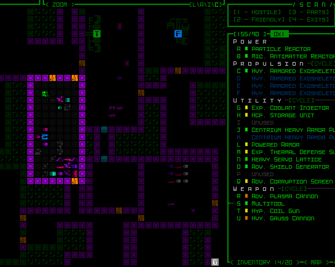
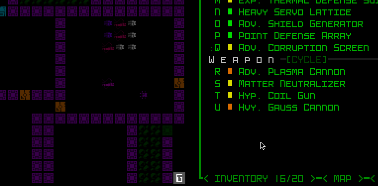
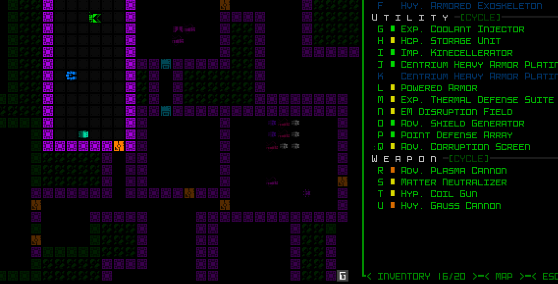
Purely item-based capabilities may even raise gameplay freedom to a new level, enabling players to reinvent themselves in the middle of a run, even to something in diametric contrast to an earlier state.
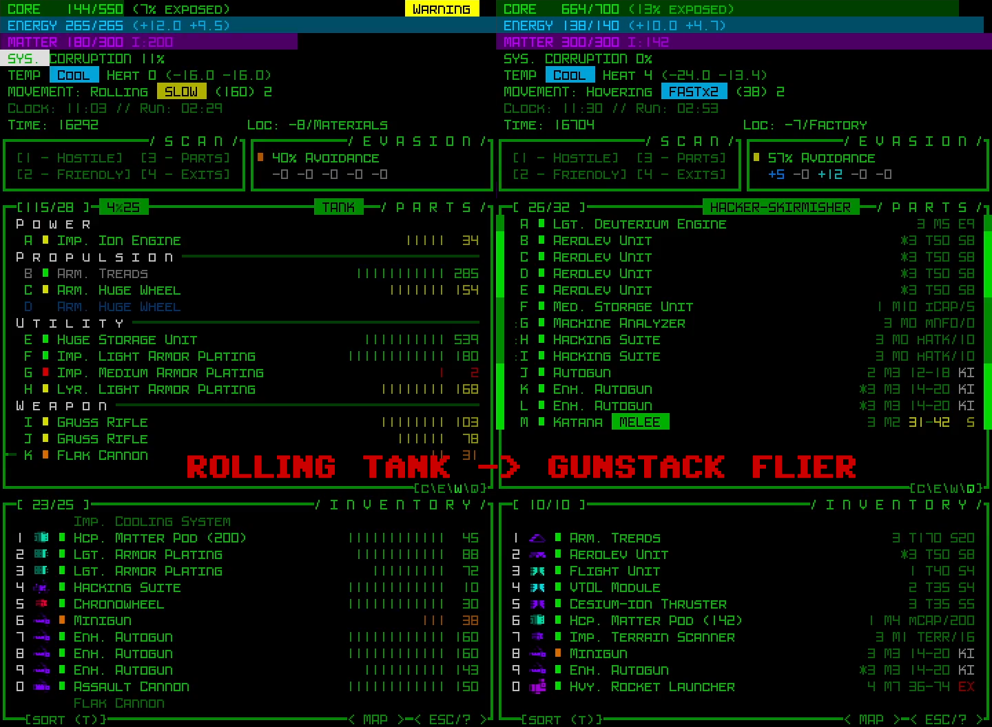
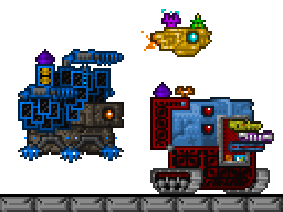
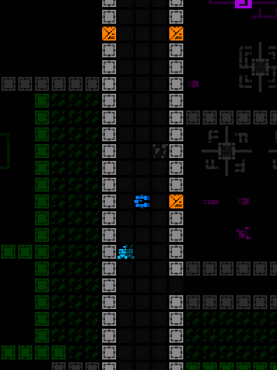
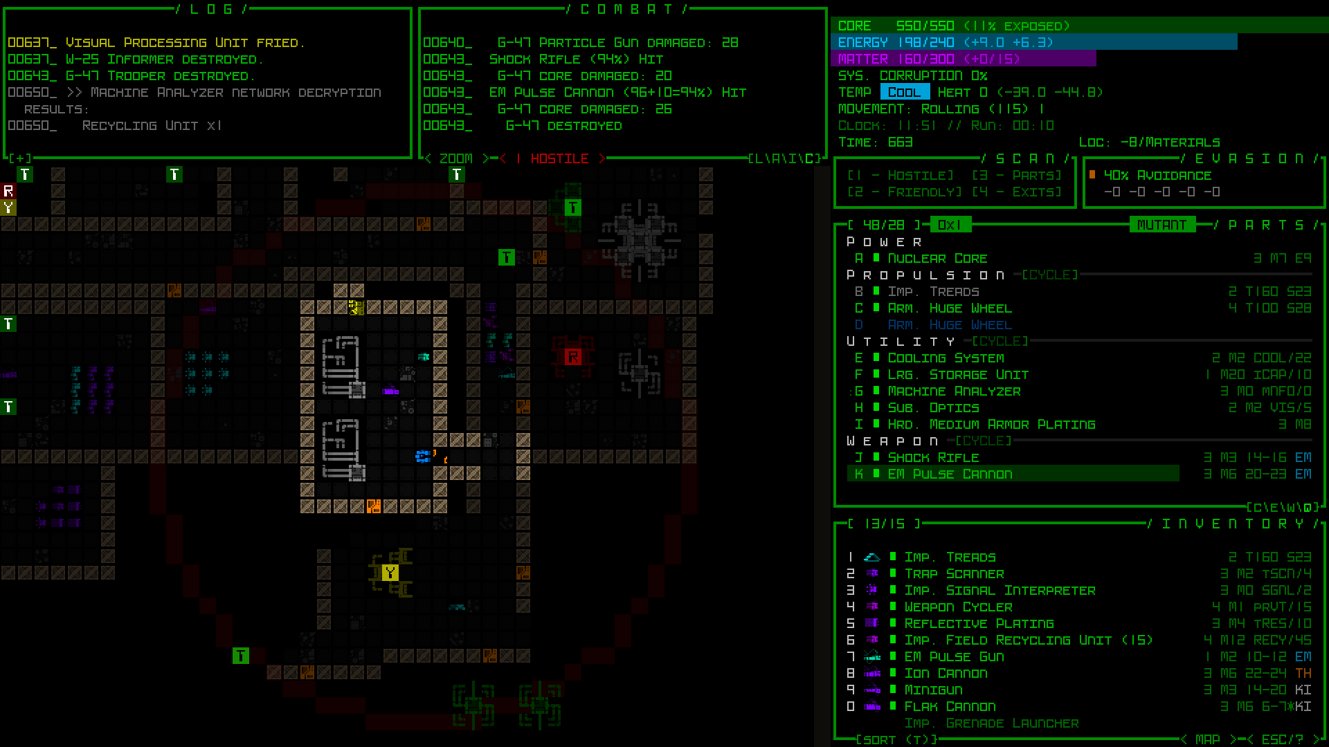
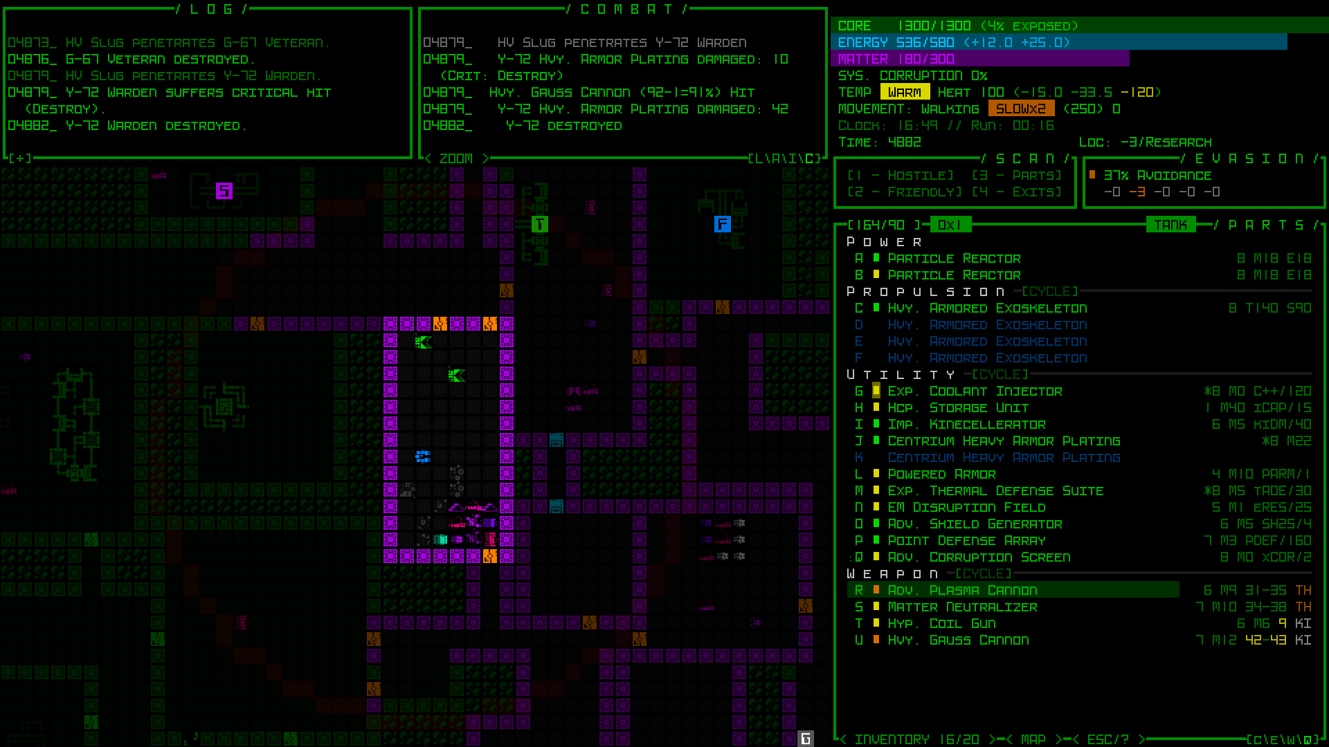
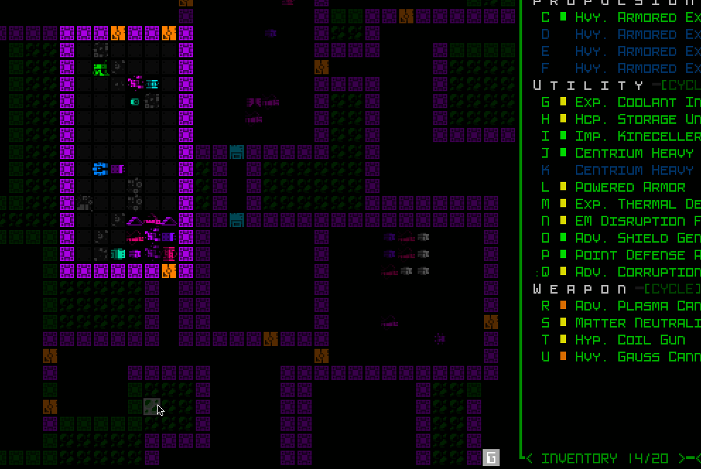
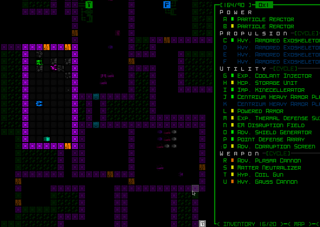
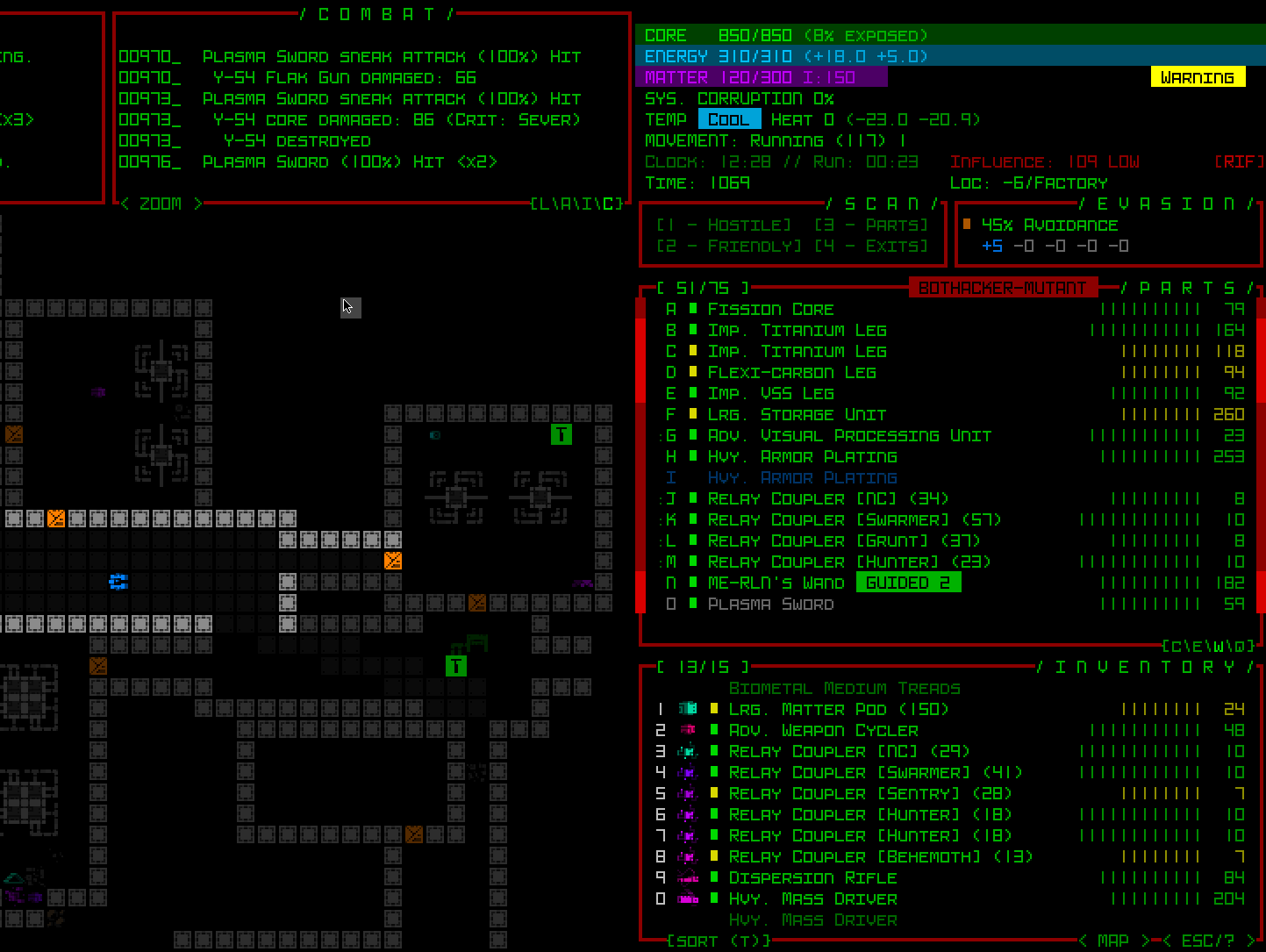
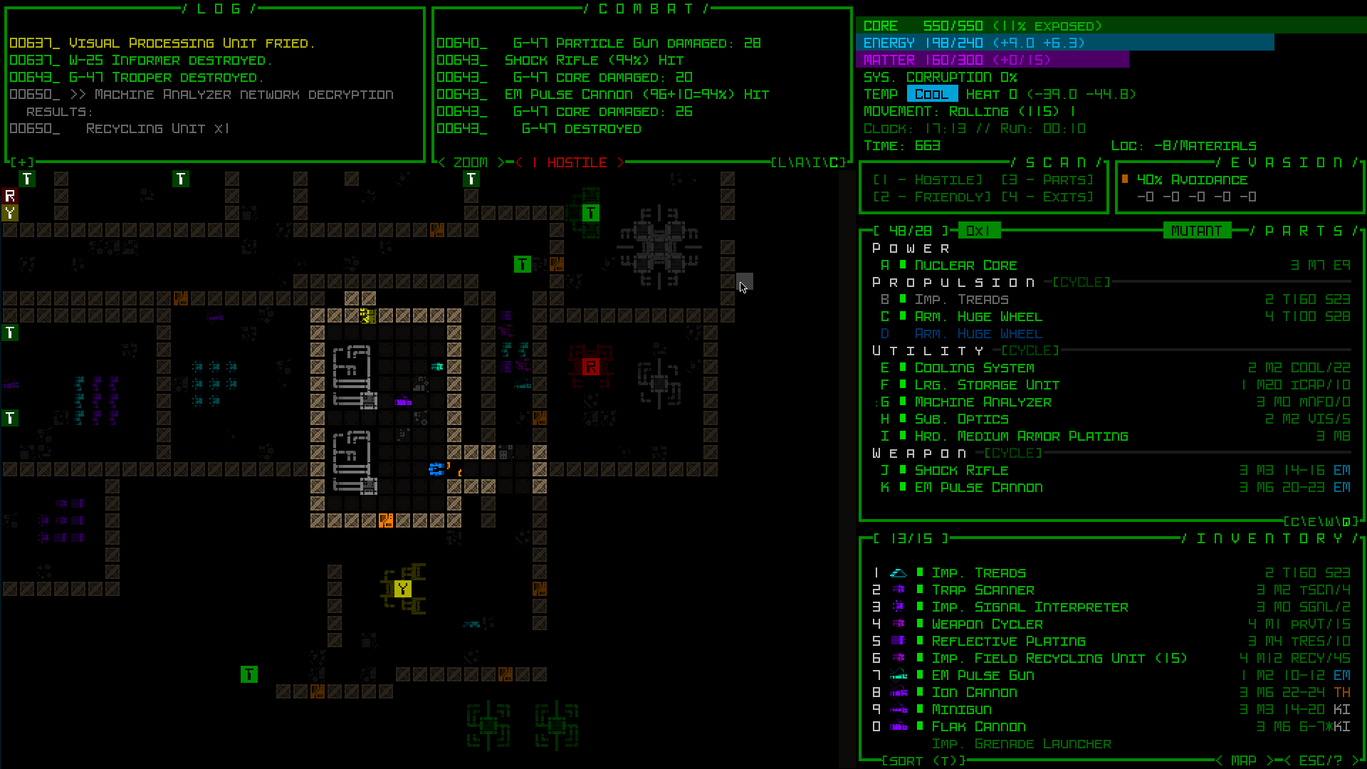
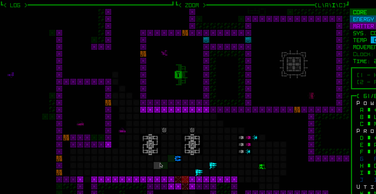
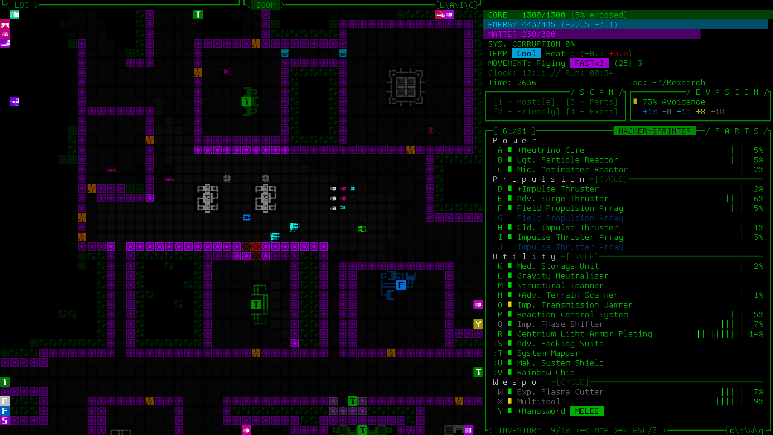
A sample transition taken from one of my streamed runs earlier this year, going from a slow rolling armored tank ready to mow down combat bots to an airborne build moving three times as fast as most enemies, and wielding decent machine-hacking power but capable of engaging in some fights if necessary.
This is the ultimate adaptation, whether intentional in order to aim for some new or shifting goal, or more of a defensive measure when coming under pressure as a run is railroaded by unexpected events.
Comebacks
Although I enjoy the tension in roguelikes, I don’t think it’s necessary, or as fun, to allow for singular mistakes or decisions over just one or two turns to instantly sink an entire run.
Most roguelikes are capable of killing you very quickly during a single encounter (being this dangerous almost by necessity since many also allow you full or near-full recovery between encounters, but that’s a separate issue). I like the idea of giving players more opportunities to recover from mistakes--after all it’s another chance to demonstrate that mastery!
Consumables or otherwise limited-use high-impact items tend to be the tools offered by roguelikes to help prevent such situations at the last moment, but naturally that requires using them in a timely manner (assuming one has an applicable tool), otherwise reminding us of the whole “dying with an inventory full of great potions” trope.
Cogmind is more unique in this regard, taking comebacks to an extreme by enabling survival following numerous mistakes (or just a stretch of bad luck :P) because the PC is quite resilient against any one or even many enemies, and fairly fast and tanky even if naked and item-less. (As a built-in feature one can instantly remove all their attached items as a free action, in case the build has become too slow or unmaintainable for whatever reason and a quick escape is needed.)
Unlike consumables one may or may not have at the right time, this approach offers a universal if costly avenue for escaping trouble, and subsequently extra breathing space within which to flex those mastery skills. At the same time this aspect of gameplay can contribute to Cogmind’s reputation as a highly stressful roguelike, no doubt because it doesn’t end quickly for you while there is almost always hope to survive, escape and rebuild again, but you have to be willing and able to face that kind of a high-pressure situation.
This takes some getting used to, both as different skill set and mentality coming from other games/roguelikes, not to mention getting over the potential frustration of having lost capabilities (items). But a good rebuild can see you back to a stronger form than before, and many winning runs end up going through one or more partial or complete rebuilds before reaching the end. Whereas in most roguelikes the player is generally increasing in power throughout a run, Cogmind is instead like riding a wave of ups and downs, in the process offering many more opportunities for unique decisions in a bid to survive, if not thrive.
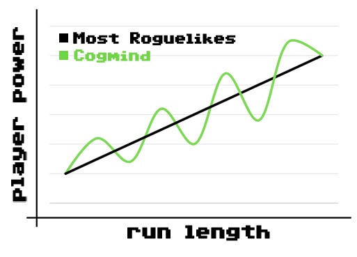
Graphing hypothetical average power level over time in roguelikes. In Cogmind the ups and downs tend to be more pronounced, whereas in other games the general trajectory is going to more clearly be up.
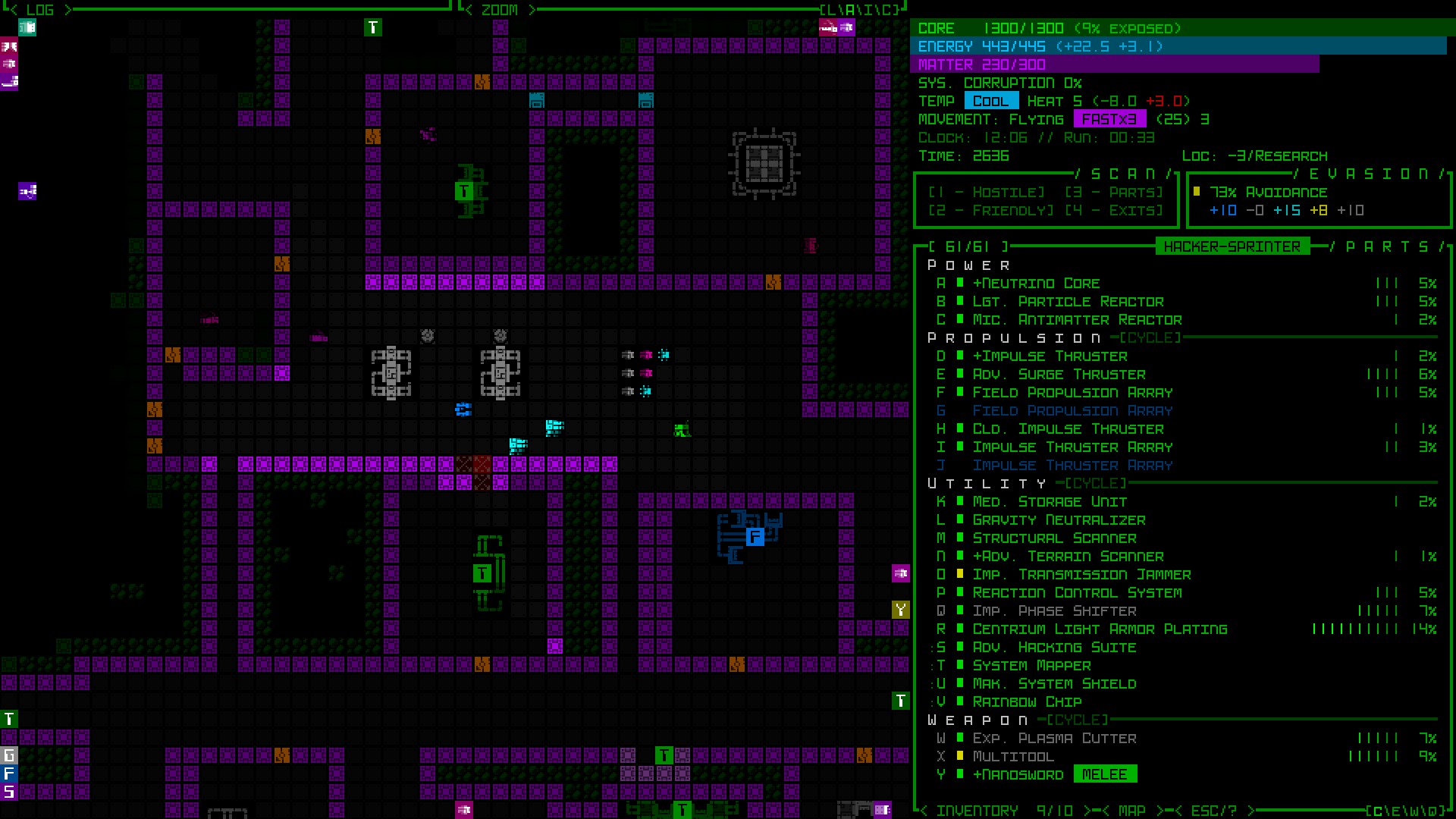
This topic reminds me of Valguris, who streamed a Cogmind run in which he demonstrated rebuilding principles by leaving behind all his attached parts upon entering every single new depth. It’s years old at this point and in an older version, but the concepts remain the same. (He made it to the last floor in that particular run--the very late game is especially dangerous for rebuilding like that :P).
I recall from one of my own Cogmind streams some months back I was getting beat up pretty bad at one point in the late game and one viewer assumed from the looks of things that the end was nigh, but nope, won that run, too :D. As an experienced player, to me the whole situation probably looked rather different since I could see remaining options for survival, even if it might mean short-term sacrifices and a change of plan.
Rebuilding is a frequent topic of discussion in the community, and a noticeable way to get one of those “gaming highs” in the middle of a run, a mini-accomplishment in the form of turning what feels like a near-death experience into a resurrection as a brand-new death machine yourself (or becoming a sneaky hacker--whatever you happen to have found and/or worked your way into after an incident).
It’s worth emphasizing that this kind of extreme is not for everyone given that many roguelike players are interested in creating and maintaining a consistently effective build, leaning more towards the so-called power fantasy side of things, for which I feel CRPG-style roguelikes are better suited.
Forced Adaptation
Aside from dealing with local short-term situations, we also hope that the player needs to consider how to adapt over the long term!
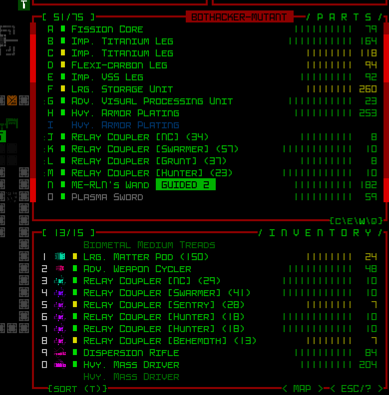
To that end, in Cogmind most build types are to some extent affected by integrity loss. Because items in use are also covering the PC’s body (core) to protect it, that also means they may take damage when coming under fire, in turn leading to a possible loss of one or more parts or their corresponding functionality. Replacements from inventory or elsewhere are essential at one point or another, thereby changing or limiting one’s capabilities.
Having a fairly steep difficulty ramp also forces players to always be on the lookout for (or have a plan to acquire) better/upgraded items without relying on the same ones for too long (although some less combat-oriented items may remain useful throughout an entire run). Keeping up with the power curve is a challenge in itself, and one is likely to stay ahead of it only for so long without change.
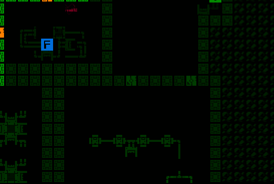
Together these design elements play into adaptation in a more macro sense: forcing or suggesting a change of route. Cogmind is not a linear “dungeon,” the world instead comprised of numerous routes branching and reconverging at various points (but importantly no backtracking), so while you may want to reach a certain location for whatever purpose, circumstances may dictate an alternative.
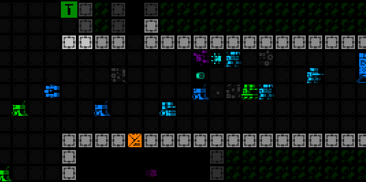
Maybe the opportunity cost is too great to seek out a more hidden but desirable destination, or reach a known location without suffering too much loss. Of course the best players might just try anyway, and deal with the consequences--a different form of mastery in action! There is a clear difference between what odds skilled veterans are willing to face, with a better understanding of what limits can be pushed, and how far.
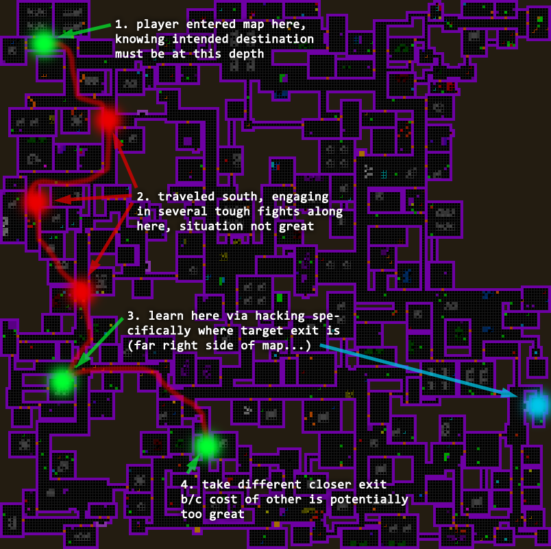
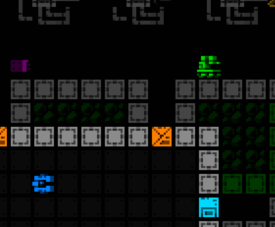
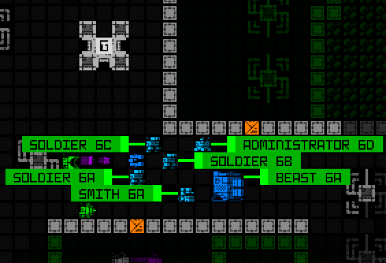
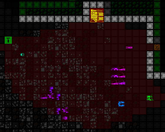
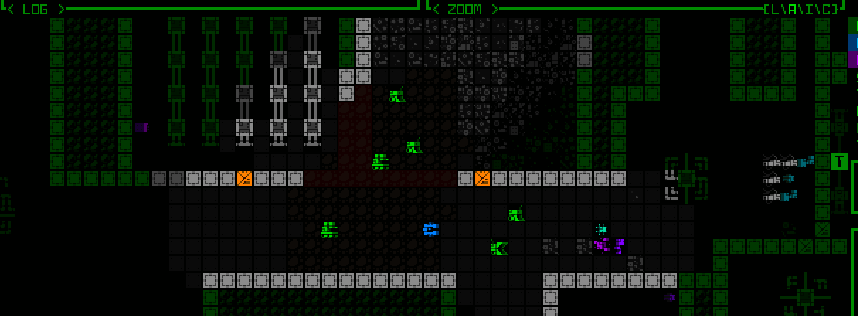
A hypothetical but common scenario, annotated by location. Some late-game Cogmind maps are notorious for forcing players to change plans or face dire odds to achieve previously set goals.
Agency
Developers have a huge number of levers for controlling an experience, but on the other hand the more levers we put at the player’s disposal, the more opportunity to see their mastery in action.
This includes player control of situations either before or after any game-changing event, e.g. preparing for combat, or avoiding combat, or changing the trajectory of an engagement, or recovery after the fact… build choices, item choices, special items and consumables all play a part.
Due to the aforementioned integrity loss (among other types of “food clocks” we won’t get into just yet), almost everything the player does in Cogmind comes with opportunity cost, so the stakes are a bit higher, even if the consequences usually aren’t immediate.
Although Cogmind has very few explicit consumables, the PC’s own durability and pliability ensures core survival while nearly all items are technically considered consumable. Fortunately all other inhabitants of the world are composed of parts (items) as well, providing spares for rebuilding, sidegrades, or new functionality. So by salvaging other robots (many of which are not actually hostile), the player always has access to at least what is necessary to ensure continuity of function. Supporting that capability is an important part of the environment, so important that its semi-absence in one type of map (caves) tends to be a glaringly absent feature for first-time visitors.
In short, at almost all times there are some or even many tools to work with, and the best players will be able to do more with less.
For more specific needs, I did want it to be possible for players to augment their builds or otherwise fill certain unique holes in their loadout by acquiring desired items through more direct means rather than relying on salvage or pure discovery. This was the origin of the Fabricator concept, where it’s possible to use schematics to build specific parts, albeit in limited quantities.
Predictability
Even in procedural environments, the ability to plan ahead is pretty important for those with the skill to do so.
Depending on what kind of route one is aiming for, whether to support a certain play style or accomplish long-term goals like a certain ending, where might they acquire the necessary tools to facilitate that journey?
For this purpose the world can offer various expected pit stops containing a known range of rewards (which may of course be guarded or otherwise involve their own challenges). Of course we don’t want too much static content--we’re trying to use procgen to keep experiences fresh, after all, but having a set of specific knowns in which to anchor plans provides a semi-reliable way for players to thread their own run through the world if desired.
This approach ties in especially well with Cogmind’s multiple plot lines, since the relevant areas required for the narrative can also serve double duty as said pit stops. (Cogmind always includes all maps in every world, but most of their exact locations are somewhat randomized for just the right amount of mixing things up.)
Related: I’ve previously shared a breakdown of Cogmind’s static vs. procedural content using more diagrams and data.
Predictability is also important in a more local intramap sense. Experienced players expect challenges and rewards to remain within certain bounds by default, and anything that changes the status quo should ideally be telegraphed.
Here we don’t need to be too fearful of giving the player too much help, since surprises will no doubt happen regardless, but feeding them hints about notable changes to the default state enables them to capitalize on their mastery to meet new challenges by adjusting plans.
Cogmind does this almost everywhere it’s relevant.
Being spotted by a surveillance-type enemy that alerts their nearby (but unseen) allies within a larger radius shows an animation and message to that effect, suggesting one flee, reposition, batten the hatches, or take whatever other responsive measure is appropriate depending on the situation.
Being traced while hacking a machine, attacking certain busy worker bots, fighting in certain areas, and various other actions all trigger various types of appropriate hostile dispatches, and all of which are immediately accompanied by a floor-wide announcement to that effect.
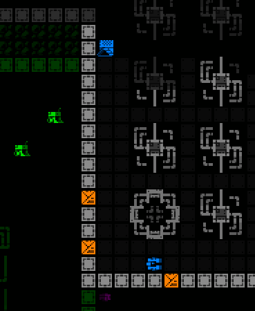
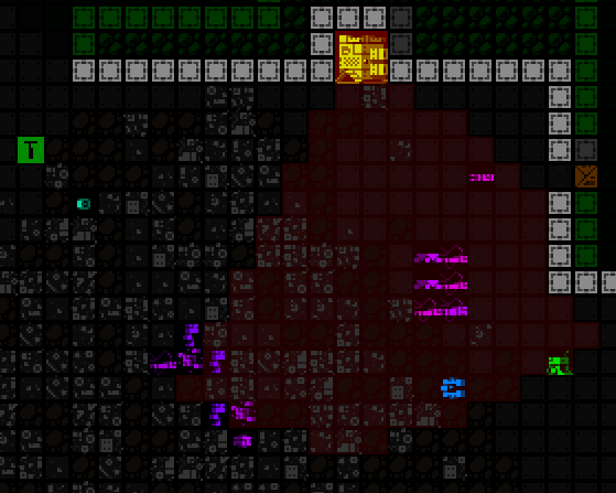
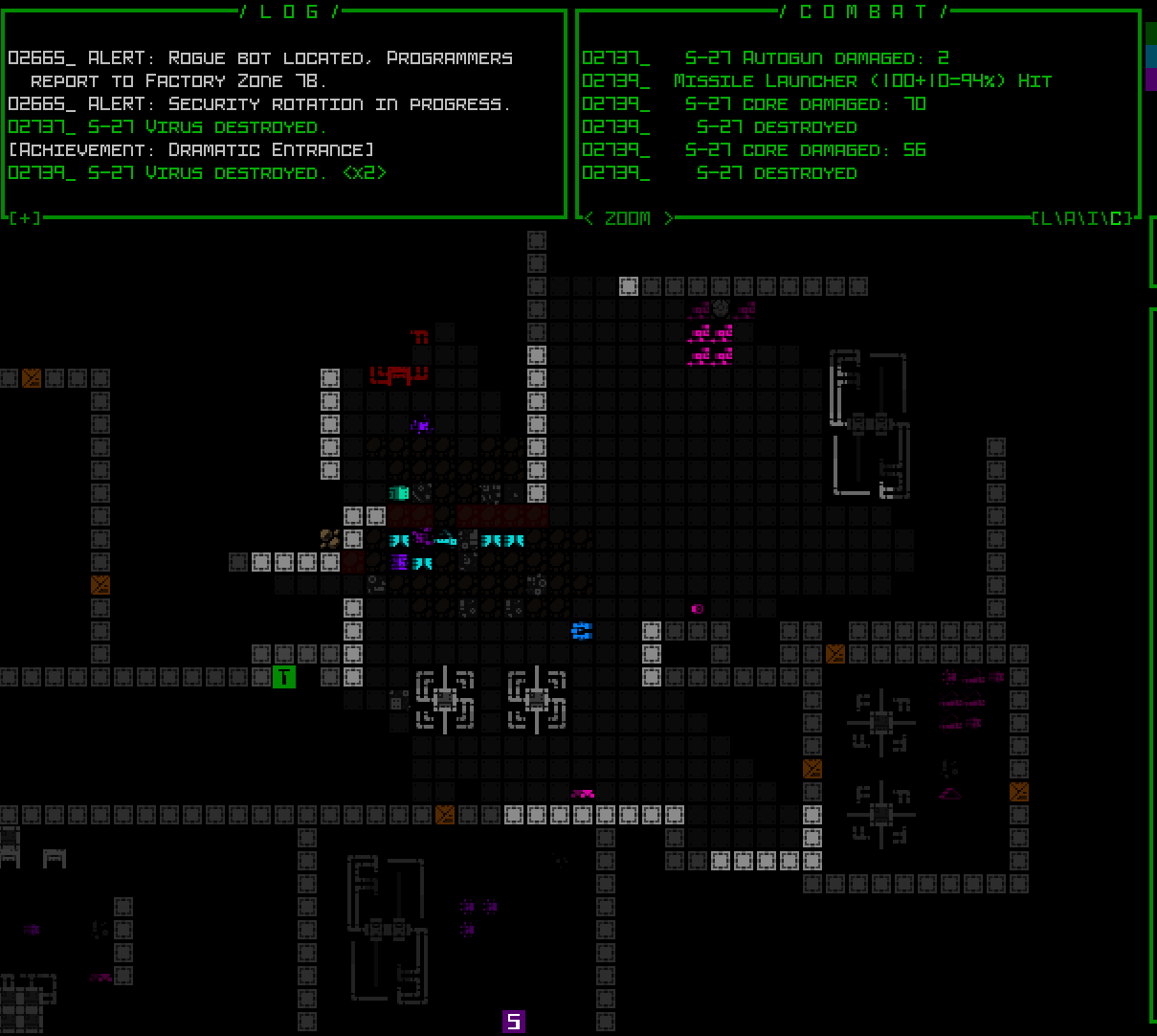
One of the most dangerous (but also potentially most rewarding) events in certain main maps is an active Freighter convoy, and it’s so dangerous that it is even telegraphed and trackable through multiple means. Actually, years ago I wrote a whole article on this feature, with a section about telegraphing :P
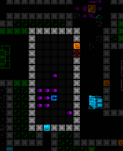
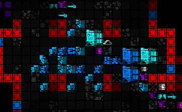
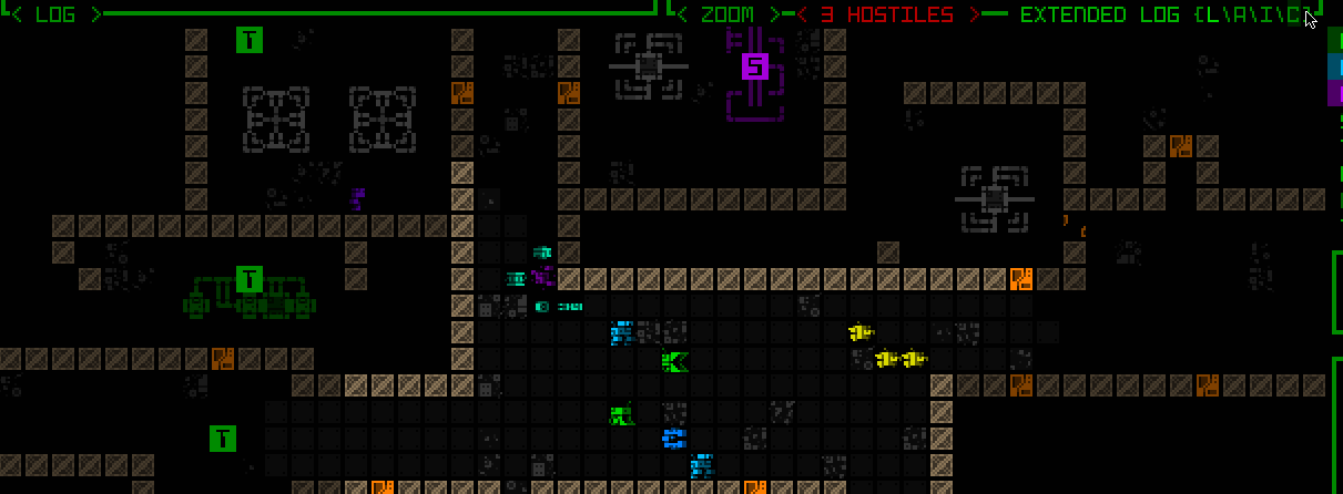
Highlighting a sample cargo convoy route across a Factory map, information accessible via the Transport Network Coupler, but this following both a floor-wide pre-announcement and a delayed dispatch preceded by an especially fast group of weaker bots that travel the path first (if you see them rushing through, you know bigger trouble is coming!)
Anyway some people will ambush or hunt these things down if capable, others will do their best to avoid them, but in either case the important part of the design is that the knowledge is there to react how one pleases, and these and other announcements naturally impact one’s decision-making in a more meta way, before even any sort of confrontation!
Metaprogression
Speaking of meta… metaprogression is relevant here--wait, not that kind! Not the roguelite-style metaprogression where you allow previous runs to give some sort of edge in future runs, like augmenting your character by bringing along extra items or abilities etc…
Metaprogression of the mind! We grow as players, expanding our understanding of the balance and mechanics driving a particular roguelike.
Although most players will have some reasonable idea of what to expect and how to react when an “assault force” dispatch is announced, for example, with greater mastery comes a better feel for the full range of available options and what to prioritize in a response.
This is why some amount of immediate feedback on actions and their consequences is important, enabling players to more quickly build that knowledge and afford greater agency in the long run. Of course feedback at this particular level may not be very relevant in a lot of roguelikes, which are often based on more localized encounters compared to Cogmind where actions have both local and global consequences, but it stands as a general example of the advantage of feedback facilitating “player metaprogression.”
Metaprogression also improves alongside familiarity with systems, with players “feeling like a genius” (many a quote among Cogmind players!) for their growing ability to navigate the intersections of all these systems. Again this is an area where Rogue itself is somewhat lacking, without the same level of replayability or depth as later samples of the genre. There are definitely mechanics to learn and content possibilities to consider while playing, but only so much agency in a given run to affect outcomes.
Randomness
Ah, our mortal enemy (and friend!), the RNG…
Roguelikes need some amount of randomness to challenge us with the unexpected, be it manifested in the layout, the content within the environment, outcomes of actions, or more likely a mix of all the above.
Although players may be quick to “blame the RNG” for bad circumstances, a well-designed roguelike should be able to remove luck as a factor in runs by the hypothetical optimal player.
Not that everything should be fine-tuned to the point that perfect play is required--there should always be leeway for creativity and numerous solutions and builds, otherwise we’re promoting monotonous approaches to challenges and at least somewhat damaging the potential for replayability.
To this end I’d say keep an eye on players who regularly win, or even streak wins, and make sure that there’s enough variety among these runs.
Getting lucky and receiving a boost from that luck is a great feeling, too, though we also have to consider just how unlucky a player can be and still survive :P. This is why I like Cogmind’s more universal solution to escaping and rebuilding, providing the ultimate flexibility to backstop problems, one that is increasingly effective in the hands of a good player.
But in terms of general roguelike design, remember that the RNG and “random” outcomes derived from it never have to be truly and completely random ;)
There are numerous techniques and variations like weighting and number pools with different behaviors, and as a developer it may be smart to exert more control over some aspects of the game to ensure a better experience, as long as this doesn’t interfere with the player’s ability to build a feeling around these systems.
Consequences
Consequences add meaning to choices.
At the extreme end of that observation, permadeath and being unable to take back decisions serves to highlight true mastery over a roguelike. Sure a player might use save scumming to gain an expanded understanding of possibilities, or save time in the pursuit of late-game knowledge, but until completing full runs without reloading an earlier save, the mastery itself is similarly incomplete.
However, prior to the “ultimate consequence” of a loss, roguelikes also often introduce other consequences of import, in various forms.
In this area I’m very partial to Cogmind’s integrity system, already discussed, because it is an overarching consequence that makes every encounter meaningful beyond the encounter itself.
Unlike somewhat related “durability” systems from other roguelikes where items degrade from usage, here the degradation instead derives from taking damage, which crucially is an aspect over which the player has more control!
The best players know how to effectively protect their important parts from damage, and therefore retain their functionality for much longer or through much more difficult times. Instead of replacing lost items with salvage or sub-par parts, more often they are simply tossing their existing parts to actively upgrade to new ones. The data shows a huge contrast in this area as player experience and skill improves over time.
Food Clocks
One of the more common features across roguelikes that involves managing “consequences” is a food clock, so named because earlier iterations tended to literally be food that a player needed to eat intermittently in order to survive. Eventually the genre began transforming this feature into other mechanics with the same purpose.
This most fundamental of clocks is essentially based on time, intended to prod the player along and impose a cost on spending too long in one area, or progressing too slowly overall. Leaving good players to their own devices in a rich world that doesn’t mind however long they stick around likely invites optimal tedium, not to mention a lack of pressure potentially offering too much leeway for “shenanigans” :P
There are alternatives for eliminating such behavior, to be sure, food clocks just happen to be one approach, and learning to excel under this or similarly purposed limitations is yet another skill players build over time.
Ages ago I wrote a short piece on the importance of food clocks in roguelikes, wherein I also covered one of Cogmind’s primarily time-based clocks, namely programmers and corruption.
Beyond that however, Cogmind utilizes a variety of clocks, more than the average roguelike given the more integrated nature of the content and therefore greater suitability of global reactions to player behavior. In a large enough world I feel more compelling challenges can emerge from a proportionally wider variety of considerations, and have a greater or lesser effect depending on the player’s current build and behavior.
So there are many different kinds of dynamic responses to player behavior, including a more general “been causing lots of trouble over time, send stronger forces to the area.” Players can decide to either do their best to avoid triggering these consequences, or prepare for them in advance, or even directly manipulate the clocks themselves (delay them, or undo their effects after the fact…). Lots of options!
Although these features are tweaked to target the higher end of player performance, this doesn’t have to serve as a brick wall for others, as 1) flexible systems can be designed to push back harder when pushed against, and 2) given numerous routing options and alternative “early exits” from most maps, players may often opt to leave as soon as pressure starts to exceed their personal tolerance threshold.
Threat Detected!
Cogmind’s next version (Beta 16) is coming with an entirely new consequence, one that I’ve planned and alluded to for years. Already having made appearances in the in-game lore, the “Unchained” are effectively a type of mini-boss that might come after the player, triggered by a range of more extreme behavior.
I’ve always seen them as a potential catch-all for dealing with naughty (skilled!) players in a lore-appropriate manner. Will this stop players from doing the extreme things that could result in meeting one of these menaces? Of course not! But it might take things up a notch as it throws another new wrench into plans which may then need to be adapted.
Also of course the best players are out here wanting to take things up a notch, especially if there’s a chance they could get their hands on tech used by these fellows.
Either way, with their potentially strong impact on the trajectory of a run, we’re going to have a correspondingly strong need to telegraph their arrival! Likely even going so far as to announce specifically which one is operating in the area…
I say “which one” because each is a powerful NPC unique in their abilities, also with unique AI, definitely not something to shrug off. They can even track the player across multiple floors, a first, which may force players to confront them earlier if possible (or one could try to use this behavior against them?).
Telegraphing is also important because some of them may only come after the player indirectly rather than via direct confrontation, so we’ll need some reminders of just why certain unusual things may be happening ;)
Content
Several aspects of content development are heavily influenced by players achieving complete mastery over a roguelike.
Extended Game
Naturally a common refrain among skilled players is simply “we want more!”, be it harder challenges during the run, or even beyond the end.
A fair number of roguelikes feature such an “extended game” with additional optional challenges like collecting the 25 Lumenstones in Brogue, 15 Runes of Zot in DCSS, Ultra endings in ADOM and so on.
Cogmind as well has an extended game, and extended extended game, and also more and more different endings (10 in all as of 2025) that each present their own challenges, many quite unique in terms of preparation or execution.
Replayability through content additions, in particular alternative or greater challenges, is valuable in a game players have already invested so many hours exploring, learning, conquering, and enjoying. Sure the ideal is to have a highly-replayable base/core game, but if there is new territory into which to spread one’s experience from an already solid foundation, that’s like a shortcut to more fun :D
On that note, I just recently streamed my own winning run that aimed for Cogmind’s newest ending, archived here--spoilers for the newest faction, their plot, and a new map, not to mention a really long run spanning five streams (lots of talking xD), but it didn’t disappoint insofar as presenting new and interesting challenges!
Tradeoffs
I am a player myself, but as a roguelike developer I also see part of my role in building the game as a sort of competition against the best players, keeping it challenging while still offering many unique angles from which to explore the content.
Aside from the whole earlier discussion around leveraging “consequences” to prevent players from accumulating too much power, another useful tool at our disposal is tradeoffs.
This can apply at a scale as targeted as mechanic- or even item-specific, but the more impactful areas of concern are the large-scale tradeoffs involving maps, factions, and other major features. For one, changing an individual item or mechanic is easier to manage and has fewer repercussions, but a lot more thought has to be put into how large new pieces of content will fit into the meta--adjusting them later could be quite difficult and costly!
Branching routes in a game like Cogmind that doesn’t allow backtracking are especially useful for this. New players can enjoy the advantages of whatever route they end up on all the same, but skilled players will be using their knowledge to think further ahead, weighing the pros and cons of taking certain routes over the long term. In that sense, each map needs to be designed with rewards commensurate with how accessible it is and what else it may possibly (or even certainly!) block out.
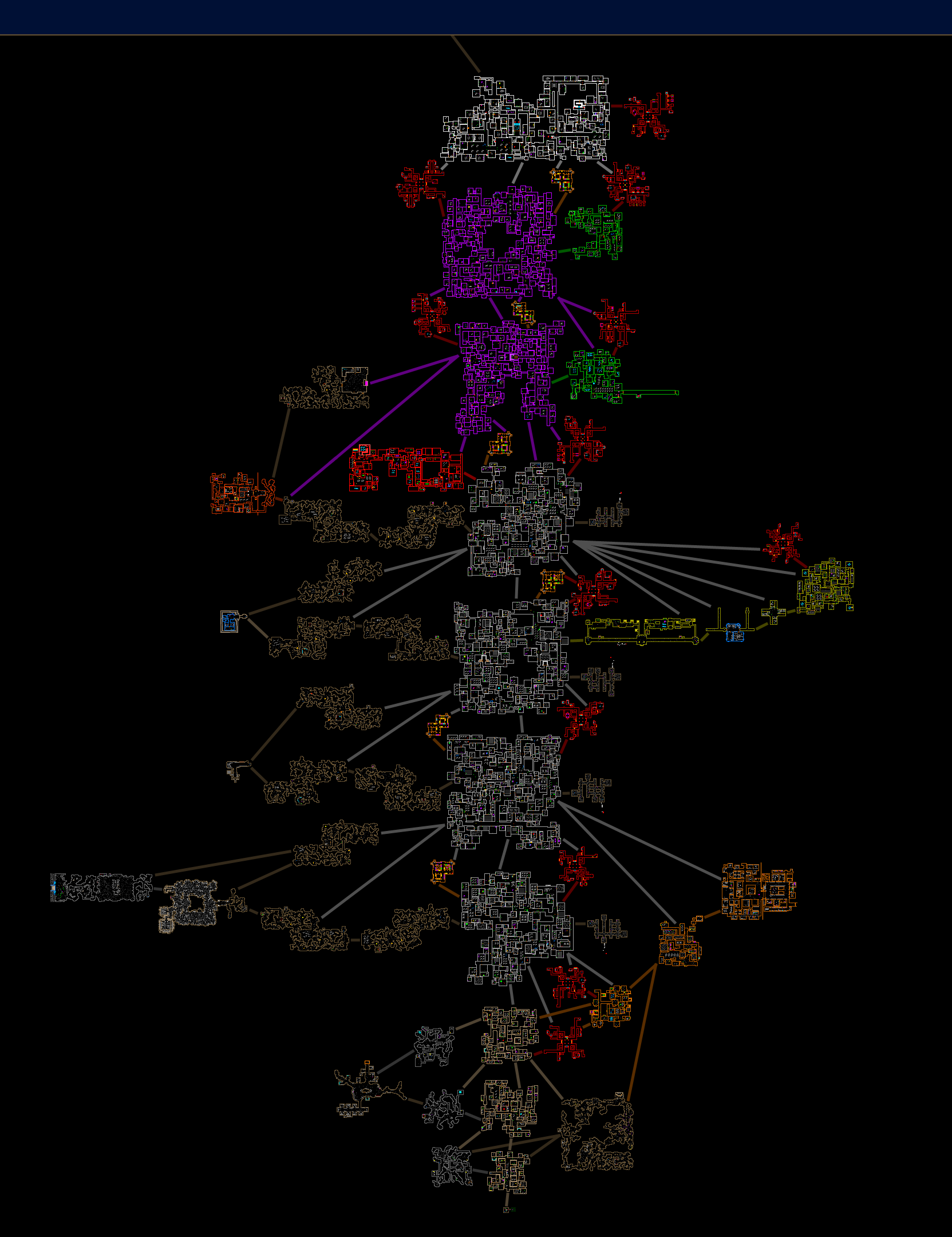
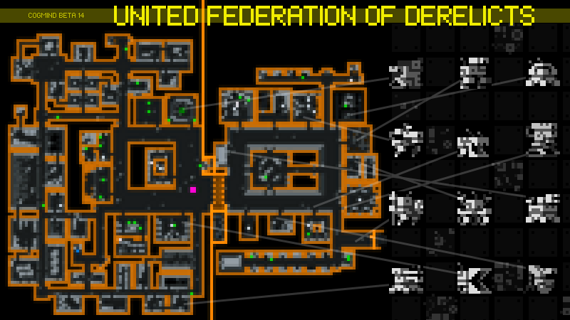
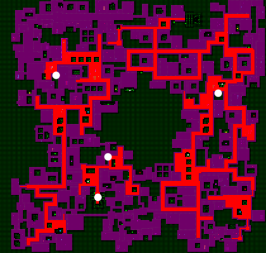
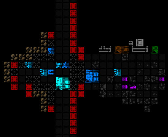
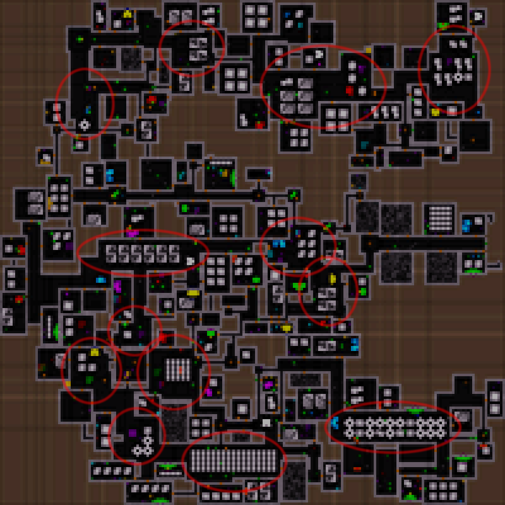
The abridged, less spoilery version of a possible permutation of Cogmind’s world map, leaving out a number of harder/secret maps. Now updated for 2025 since we’ve gotten several new maps over the last year (although even one of those is a spoiler so you won’t find it here--in the full version the top area is a lot heavier :P). But you can imagine that for every upward connection taken (in Cogmind you start at the bottom), that is a decision, forced or not, that permanently leaves behind many other possibilities.
Funny enough, for many years Cogmind’s out-of-the-way “Recycling” branch map was much neglected by players as being essentially useless, almost pure drawback. The only map with such a reputation, it was a relatively simple one added in early Alpha before cave branches existed, as a way to skip ahead, but later lost this value when compared to the alternative routes that became possible. Finally with the massive content expansion that was Beta 14/15 for the UFD faction over the past year, as one of the access points to that content, Recycling has been better integrated as a serious option.
And with that all the locations have their uses!
Another interesting major tradeoff worth mentioning is a special sensor-like system dubbed FarCom. Players can acquire this tech very early in their run, benefiting from realtime knowledge of enemy movements and also thereby hopefully learning more about enemy behaviors. I added FarCom primarily as a big help for new players (going so far as to have an NPC lead players to it to teach where it is) but I couldn’t just give this powerful tool to experts for free. Enter tradeoffs that don’t come into play until much later in the game :). Using it causes certain optional but very rewarding late-game areas to become hard or impossible to enter, so while some good players will still take it under the right circumstances, it’s not suitable for every run despite how good it is.

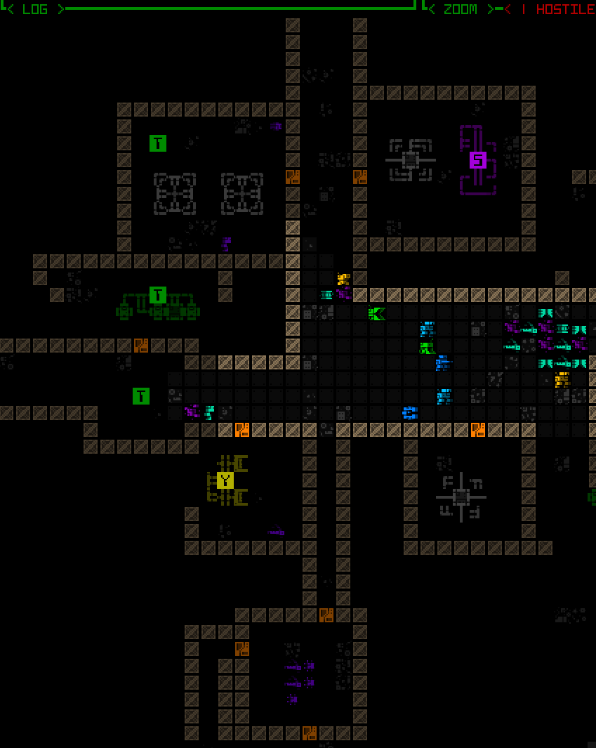
All enemies of a certain category within the circle (which normally glows faintly) are revealed, a capability akin to various sensor utilities but faster and doesn’t require a slot, so cannot be destroyed/lost.
Front-loading Difficulty
Three of Cogmind’s factions offer their own ways to front-load difficulty, in a general sense essentially making the mid-game harder in exchange for a late game that’s that much easier.
Of course the existence of these options doesn’t necessarily mean everyone can or will be able to take full advantage of them, but the effects are in part based on a sliding scale, so everyone can do their best to push harder in the mid-game, skilled players presumably pushing even harder, resulting in more breathing room towards the end.
The important takeaway, however, is that while making the late game easier every run sounds ideal in theory… mistakes are made, unexpected ignored convoys ruin your day, builds fall apart, runs often have other goals or needs to attend to, the Unchained show up, I dunno, another cycle in the world of Cogmind ;)
Think of front-loading difficulty as another tool for letting players rely on their experience to decide whether they want to risk more short-term problems that could snowball into bigger problems in exchange for a theoretically more promising view of the future.
Balance
Not every roguelike/game needs to be tightly balanced. Some people just want to find ways to become nigh unstoppable, fulfilling the power fantasy and escapist roles that games can play.
Personally I’m a fan of balanced experiences, both as a player to be challenged, and as a developer to generate those challenging scenarios throughout an entire run rather than only some smaller subset. I also think truly mastering a roguelike feels that much better if it’s not an easy accomplishment, which requires an eye towards maintaining that balance.
So how does one go about actually creating this sort of experience? Well we did already touch on balance a few times, for example with consequences and tradeoffs, though there’s more to it than that.
Numbers tend to underpin everything, so starting there makes sense. I’ve written about the numbers aspect before (11 years ago prior to Cogmind’s first release!), and again many years later with more details when every single item was revisited to check for any rebalancing needs amidst the addition of so much content and mechanics that may have left them behind in the balance at some point.
While an important foundation, however, numbers only get so far and eventually refinement comes down to play experience and game feel.
At this point player feedback is useful, and probably most vital is indirect feedback in its various forms, be it statistical data or anecdotal information. To me what players say or show to one another is more important than what they say directly to a developer (the exception is players who have an incredibly strong grasp of the game’s design--that’s a different story and very valuable feedback in itself!).
One key element I like to look out for is disagreement. Players disagreeing on what is the best item or mechanic or route and each having good explicit reasons supporting their own viewpoint and maintaining that disagreement is a good indicator of overall good balance.
I also like hearing “it depends,” which is an incredibly common refrain when discussing Cogmind and probably many roguelikes. So many decisions are and should be situational if we’re talking about procedurally generated environments and complex systems, as that’s what keeps the challenges fresh!
That’s where mastery enters the picture. It’s not possible to consult a wiki to determine how to best deal with every new encounter, there is no one-size-fits-all solution to each type of situation, it takes experience to analyze the pros and cons of each action depending on all the details at hand… (This is especially acute in a world like that of Cogmind, where consequences of decisions may easily reverberate across larger areas, or maps, or entire runs.)
Anyway, clearly this sort of approach to balance requires a lot of community interaction, or at the very least observation. Although maybe not feasible for every developer, I recommend it as incredibly valuable for creating the best possible experience. It’s worth it in the long run since traditional roguelikes tend to be developed over longer periods and have time to evolve based on that feedback if necessary.
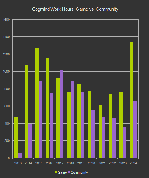
Another angle from which to approach balance (ideally in conjunction with community feedback and observation) is the other form of pure observation: stats. It’s somewhat more limited in what if can really do for balance but examining individual extremes and aggregate data from player runs does tell its own stories, especially when comparing across multiple versions to look for any trends.
Cogmind scoresheets contain a wealth of data, and I’ve posted multiple analyses here on the blog before, though I’ve also been doing this with every version for many years over on the forums. For me the statistical side of things is less about explicitly guiding future development and more about confirming the state of the player base.
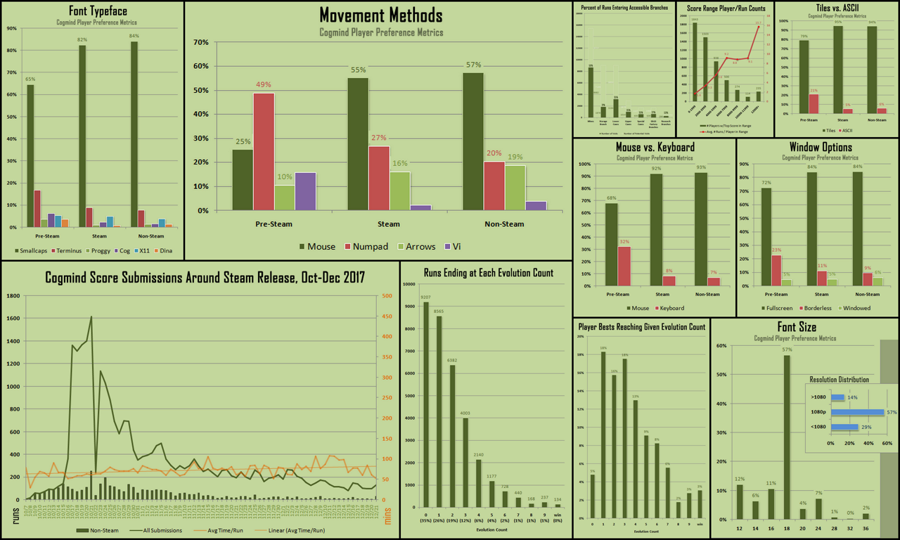
A portion of the data compiled for analysis shortly after Cogmind released on Steam, especially important at the time to examine the results of wider exposure to the non-core audience (the metrics analyzed at the time were more focused on preferences, but win rates and general performance data mattered as usual).

Run-specific data is very thorough, as you can assume from the density of the above minimized example from an atypically long run in Cogmind’s latest version (raw data).
Though I know a lot of developers outside the roguelike genre are more likely to rely on these sort of metrics, I think if the data is reflecting significant problems at scale, that’s a bigger problem with the fundamental game balance, so maybe something that’s more relevant at very early stages rather than long-term development where you’re more interested in expanding on a solid foundation and/or tweaking smaller parts of a larger game that both yourself and the community are already deeply familiar with.
Being able to predict the results of additions becomes a valuable tool--the lesson being get good at your own game ;)
Recognition
Surely most roguelike masochists focused on mastering their favorite games are in it for the sake of doing it, an ultimate personal accomplishment. Roguelikes are single-player games, after all, so there is less emphasis on the competitive aspect compared to many other genres. Bragging rights are still a thing, though, so it’s nice to add ways for players to share that recognition.
For one, online leaderboards are pretty common, often including databases that allow one to look into the details of each run.
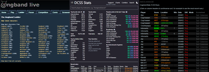
An Angband ladder for online versions of many variants, one of many DCSS stats interfaces, and one of Cogmind’s run databases. All of these give access to detailed data about the individual runs as well.
Heck, DCSS even holds great tournaments to celebrate each new version.
Cogmind has its leaderboards, reset with each new version, which frequent players are keen to keep an eye on and enjoy working their way up.

An excerpt from Cogmind’s latest leaderboards. (As a testament to the aforementioned interaction with the player base while designing the game, I’ve talked with everyone seen on the list there, and actually know the vast majority of players in the top 100, plus many scattered throughout the remainder and still working their way up as well.)
Even Rogue’s earliest versions included the type of high score list often found in early single-player games played on a single system (arcade-style), thereby facilitating competition.

A sad story from a quick run in Unix Rogue, but hey #1!
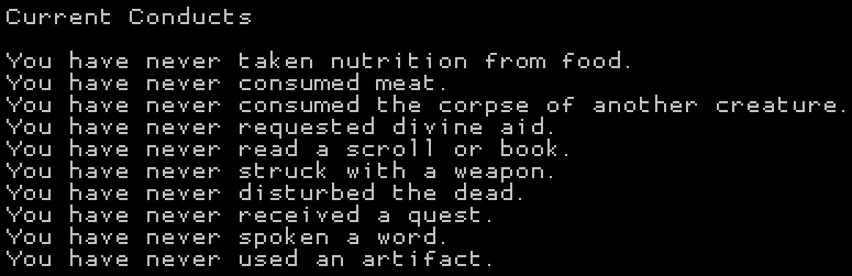
Competition aside, even just specialized personal goals have been a thing in roguelikes for ages, traditionally known as “conduct” runs, whereby for example players might adhere to artificial limitations on what they can and cannot do during the run, a clear sign that someone is probably reaching a higher level of mastery :P
What we can do in such cases is identify interesting/challenging/fun conducts and formalize them.
Even some older classics eventually took this route, tracking whether a given run has been following each conduct so that information can be recorded in character dumps.
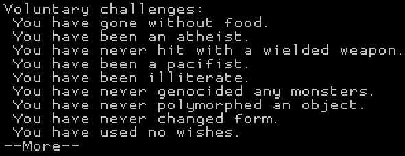
A list of conducts in NetHack. Some additional optional conducts even require configuring the game options to enable them, for example starting blind or without armor, in order to enable one to conform to the requirements throughout the run.
Another list of tracked conducts from Shadow of the Wyrm, a chill ADOM-like still in active development after nearly 15 years.
More modern roguelikes may also do this using the newer form of recognition in gaming: achievements.
I’ve written about the design of Cogmind’s own many achievements before, which include a sizeable number of “challenge” achievements that fall into this category, with coincidentally many more coming to the next release.
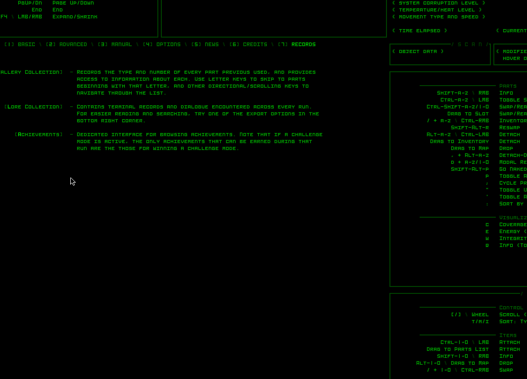
Cogmind has its own built-in achievement system, since I believe as a traditional roguelike available off Steam, it should not require that platform to have access to its features.
In the end the recognition is the less important part, and it’s more about using features of the game itself to guide players to discover new ways to interact with the content as they attain mastery, especially relevant in single-player games where players may not necessarily be attached to a community of other players.
Whew! I think that about covers a lot of the main points we discussed in the Roguelike Radio talk, and then some. Mastery is a broad subject with deep roots in the genre, so as soon as Darren proposed it earlier this year I had a strong urge to write about it. Waiting until after the talk meant I just had a handful of random notes available for the talk itself, but at least it spurred me into action to put some more writing here :)
If you’re interested in further related reading, I have an article on design philosophy containing some themes that tie into this one.


 RSS (posts)
 Mastodon
 Patreon
 Discord
 /r/Cogmind
 Indie DB